/ 2026 / Rebranding
[EN]
Vireo — International surrogacy agency
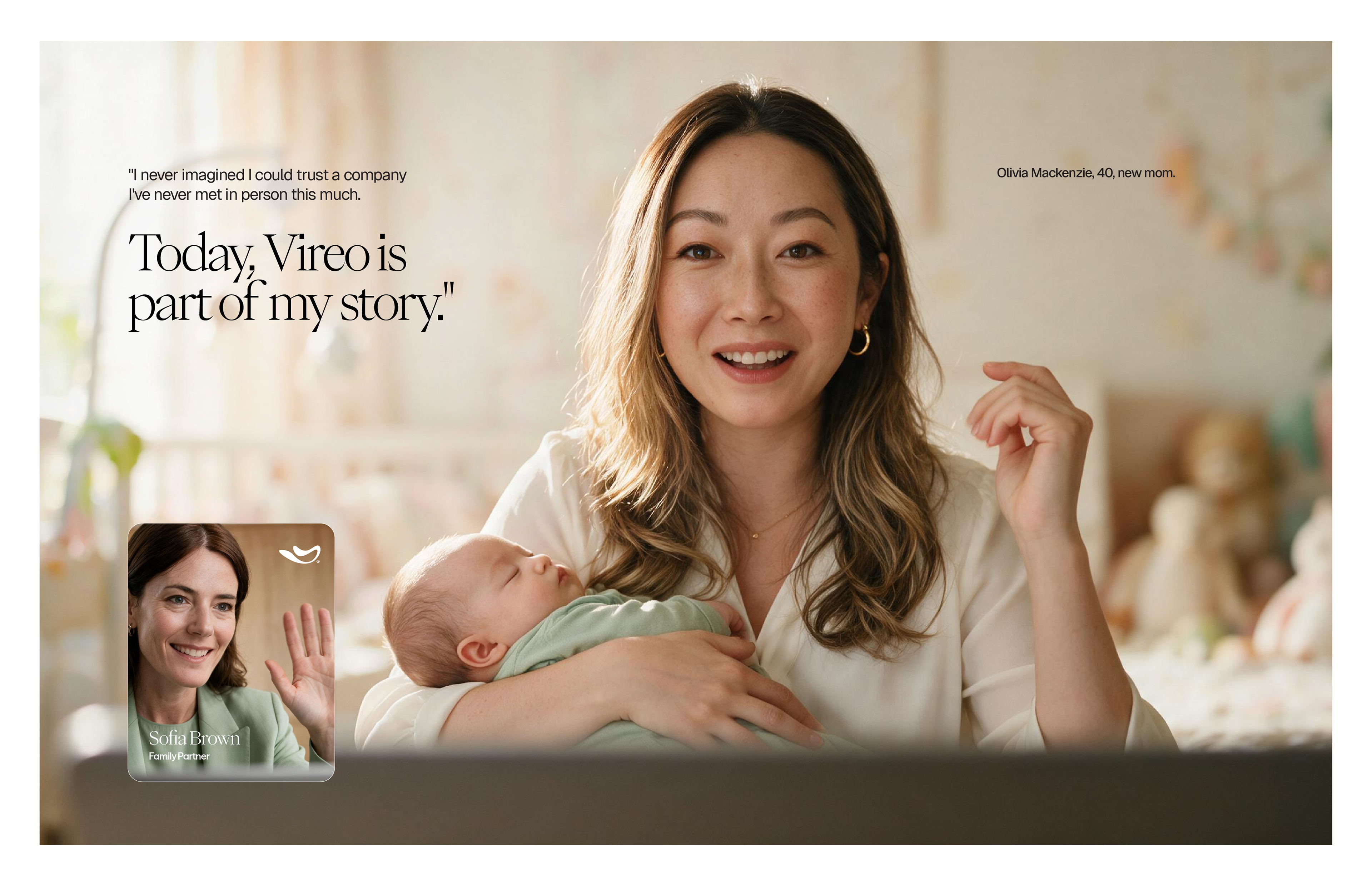
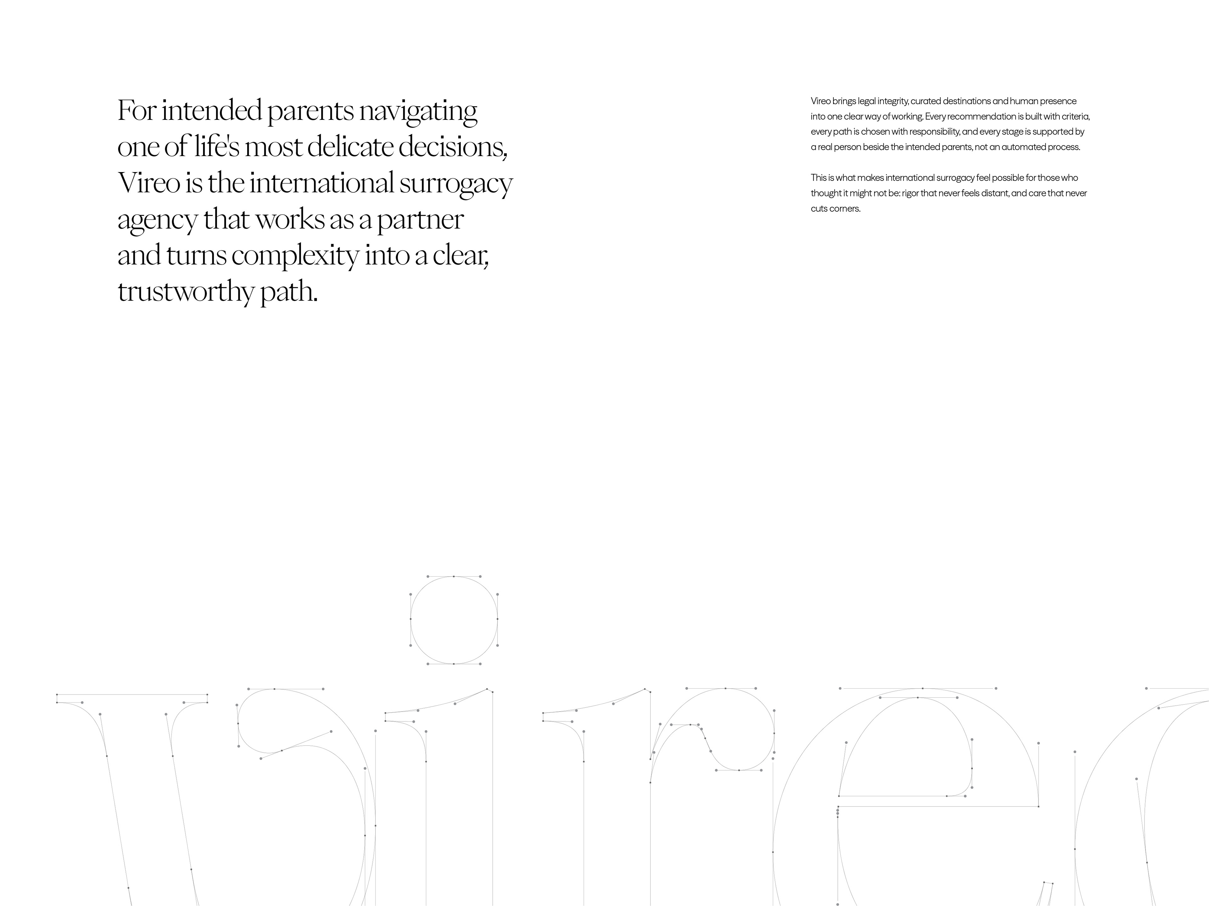
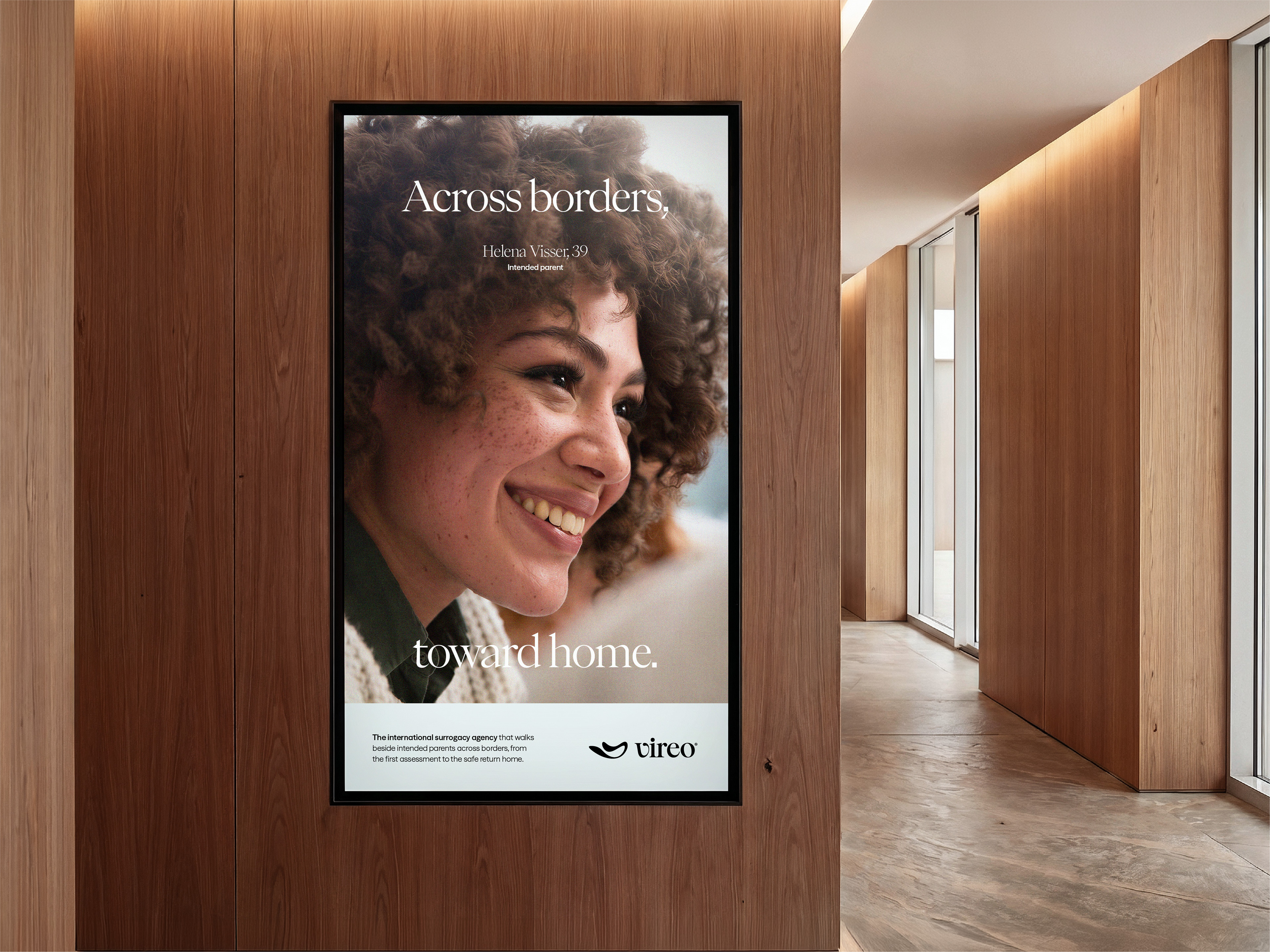
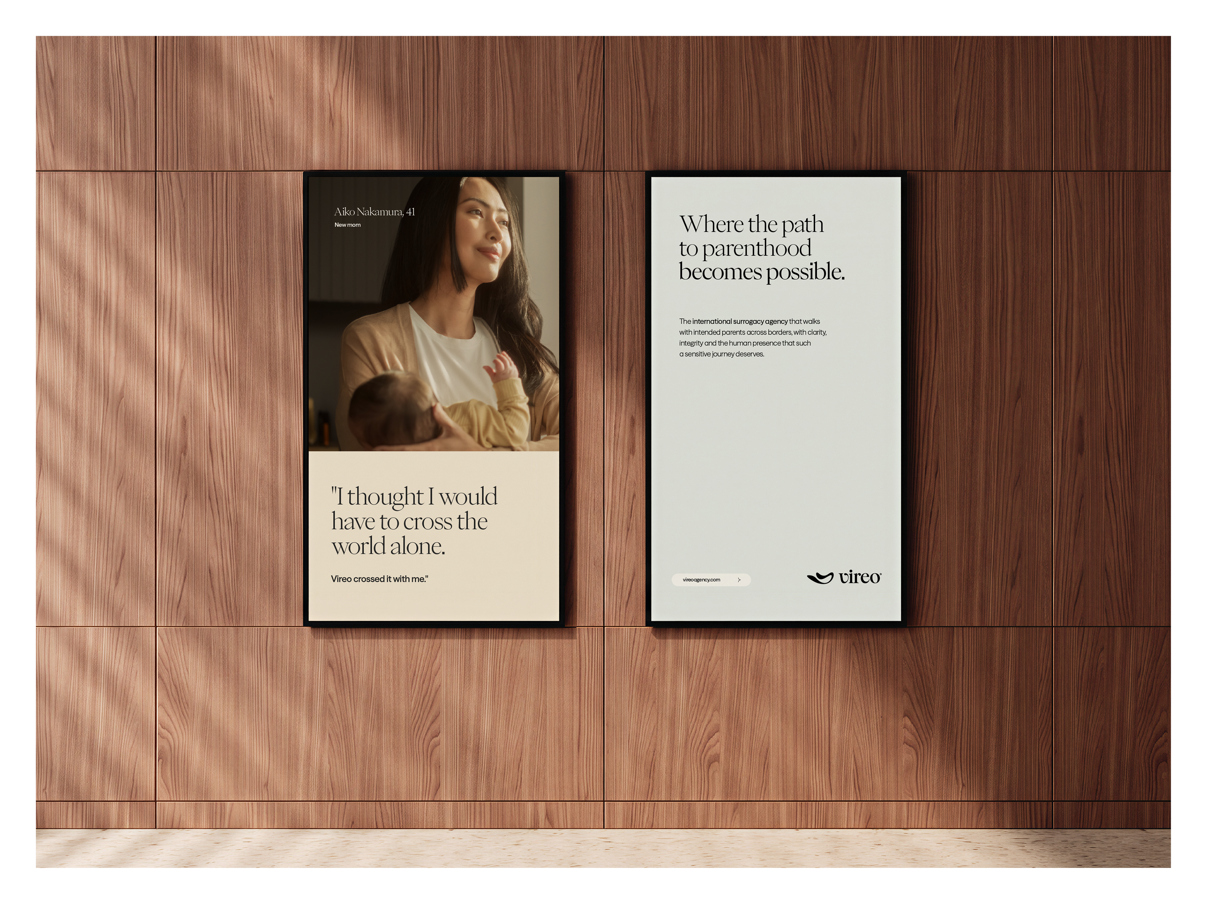
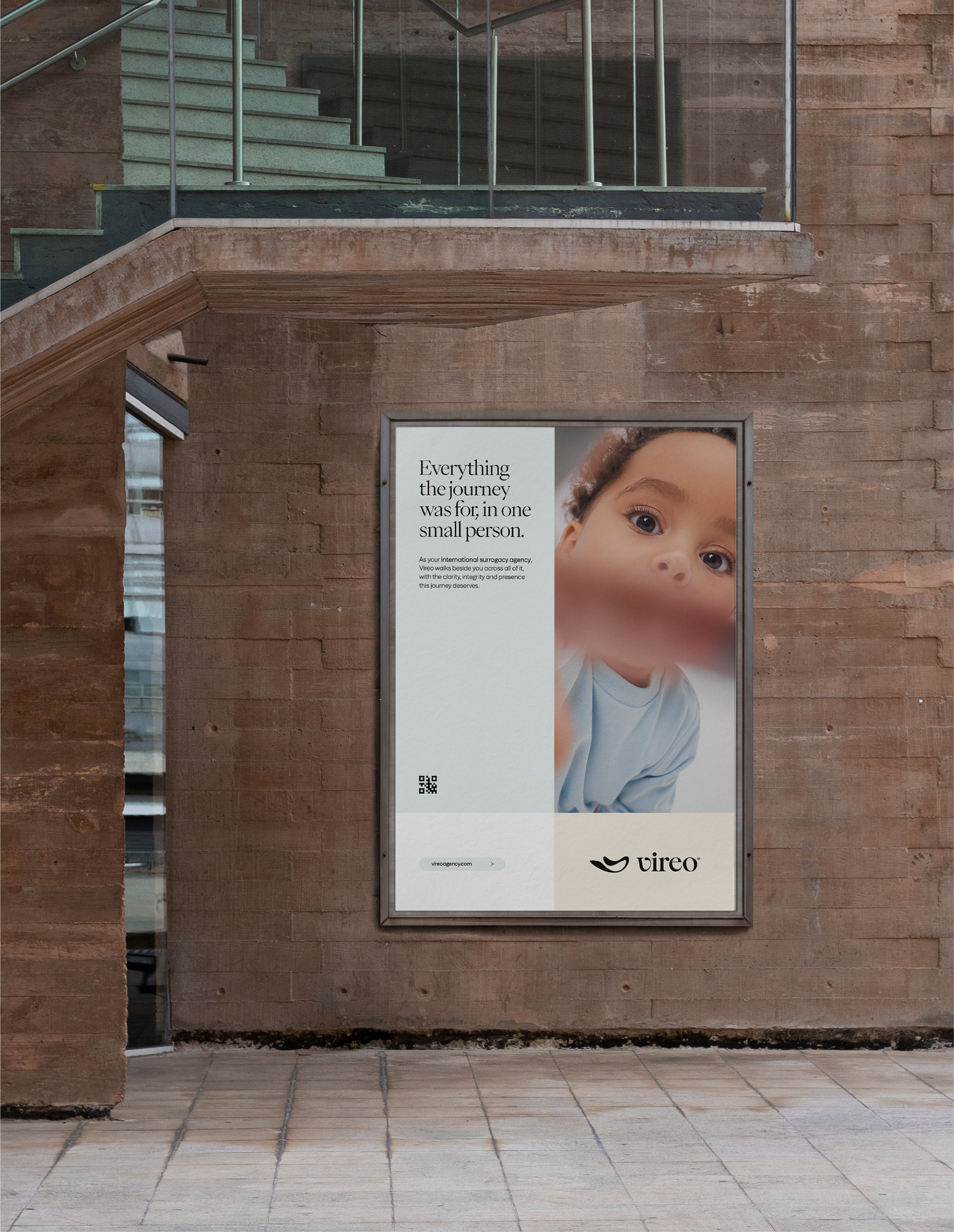
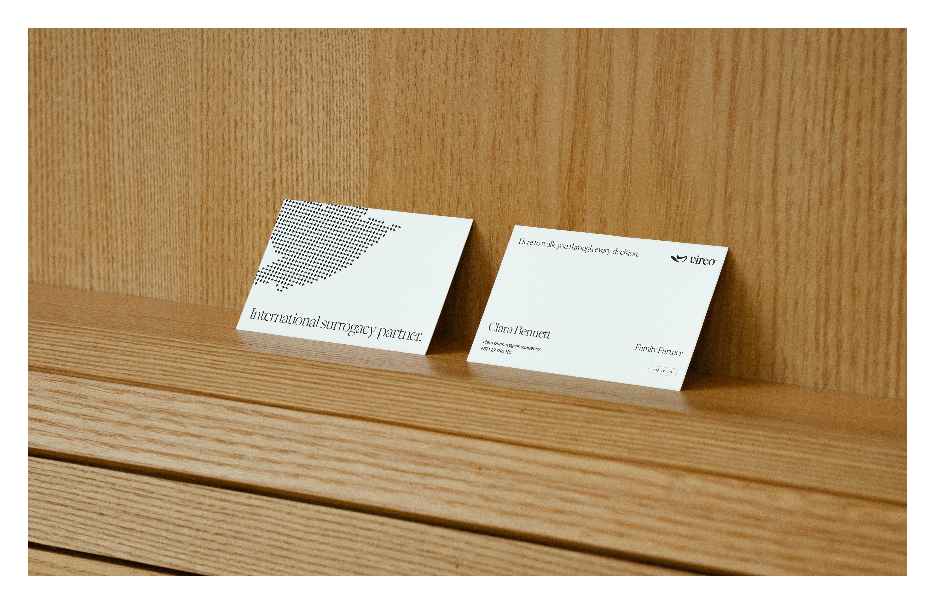
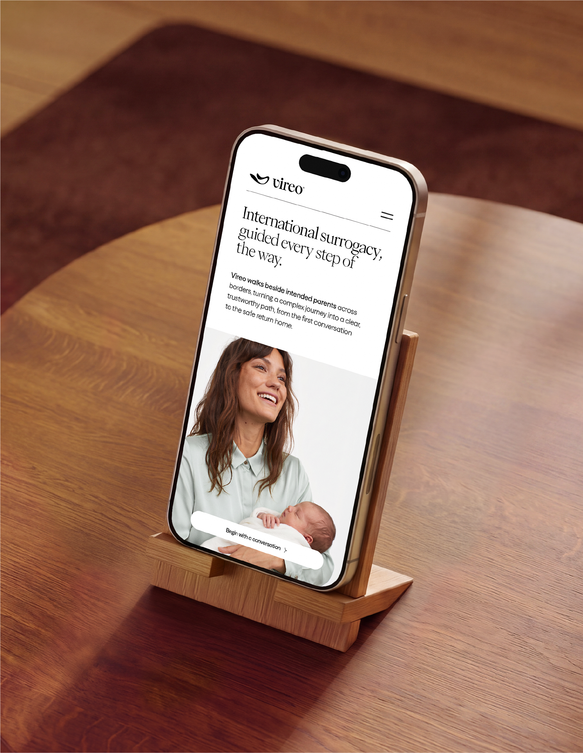
Vireo is an international surrogacy agency that supports intended parents from different countries through every stage of the process. Rather than offering ready-made programs, the agency compares legal frameworks, medical structures and costs across selected destinations to recommend the most suitable path for each family.
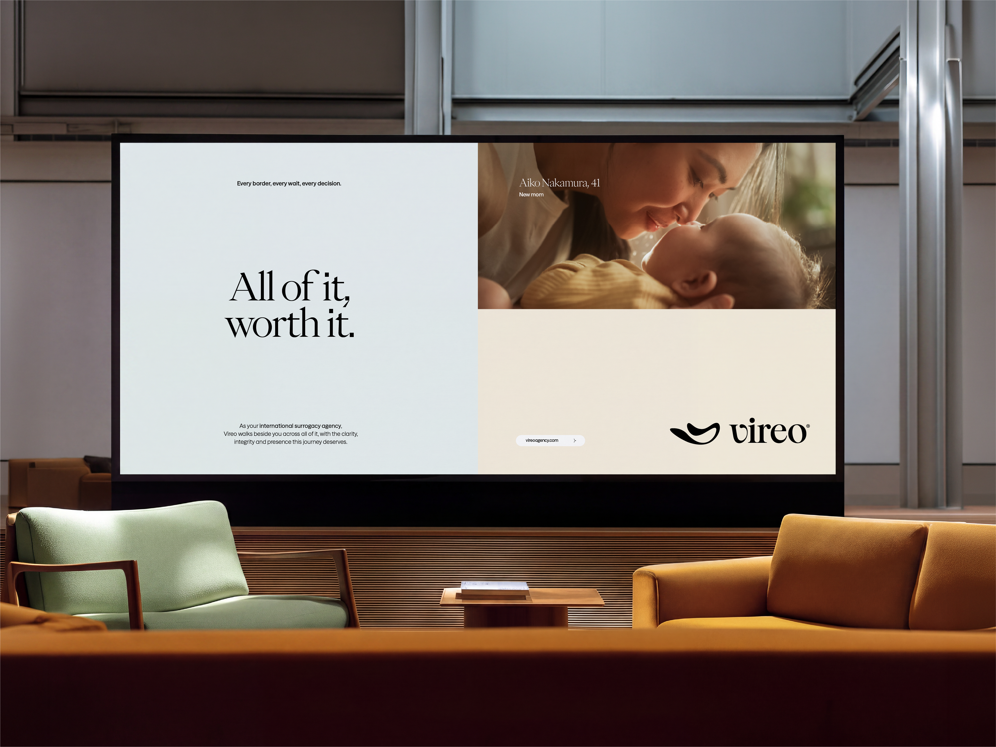
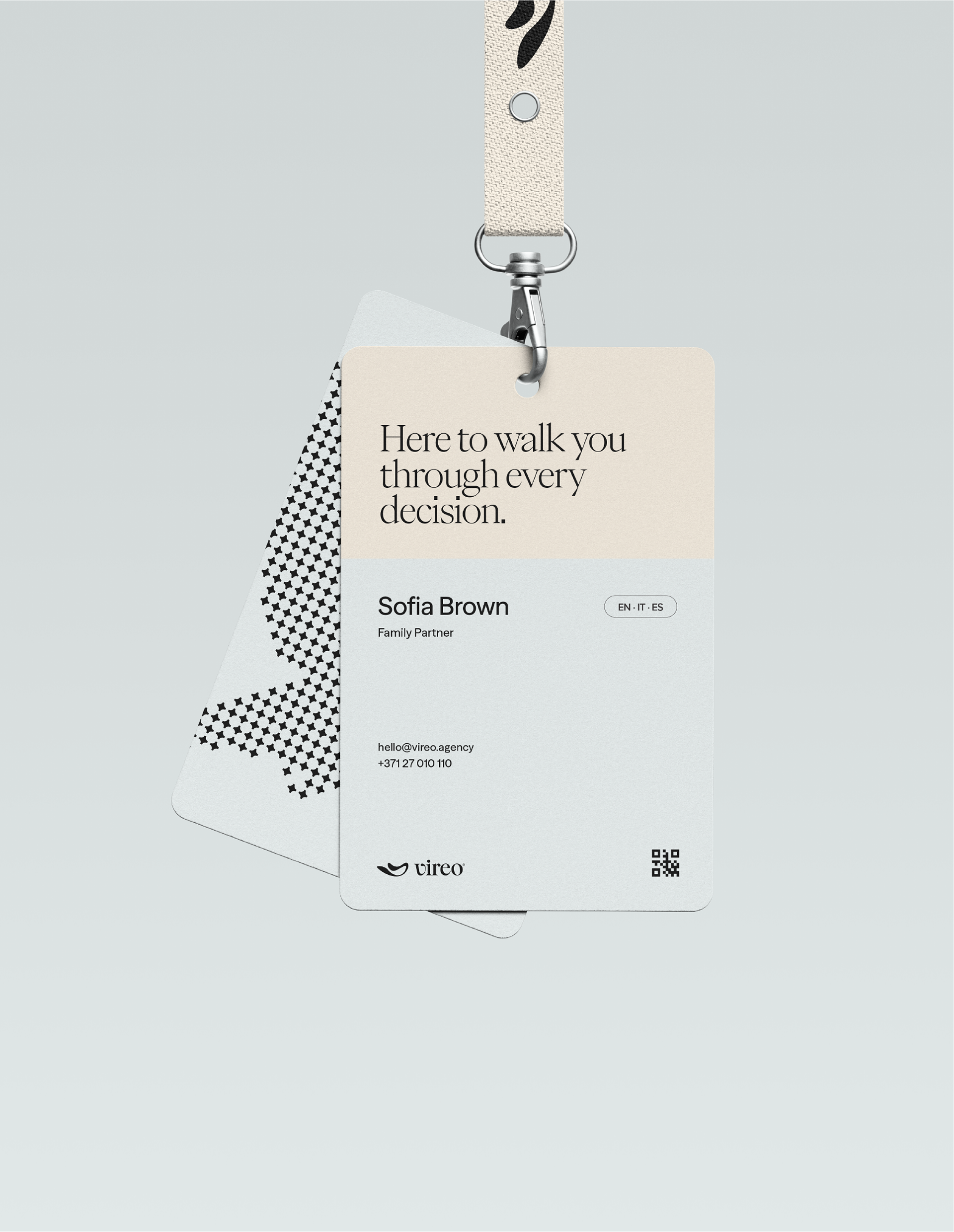
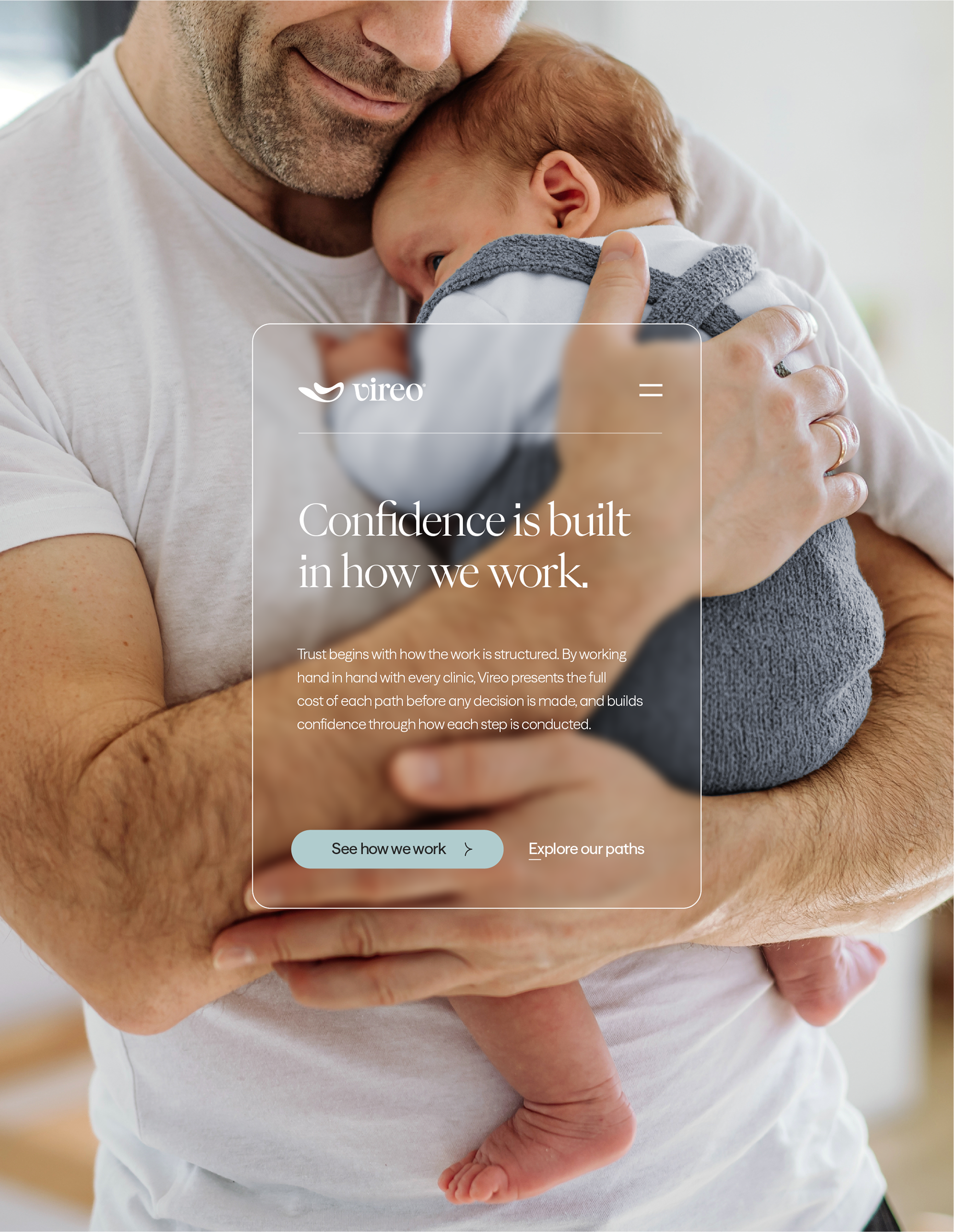
The families who come to Vireo are often vulnerable and disheartened after years of trying, or after facing legal barriers in their own country, and what they need is clear information and someone to trust. That is why the brand's new positioning turns complexity into direction and doubt into reassurance, built on three verbs that shape both what the brand says and how the team acts: to guide, to be present and to be trustworthy.
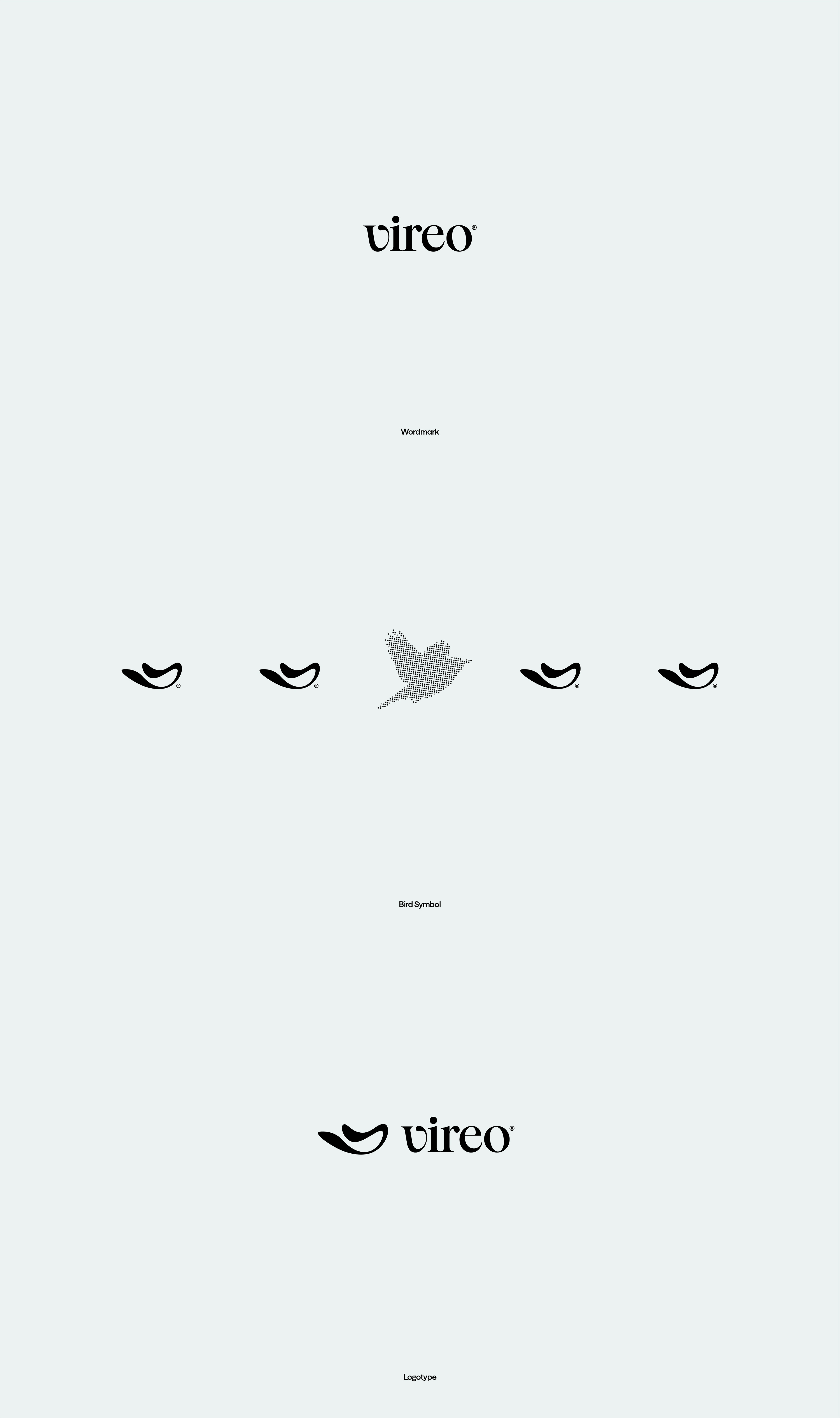
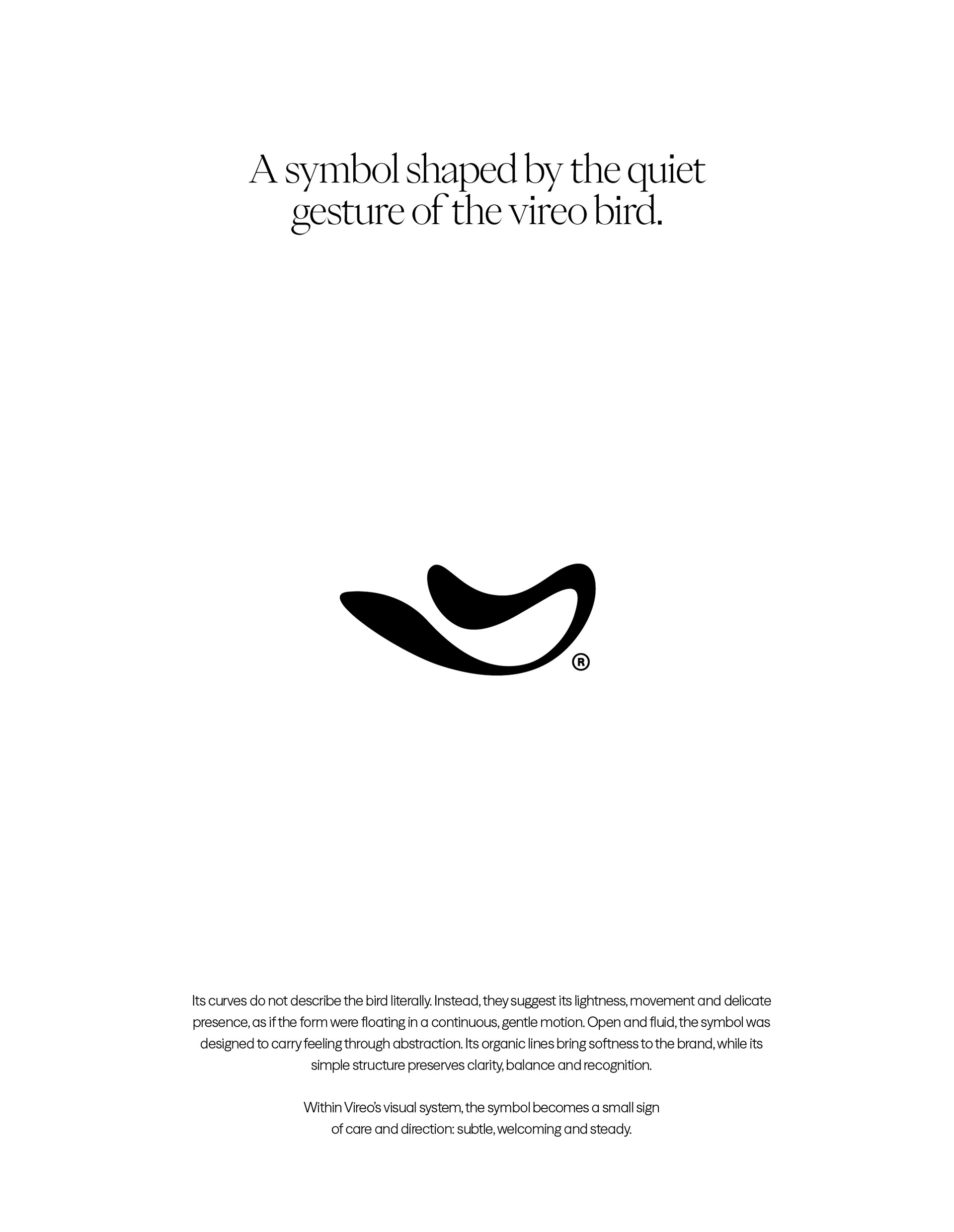
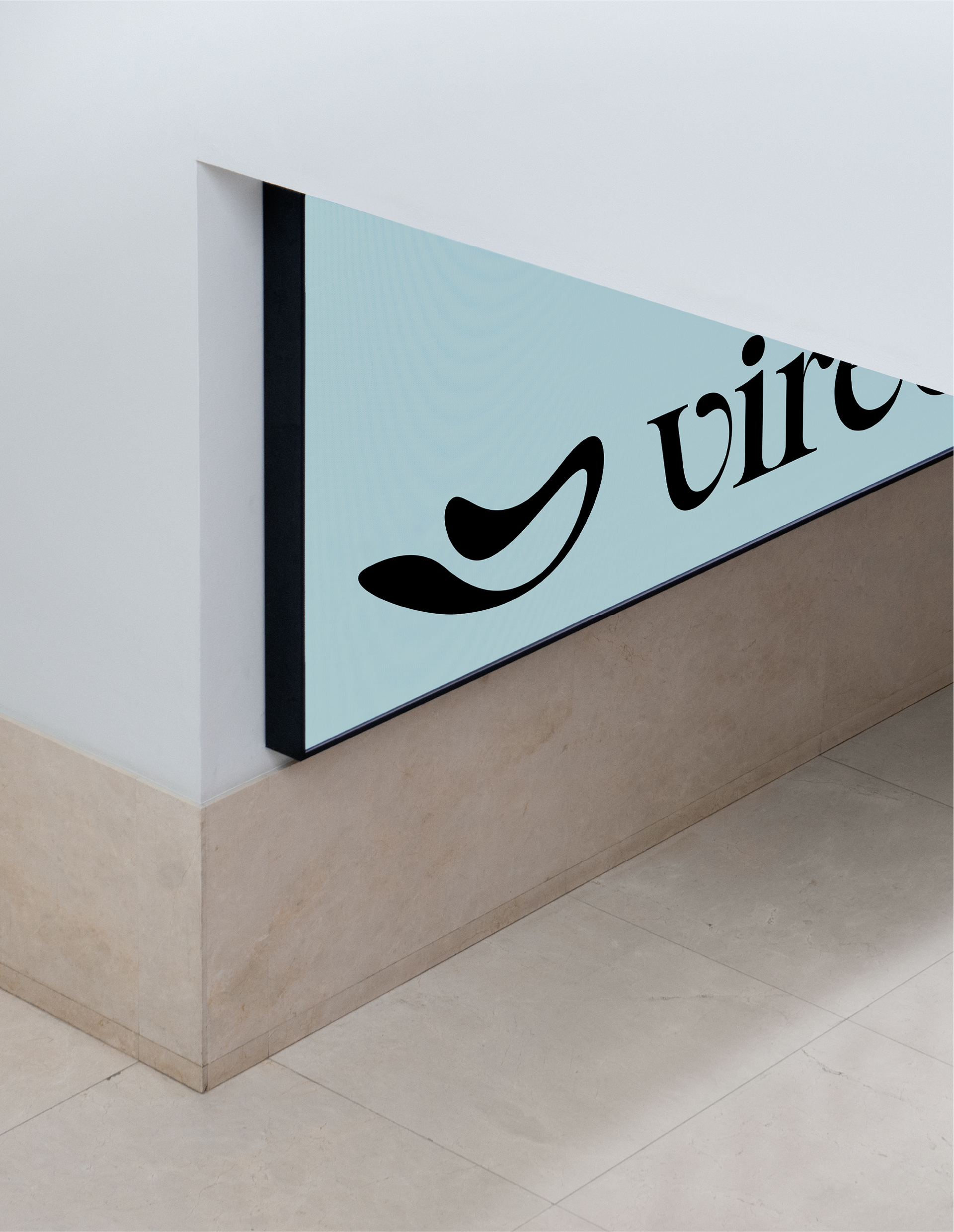
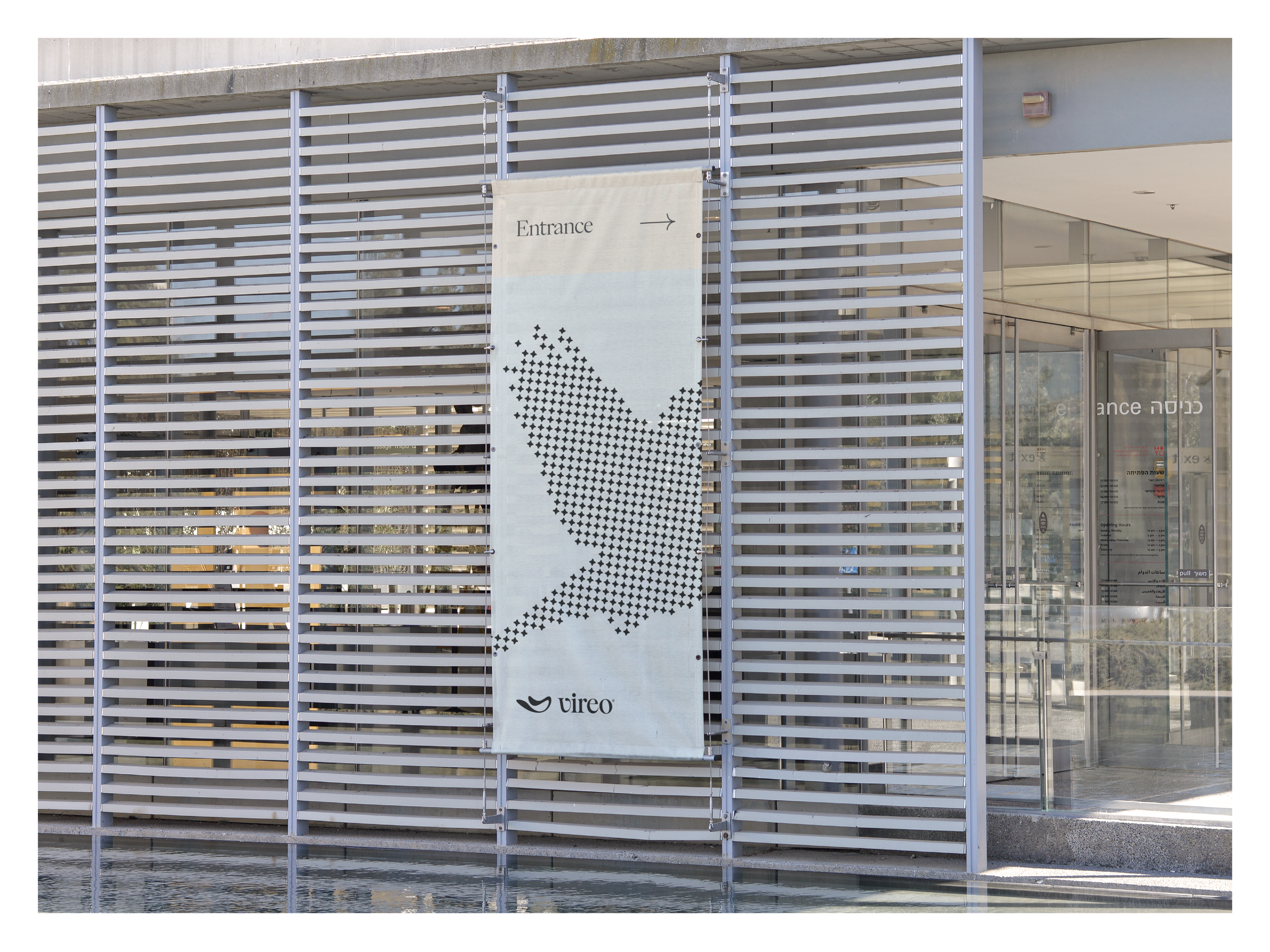
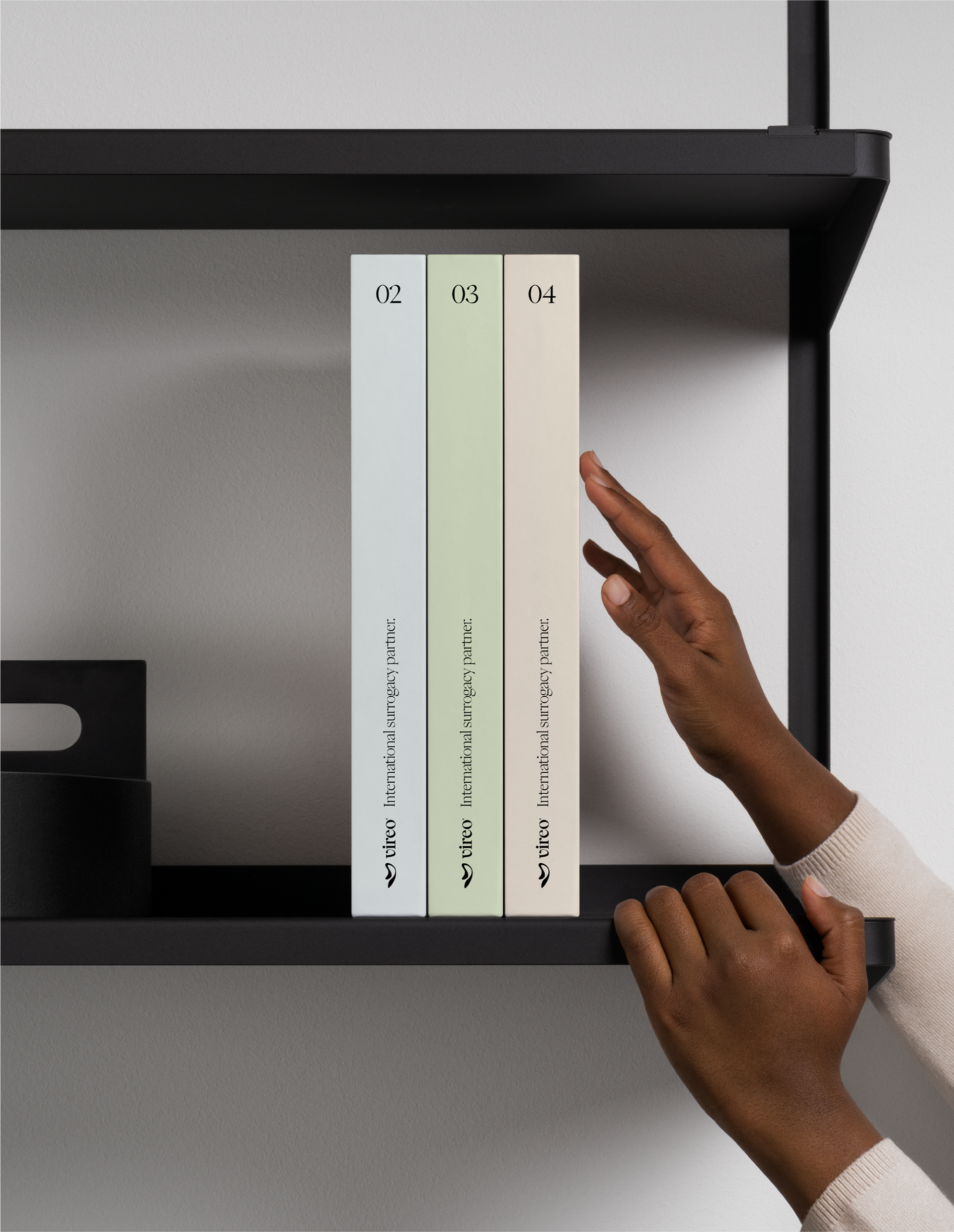
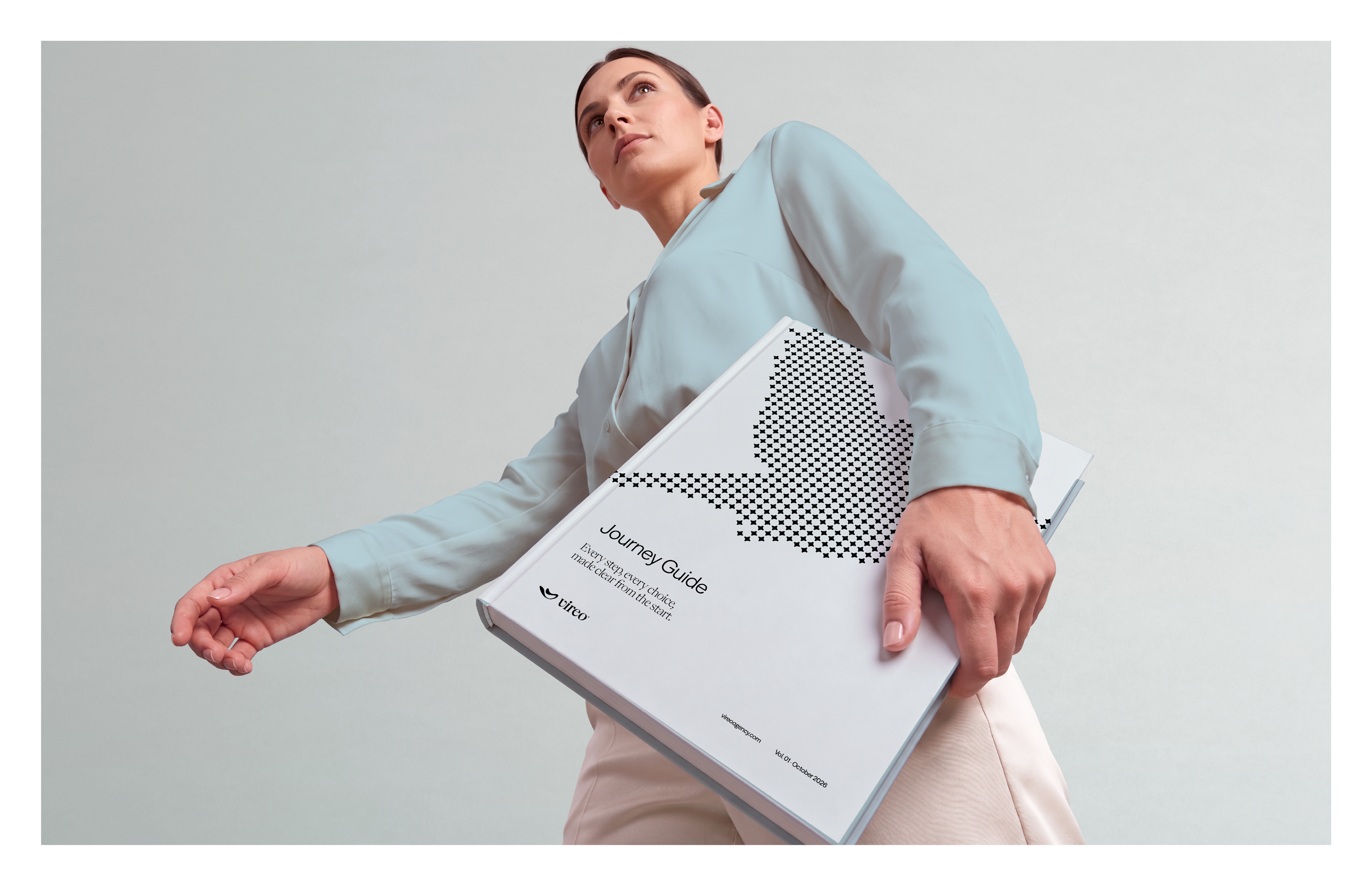
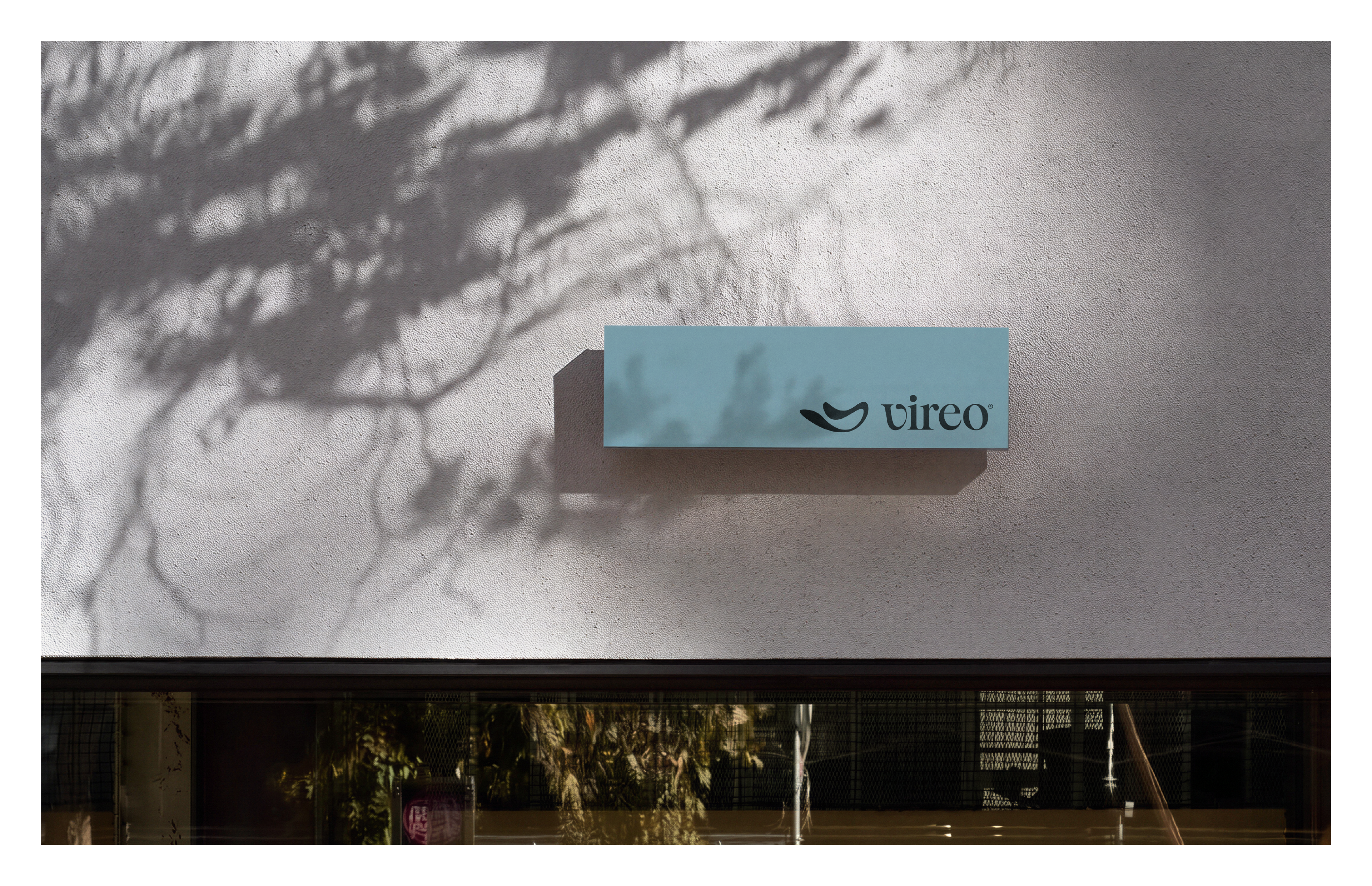
The creative concept came from the name. A vireo is a quiet songbird that crosses continents to build its nest. This image of persistence defined the brand's personality and gave rise to the symbol, whose light curves and organic form float in one continuous gesture and bring softness to the identity, while its simple structure preserves clarity, balance and recognition.
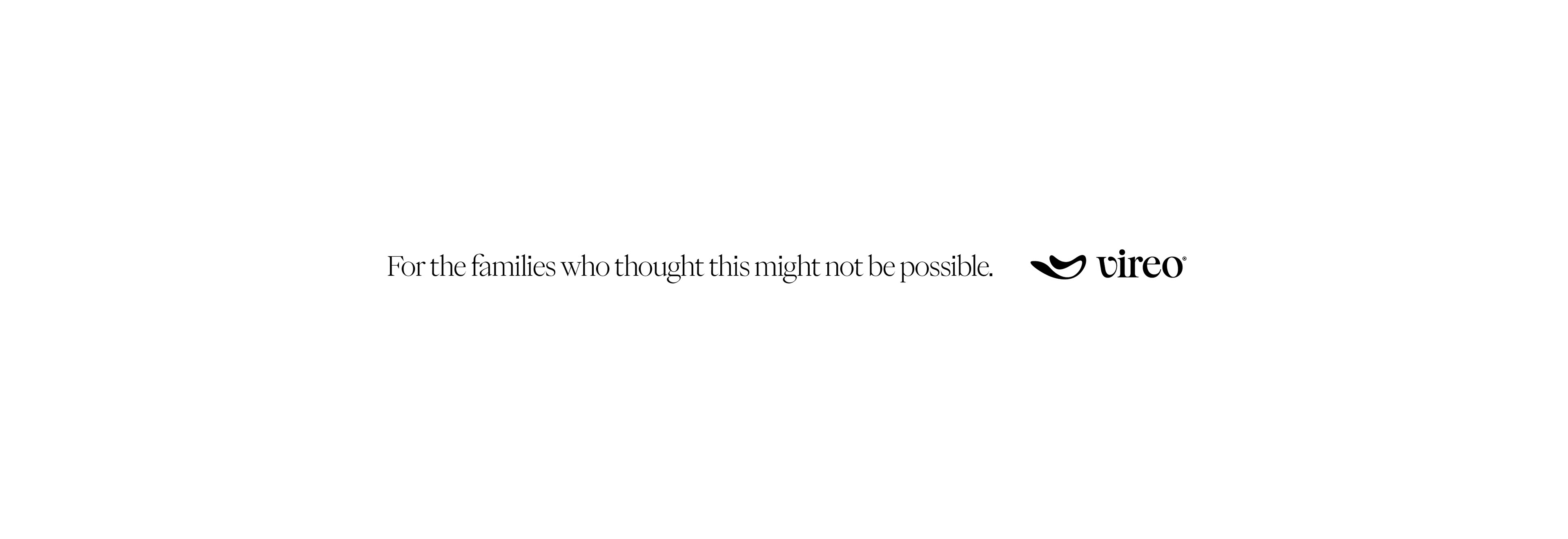
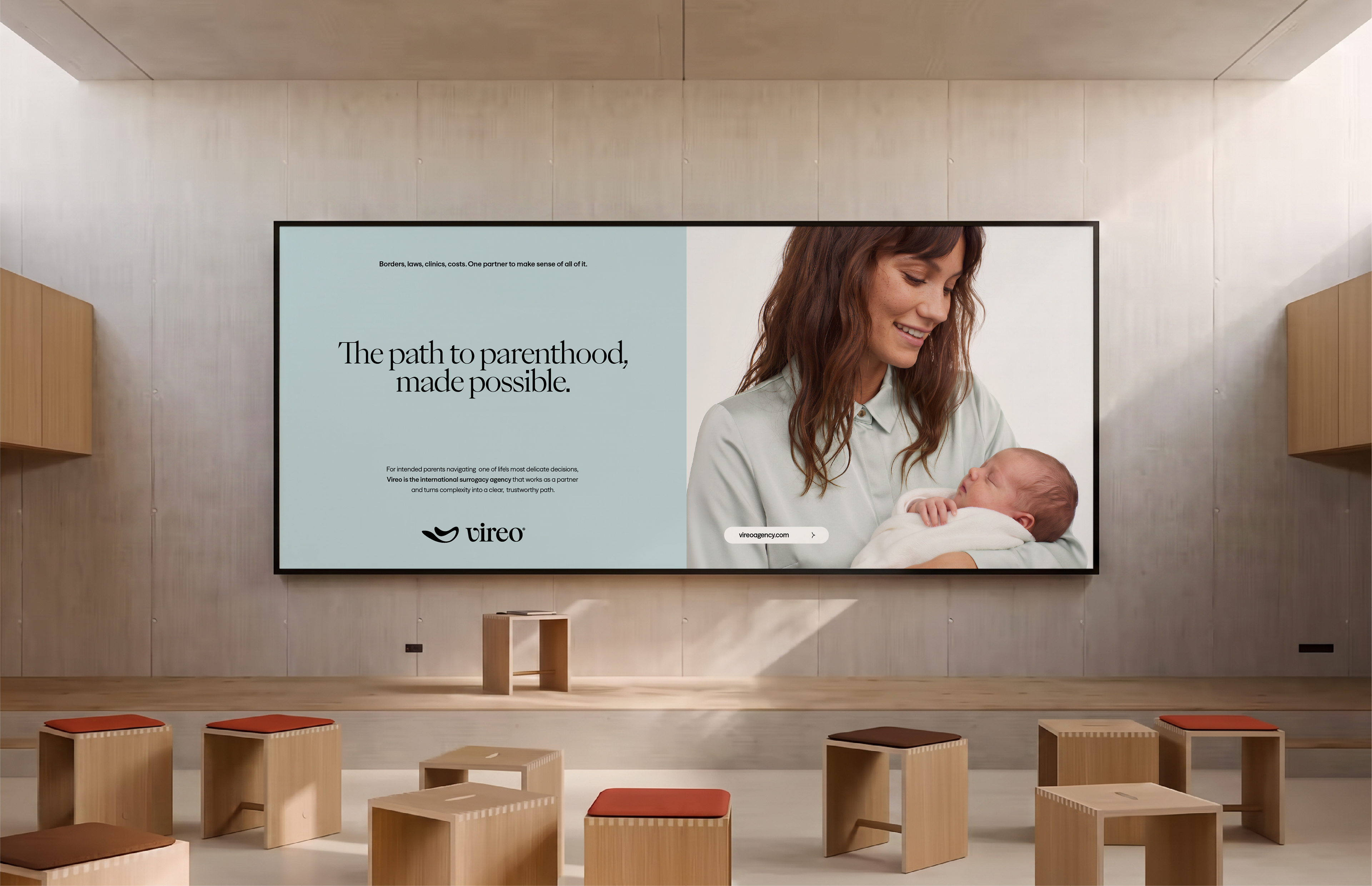
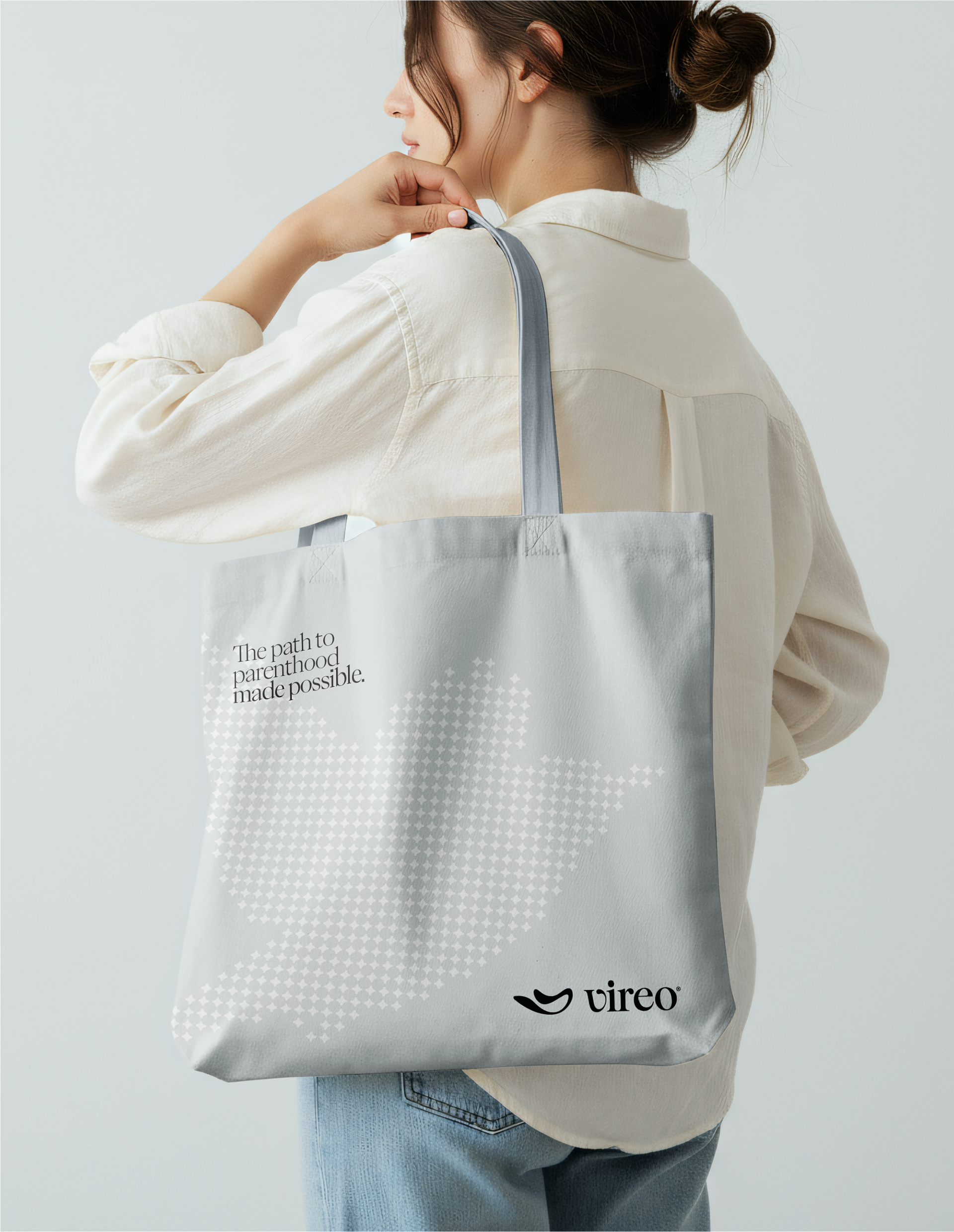
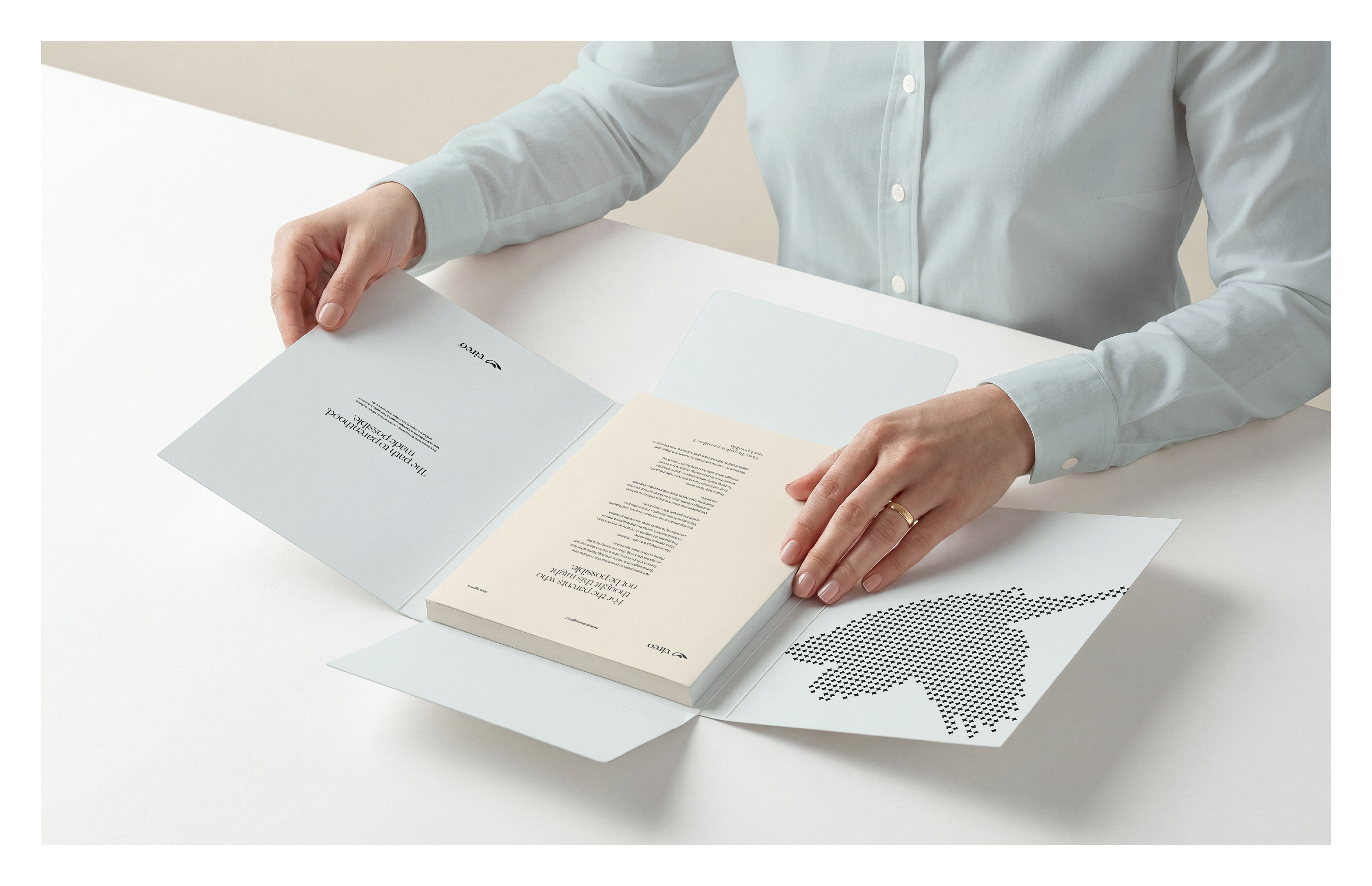
Today the identity brings clarity to a long and sensitive journey without losing the delicacy it calls for, captured in the brandline The path to parenthood, made possible.
[PT-BR]
Vireo — Agência internacional de gestação por substituição
A Vireo é uma agência internacional de gestação por substituição que acompanha futuros pais de diferentes países em todas as etapas do processo. Em vez de oferecer programas prontos, a agência compara legislações, estruturas médicas e custos entre destinos selecionados para recomendar o caminho mais adequado a cada família.
As futuras famílias que procuram a Vireo muitas vezes estão fragilizadas e descrentes depois de anos de tentativas ou de impedimentos legais no próprio país, e precisam de informação clara e alguém em quem confiar. Por isso, o novo posicionamento da marca transforma complexidade em direção e dúvida em acolhimento, apoiado em três verbos que orientam tanto o discurso quanto a conduta da equipe: guiar, estar presente e ser confiável.
O conceito criativo partiu do nome. Vireo é um pássaro discreto que atravessa continentes para construir seu ninho. Essa imagem de persistência definiu a personalidade da marca e deu origem ao símbolo, cujas curvas leves e forma orgânica flutuam em um gesto contínuo e trazem suavidade à identidade, enquanto a estrutura simples preserva clareza, equilíbrio e reconhecimento.
A identidade traz hoje clareza a uma jornada longa e sensível sem perder a delicadeza que ela exige, resumida na assinatura The path to parenthood, made possible.



Scope of Work
Strategic Positioning & Brand Identity.
Design Studio: Bortoletto ® Studio
Brand Strategic, Copy, Art Direction & Design: Gustavo Bortoletto
Brand Strategic, Copy, Art Direction & Design: Gustavo Bortoletto
Bortoletto ® Studio is a branding studio working across industries, shaping positioning,
identity, and voice for brands at every stage.