
[PT-BR]
Finboo. Pagamentos globais de forma simples.
Contratar talentos e gerenciar pagamentos globais não deveria ser um processo complexo. A Finboo nasceu dessa convicção: ser a fintech que simplifica e faz as conexões profissionais fluírem ao redor do mundo. Em um mercado conhecido pela burocracia, nosso desafio foi criar uma marca que transmitisse o exato oposto: humanidade, confiança e simplicidade.
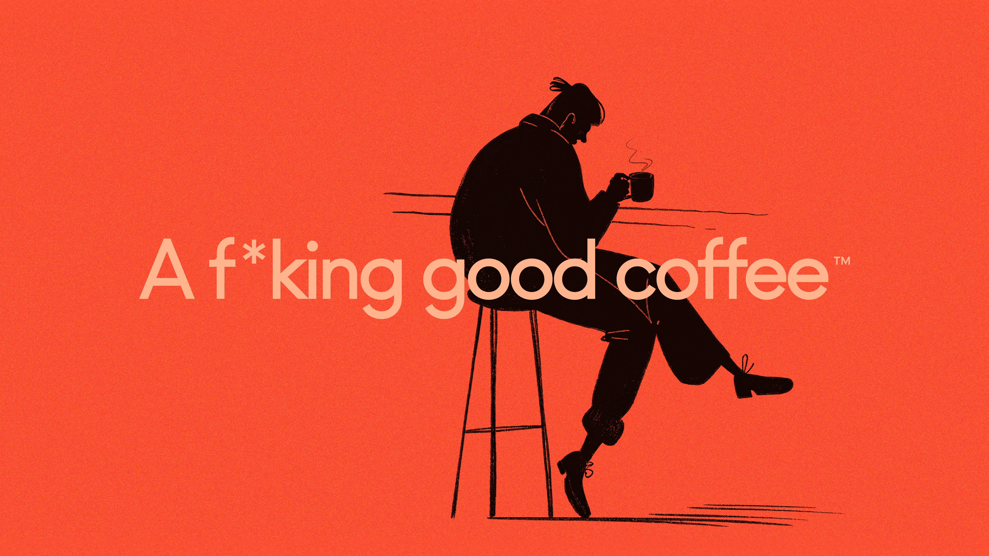
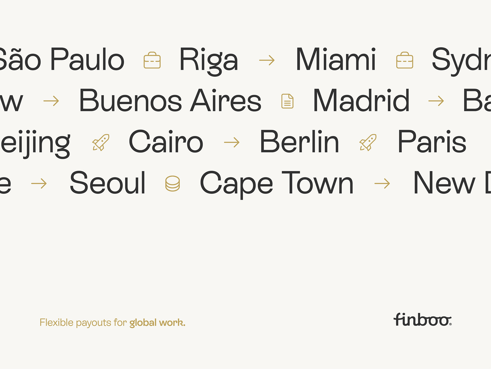
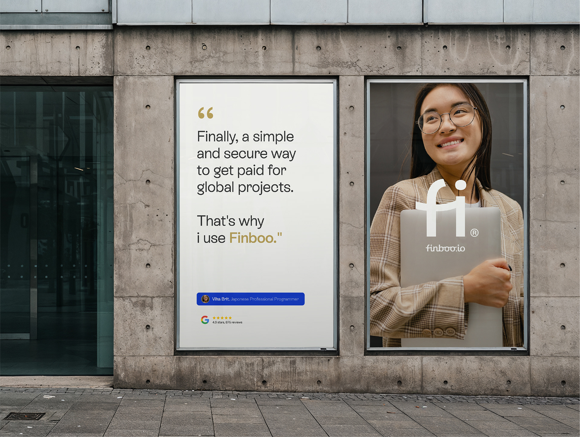
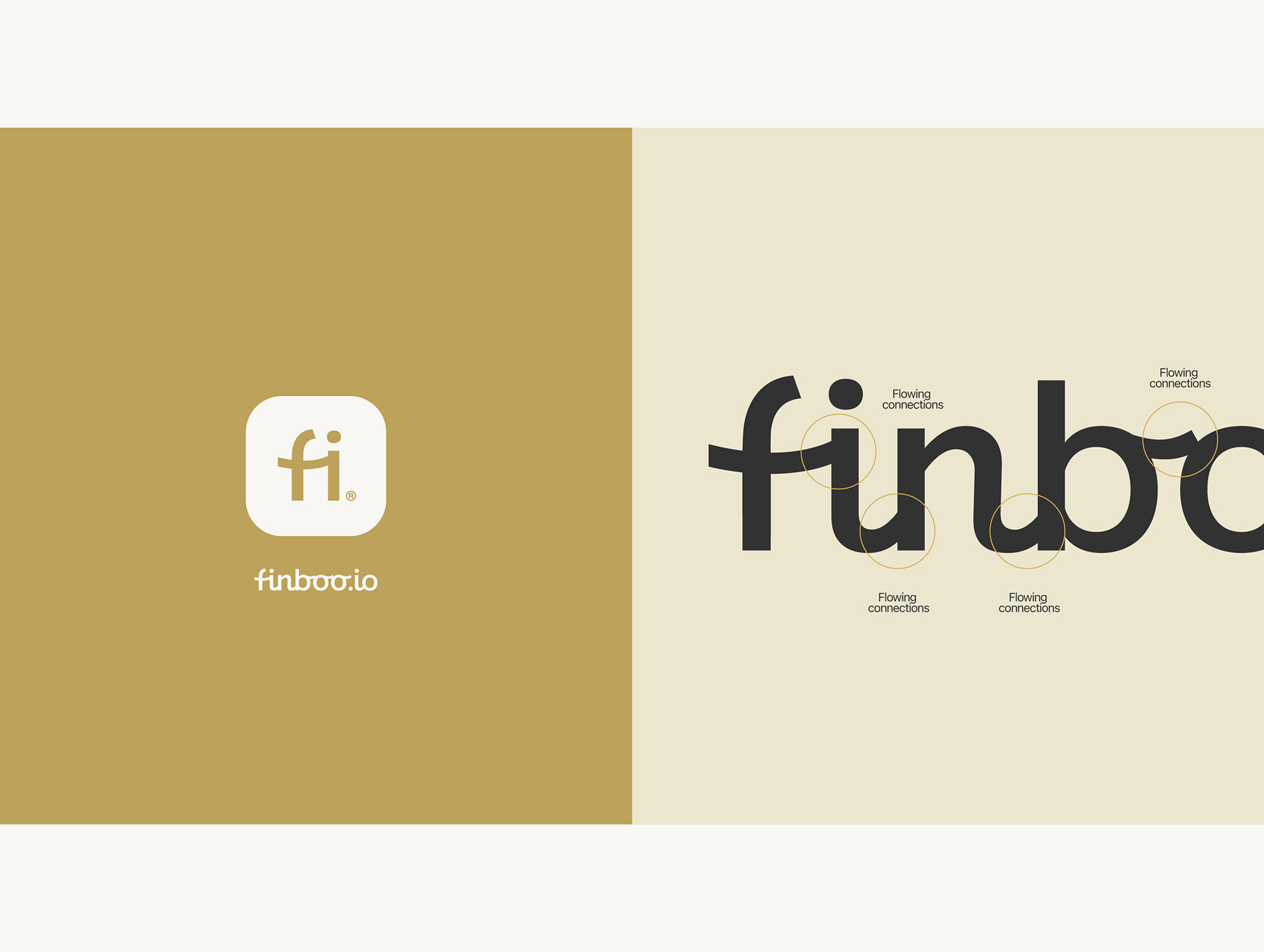
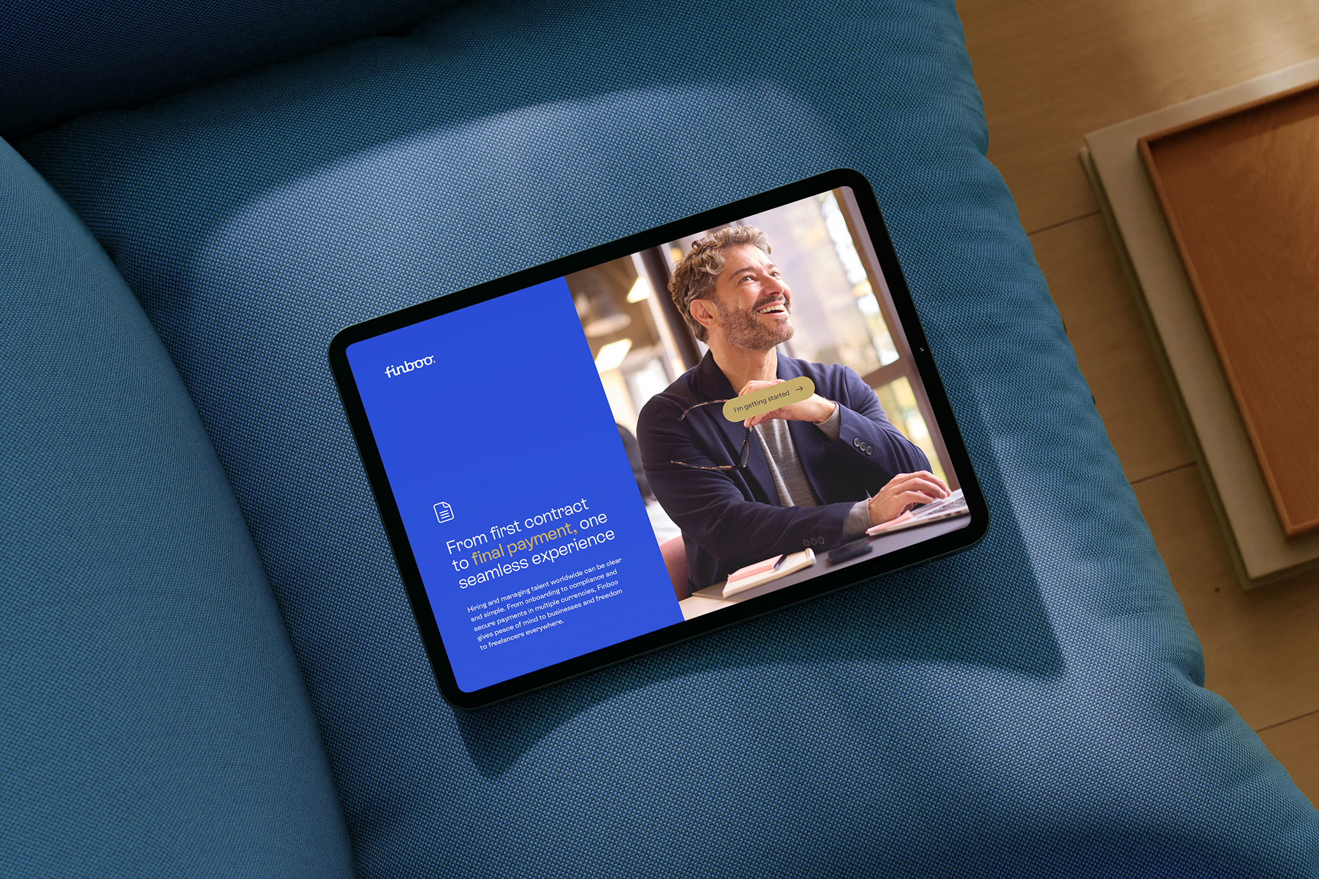
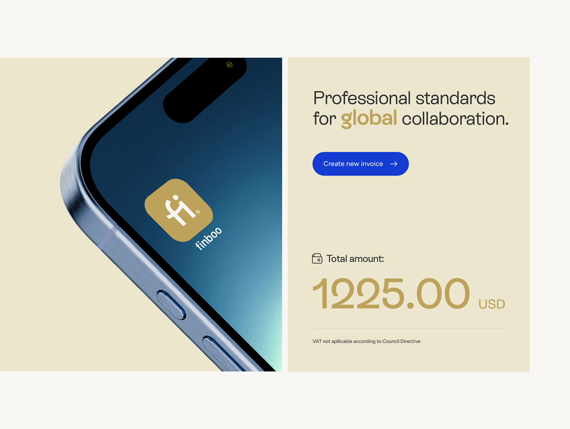
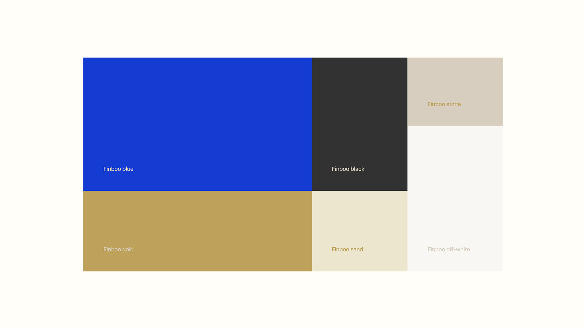
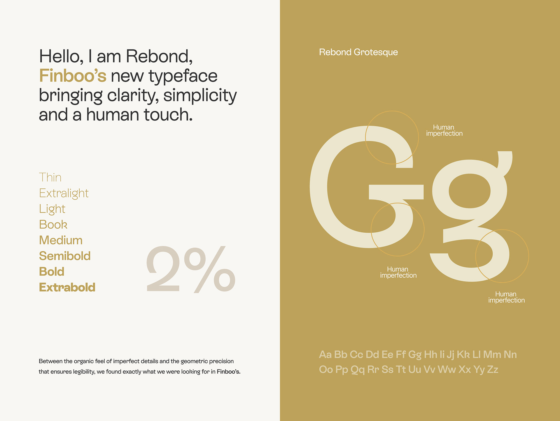
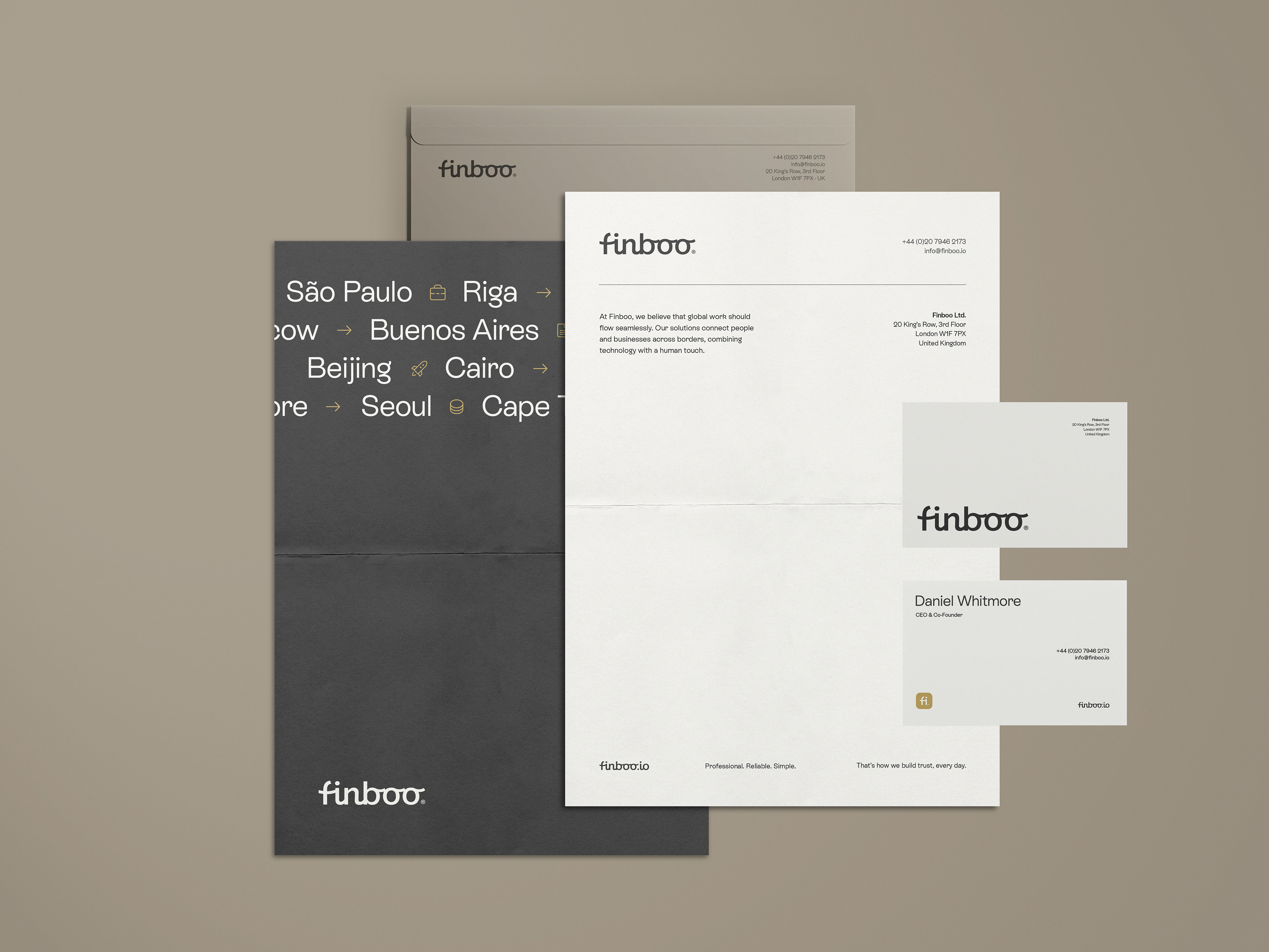
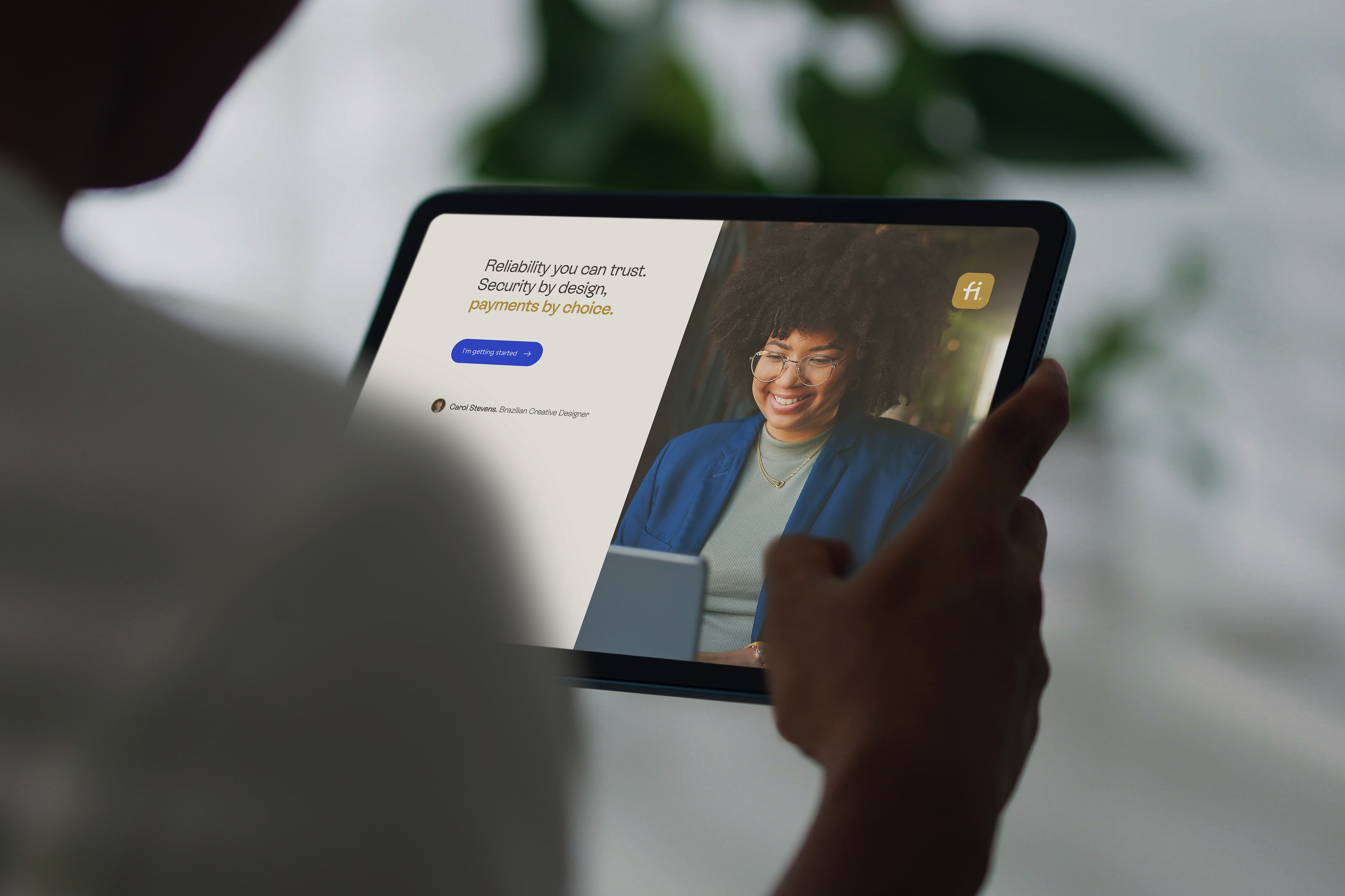
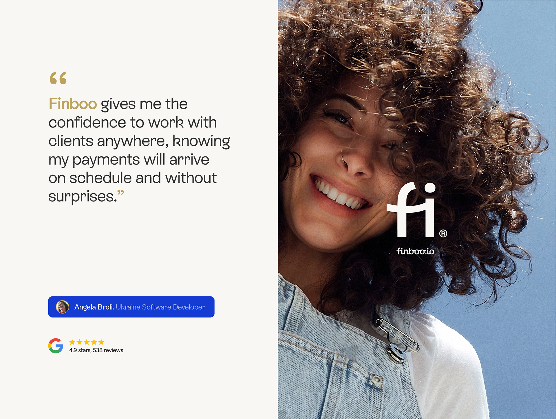
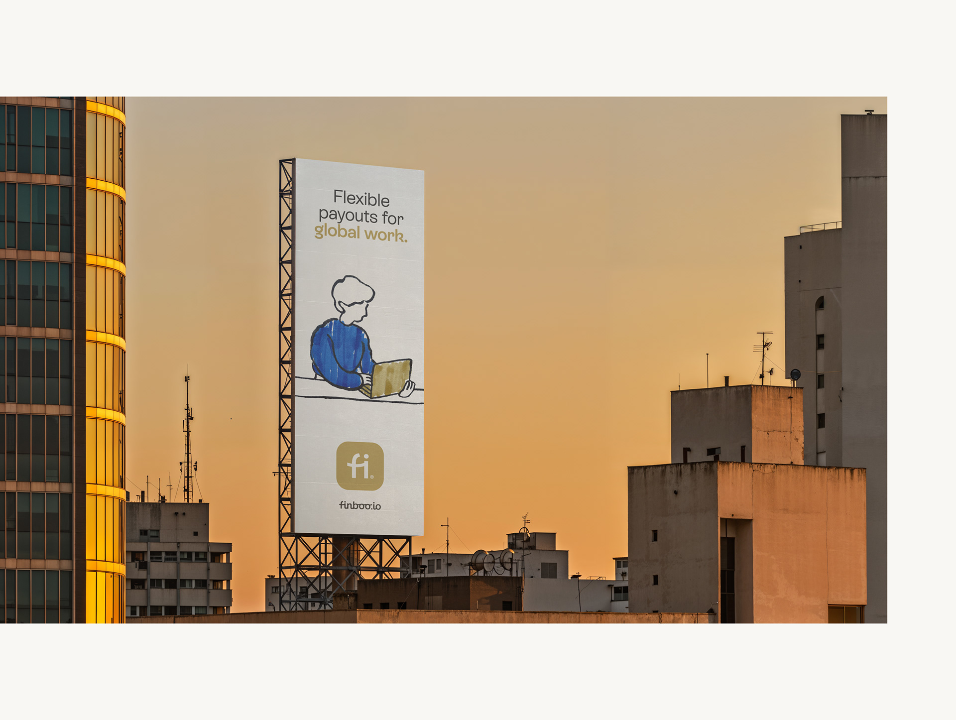
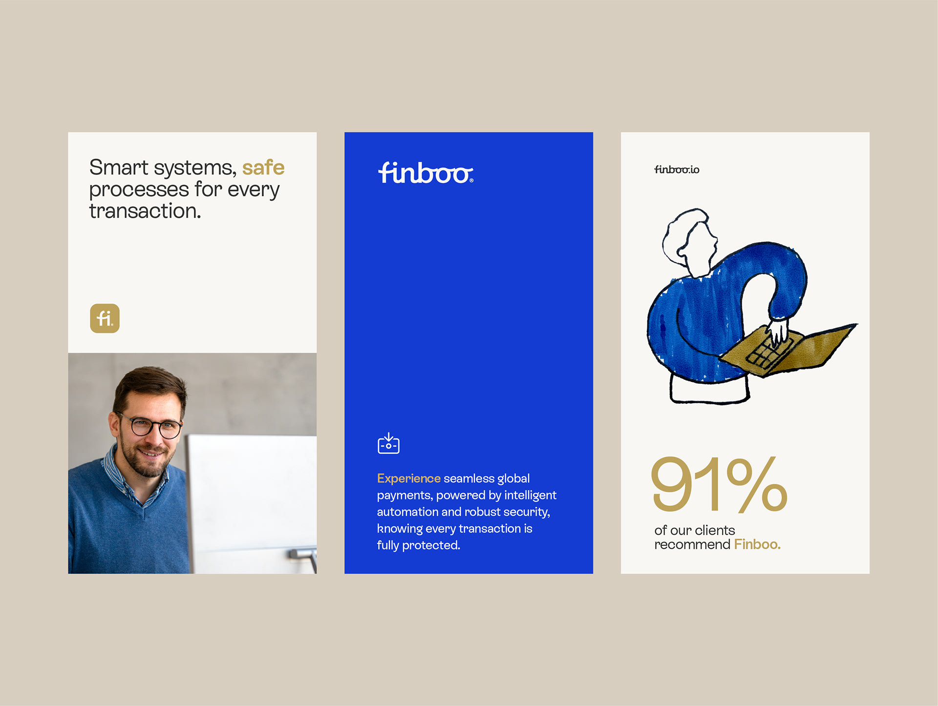
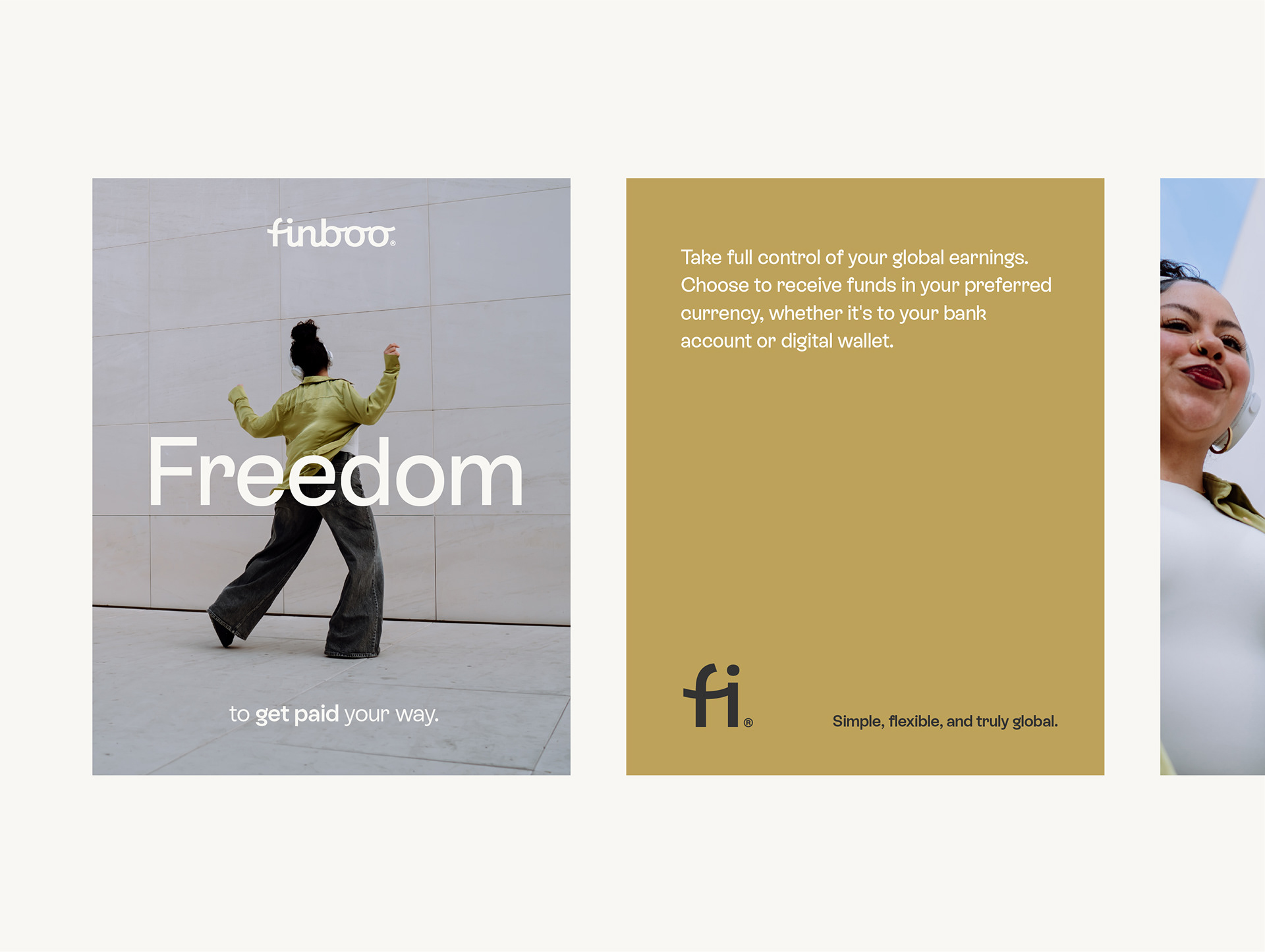
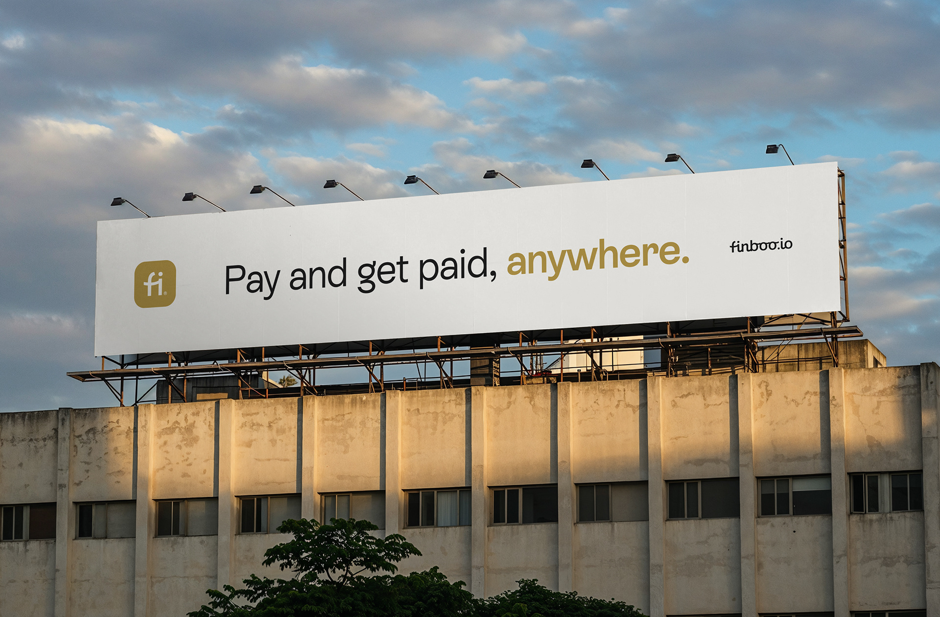
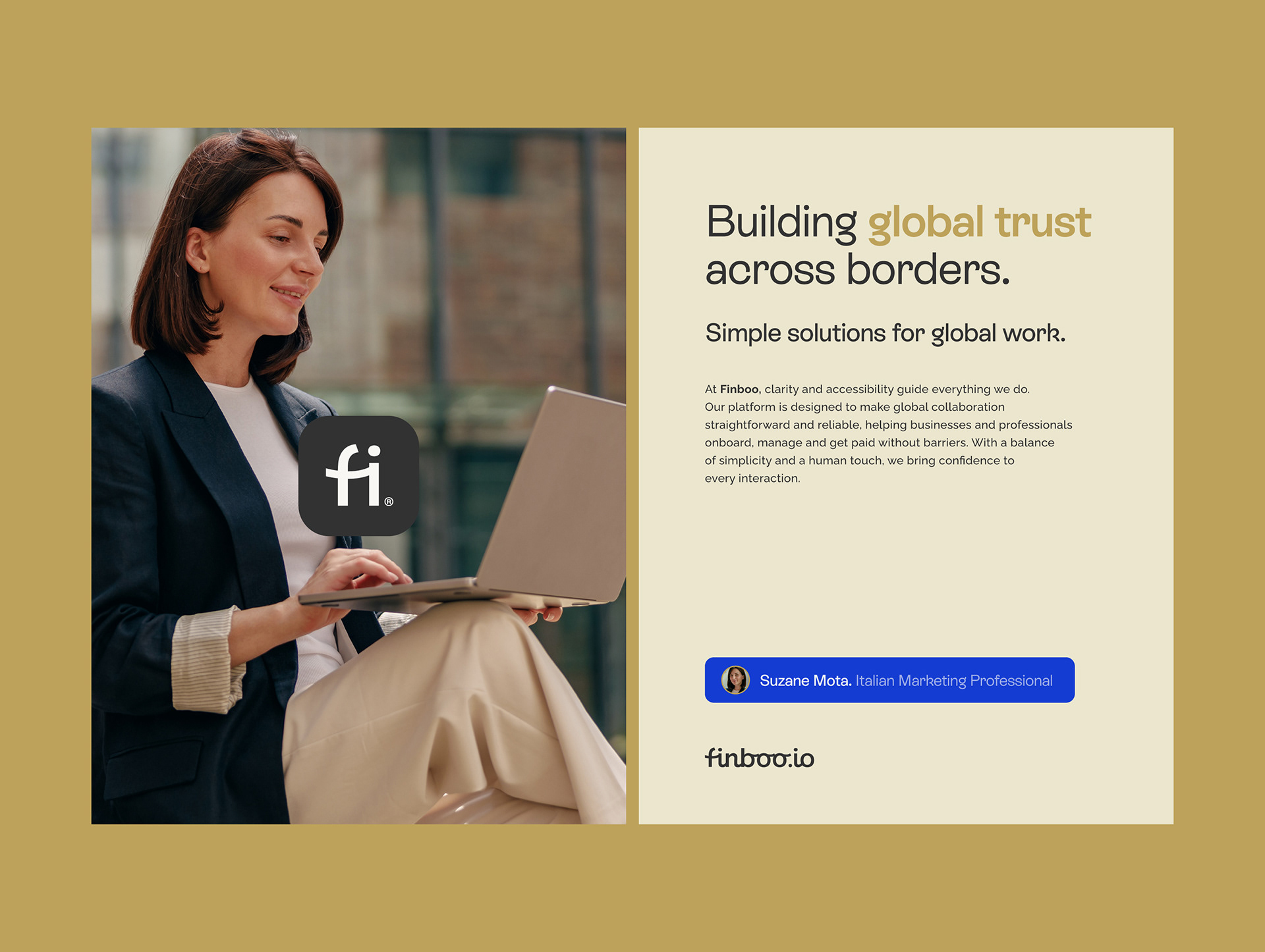
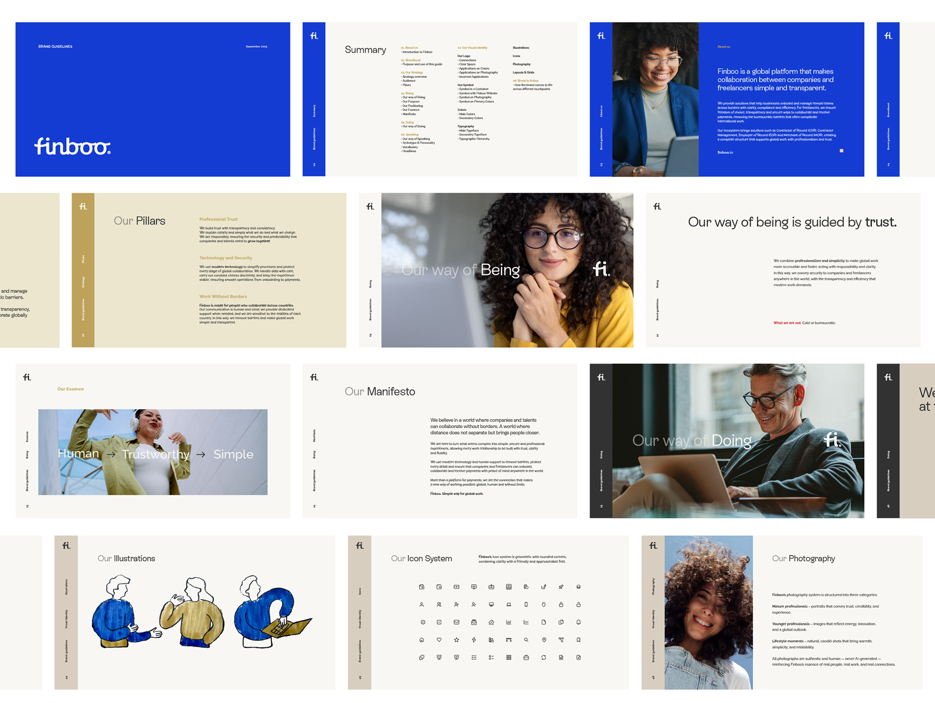
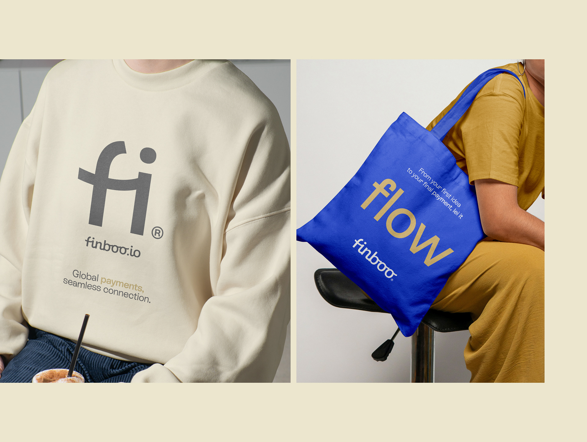
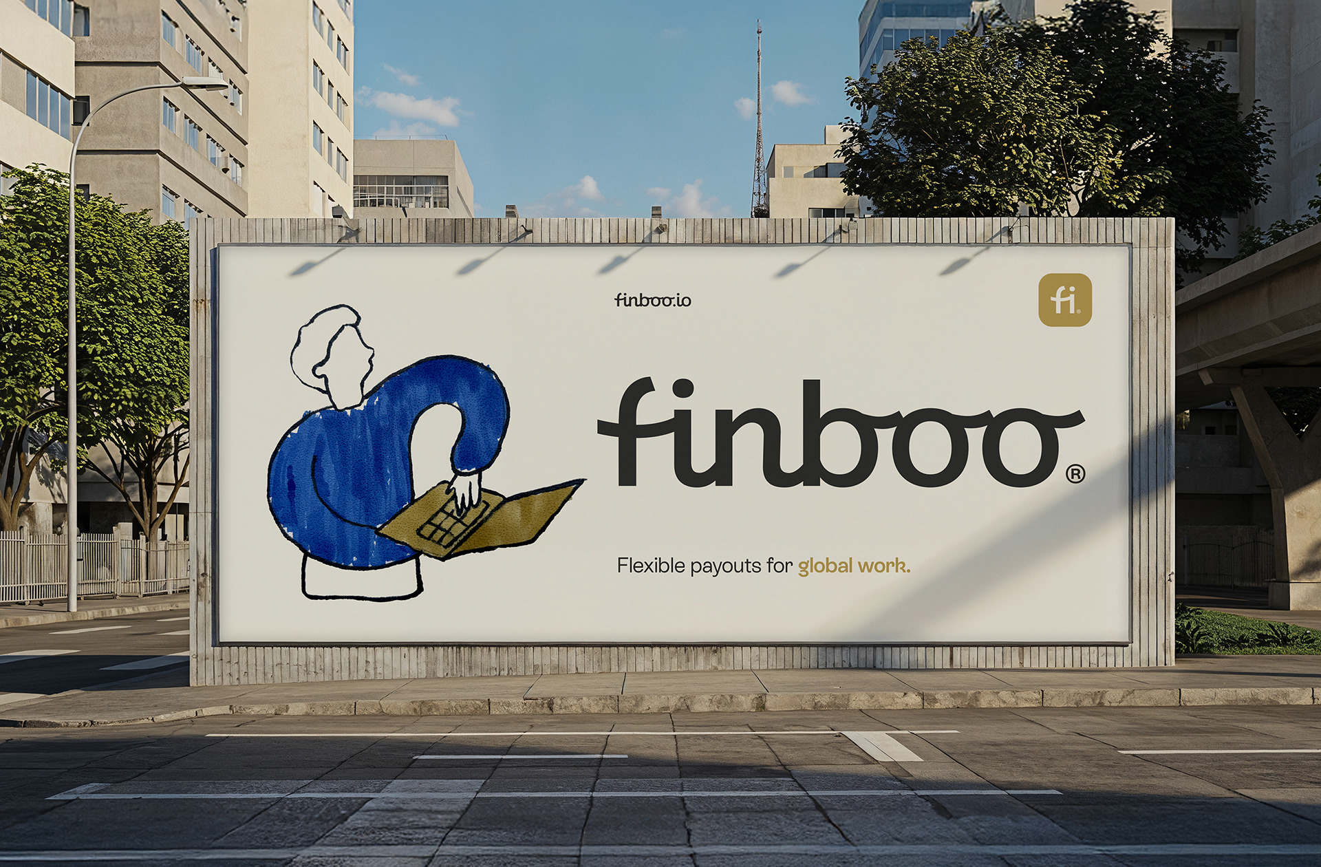
A partir de um diagnóstico de mercado, definimos um novo posicionamento focado em conesimplicidade e proximidade. O rebranding traduz essa estratégia em cada detalhe da nova identidade: a tipografia une a precisão geométrica a um toque humano; a paleta de cores reforça a segurança e o profissionalismo; e as ilustrações minimalistas feitas à mão adicionam criatividade e um toque lúdico. Como símbolo central, o logo captura a fluidez com que conectamos empresas e talentos globais.
O resultado é uma marca que comunica eficiência e empatia, equilibrando um sistema visual profissional com uma alma humana.
[EN]
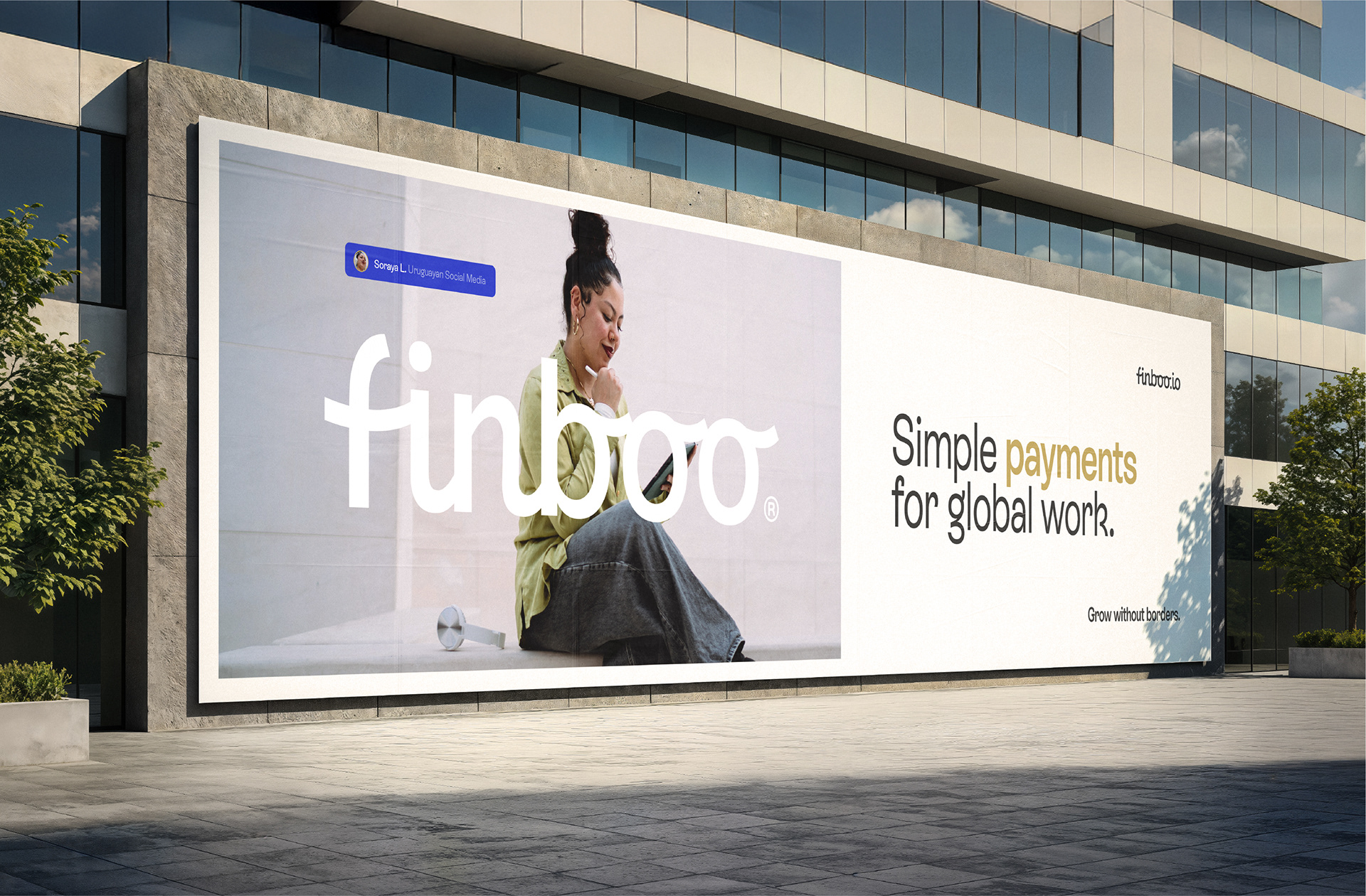
Finboo. Simple payments for global work.
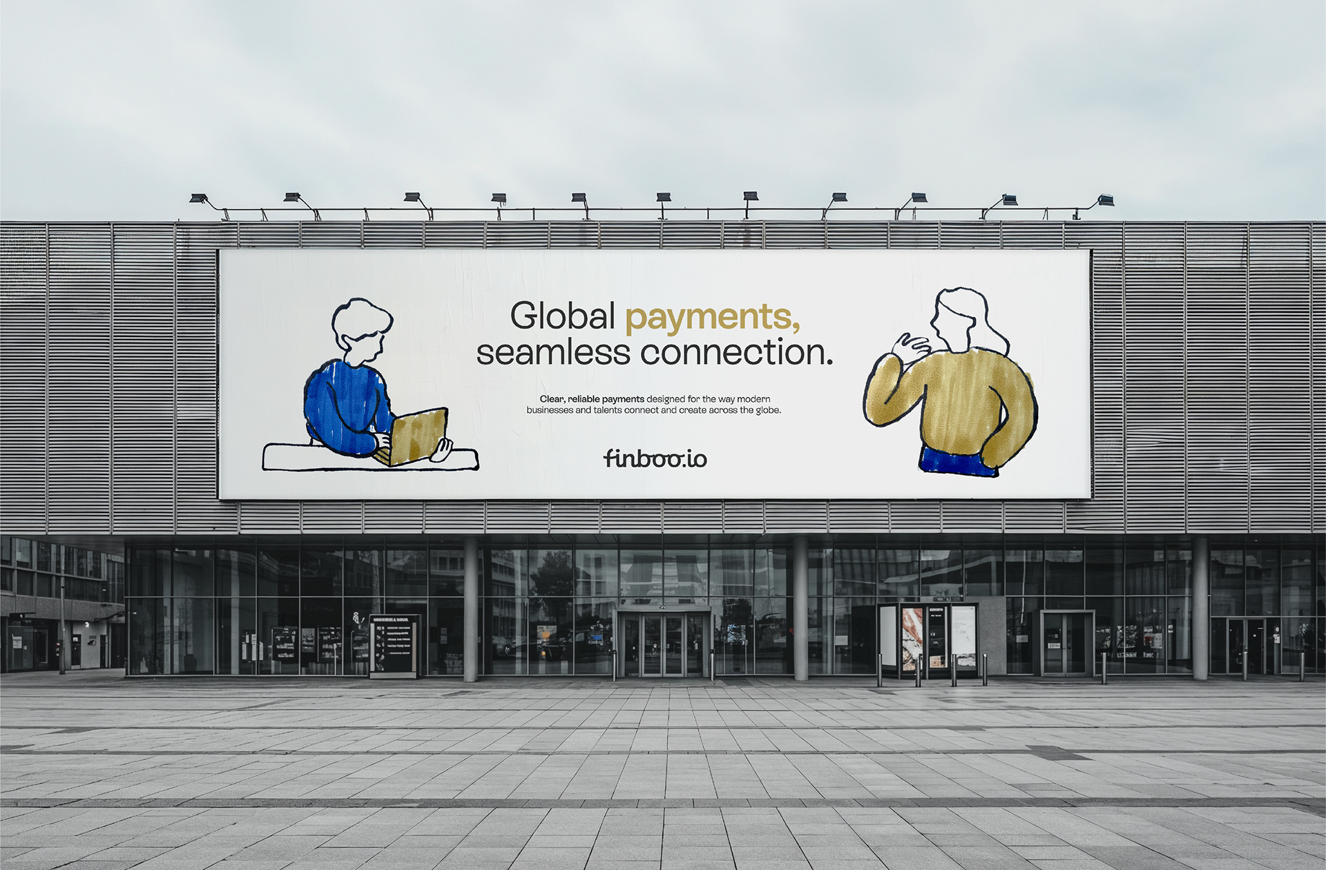
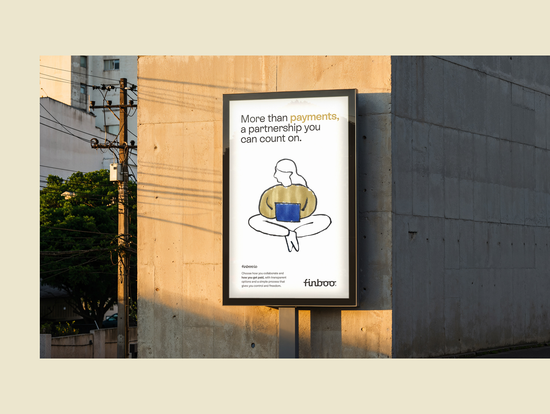
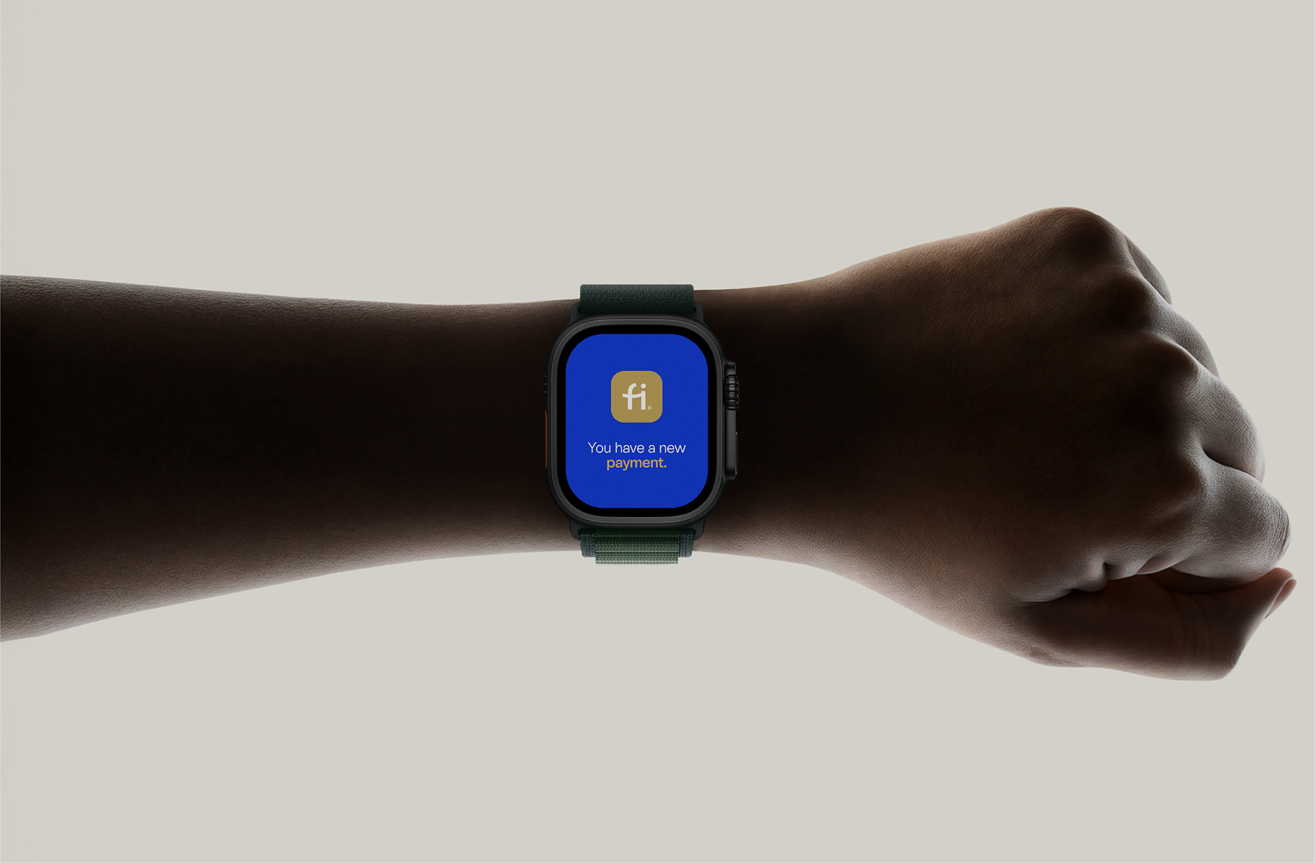
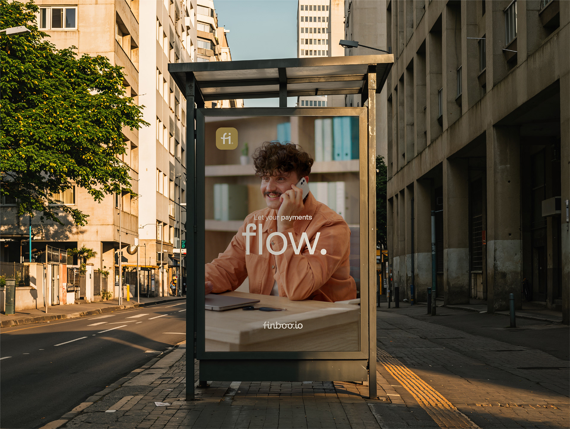
Hiring talent and managing global payments shouldn't be a complex process. Finboo was born from this conviction: to be the fintech that simplifies and helps professional connections flow around the world. In a market known for bureaucracy, our challenge was to create a brand that conveyed the exact opposite: humanity, trust, and simplicity.
[EN]
Finboo. Simple payments for global work.
Hiring talent and managing global payments shouldn't be a complex process. Finboo was born from this conviction: to be the fintech that simplifies and helps professional connections flow around the world. In a market known for bureaucracy, our challenge was to create a brand that conveyed the exact opposite: humanity, trust, and simplicity.
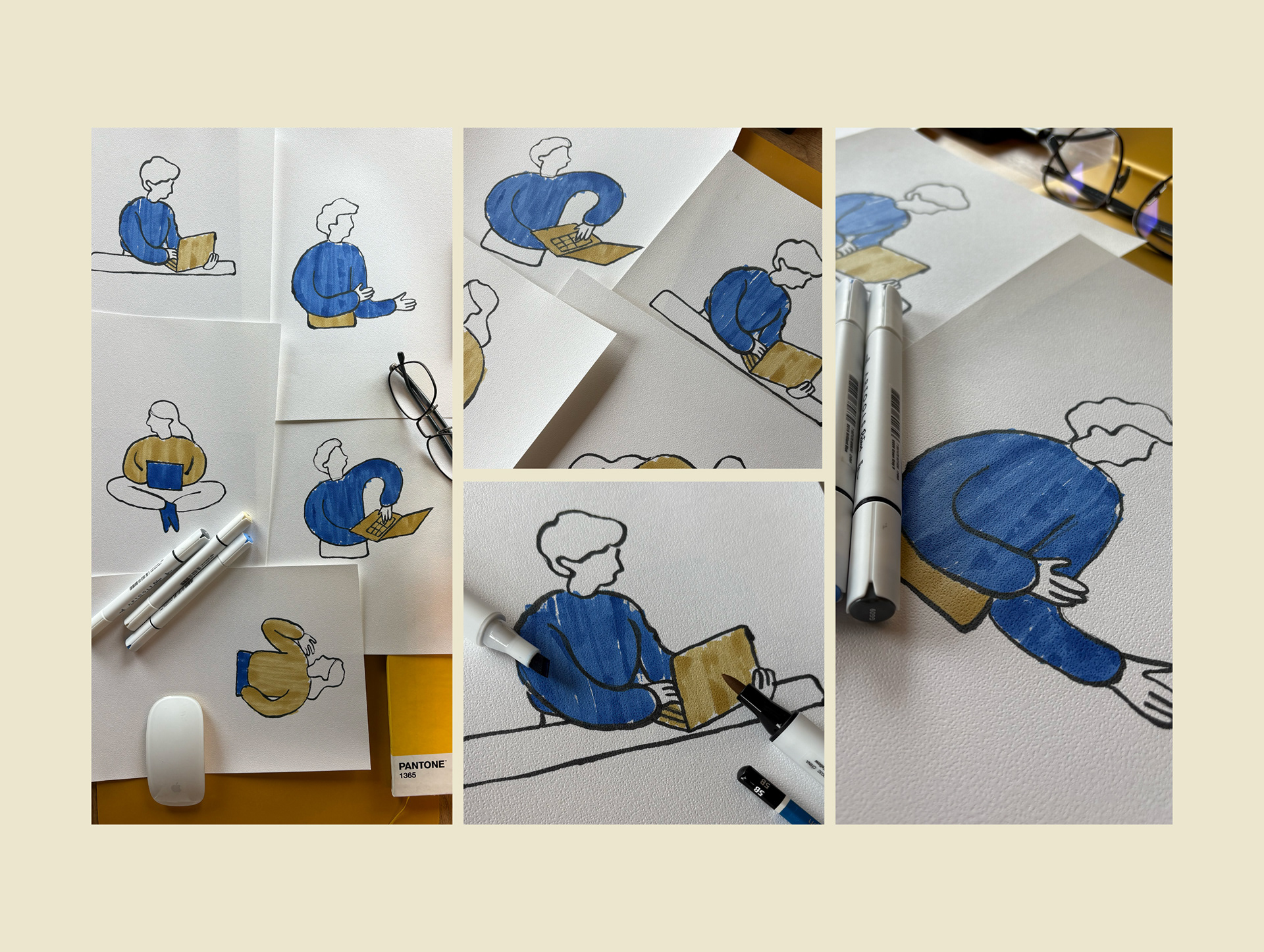
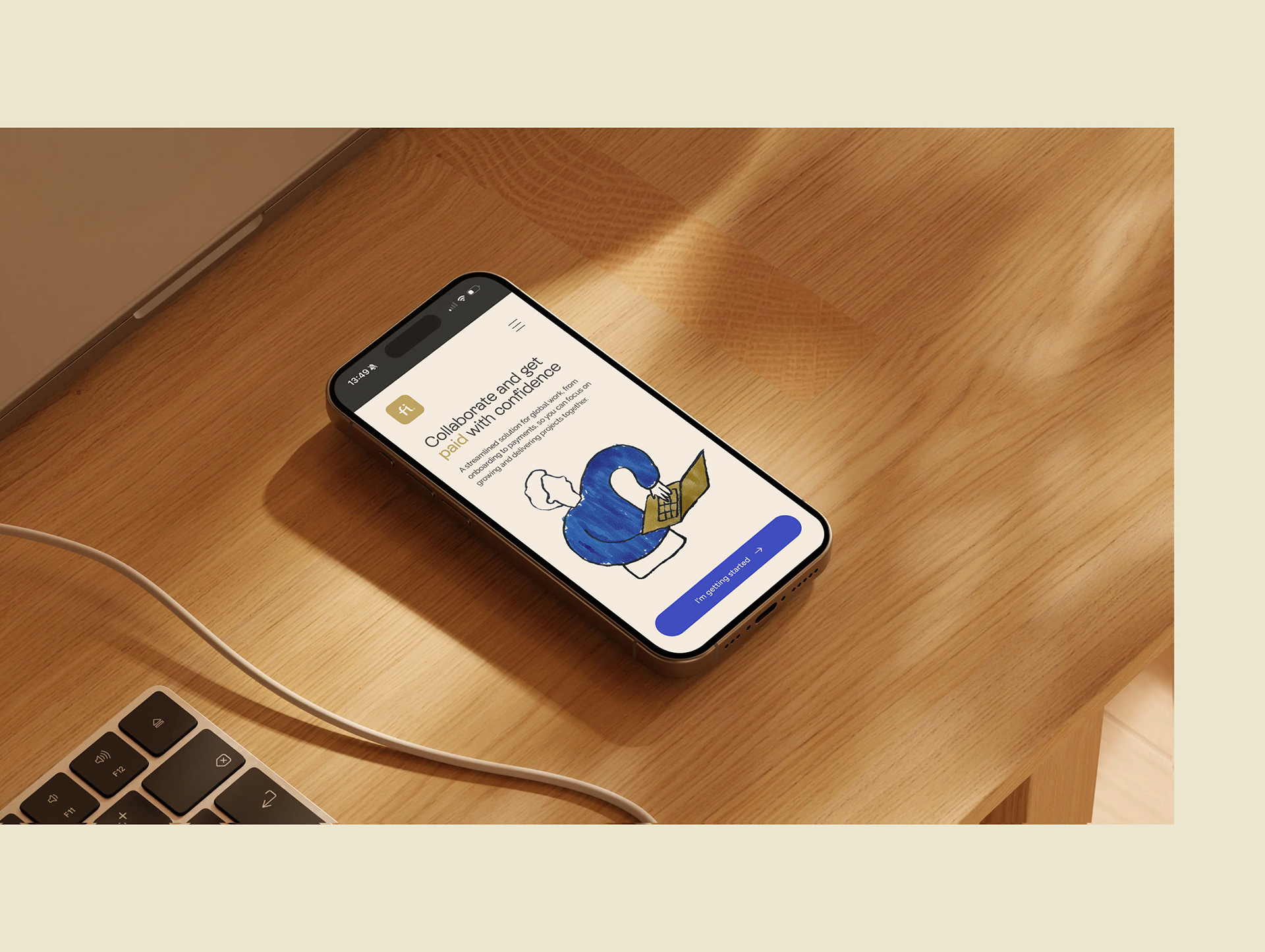
Based on market analysis, we defined a new positioning focused on simplicity and approachability. The rebranding translates this strategy into every detail of the new identity: the typography merges geometric precision with a human touch; the color palette reinforces security and professionalism; and the minimalist, hand-drawn illustrations add creativity and a playful touch. As the central symbol, the logo captures the fluidity with which we connect companies and global talent.
The result is a brand that communicates efficiency and empathy, balancing a professional visual system with a human soul.
Brand, Art Direction & Design: Gustavo Bortoletto
Estratégia: Gustavo Bortoletto e Carol Stevens
Animação: Leonardo Zampieri
Ilustrações: Gustavo Bortoletto
Estratégia: Gustavo Bortoletto e Carol Stevens
Animação: Leonardo Zampieri
Ilustrações: Gustavo Bortoletto
Contato: bortolettostudio.com