/ 2026 / Rebranding & Packing
[EN]
Real Bread Baked in Germany
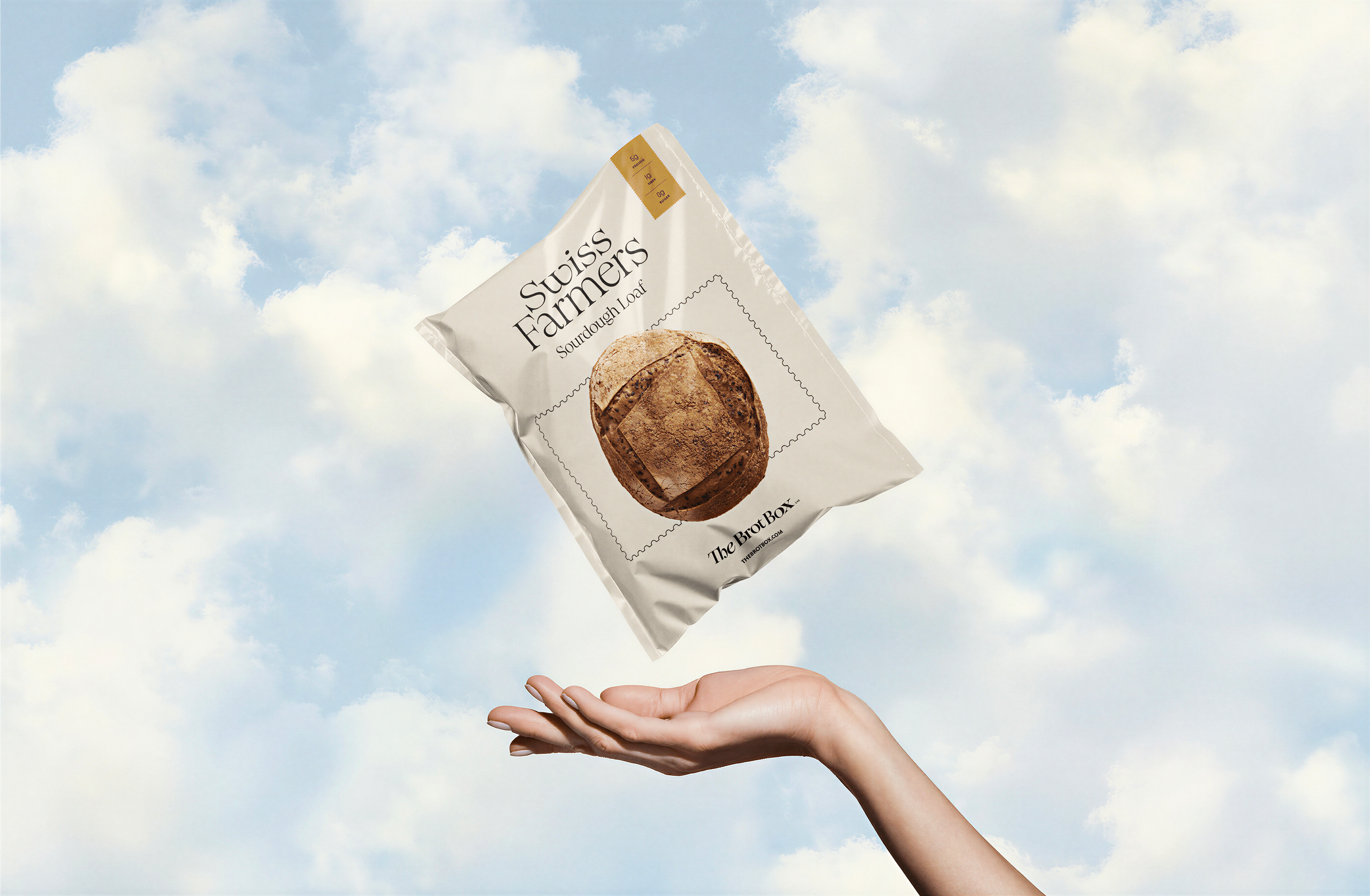
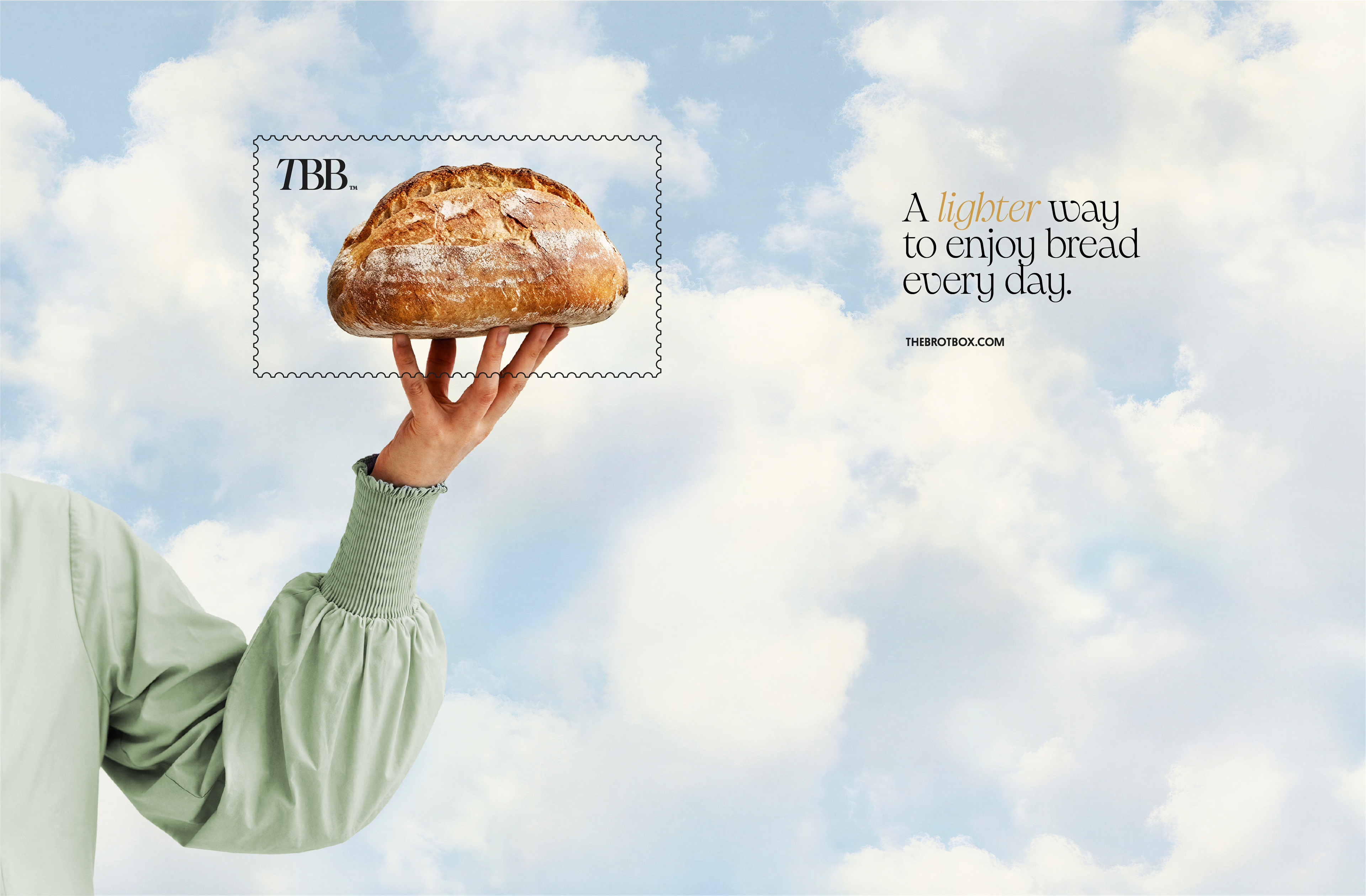
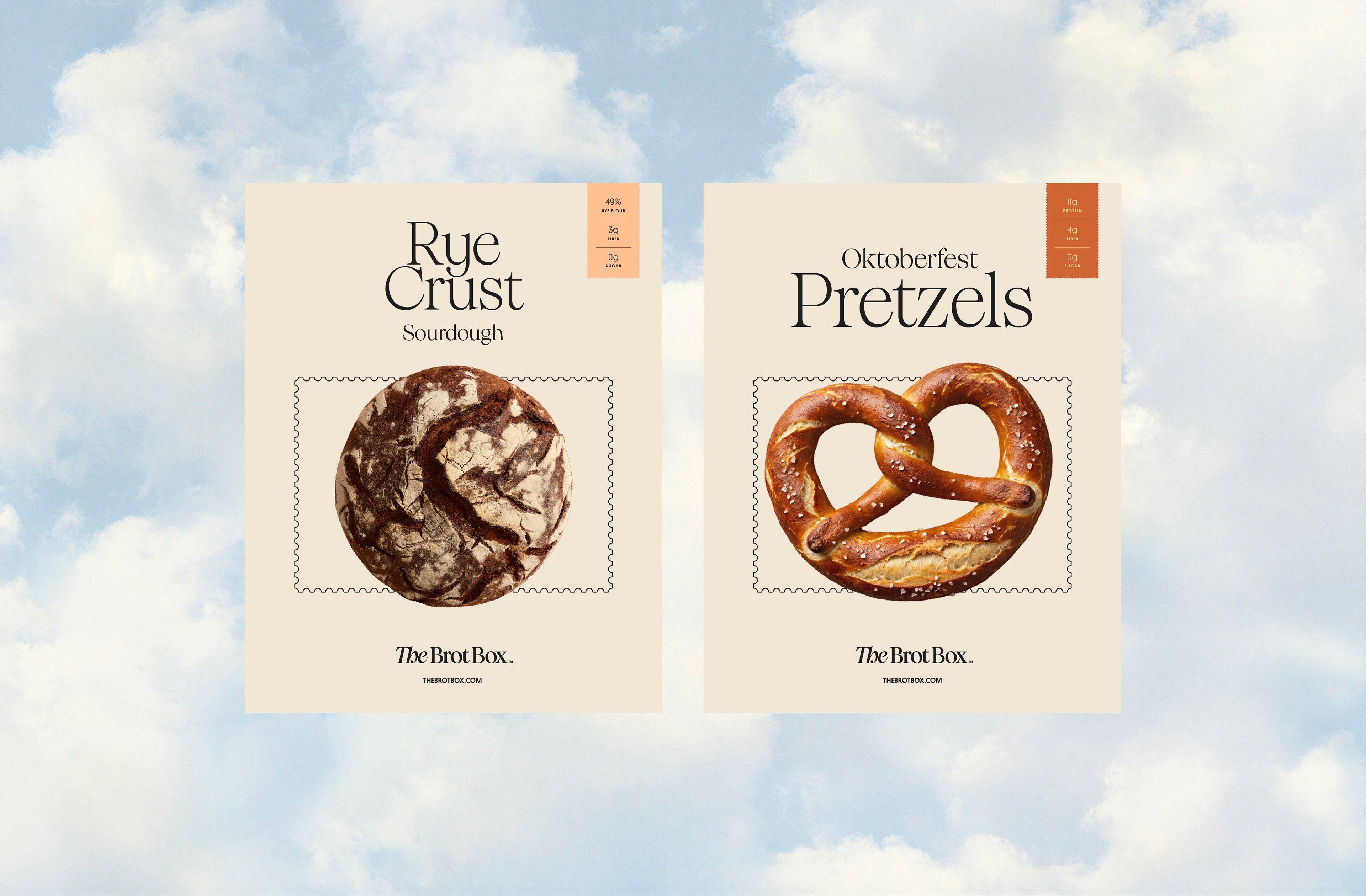
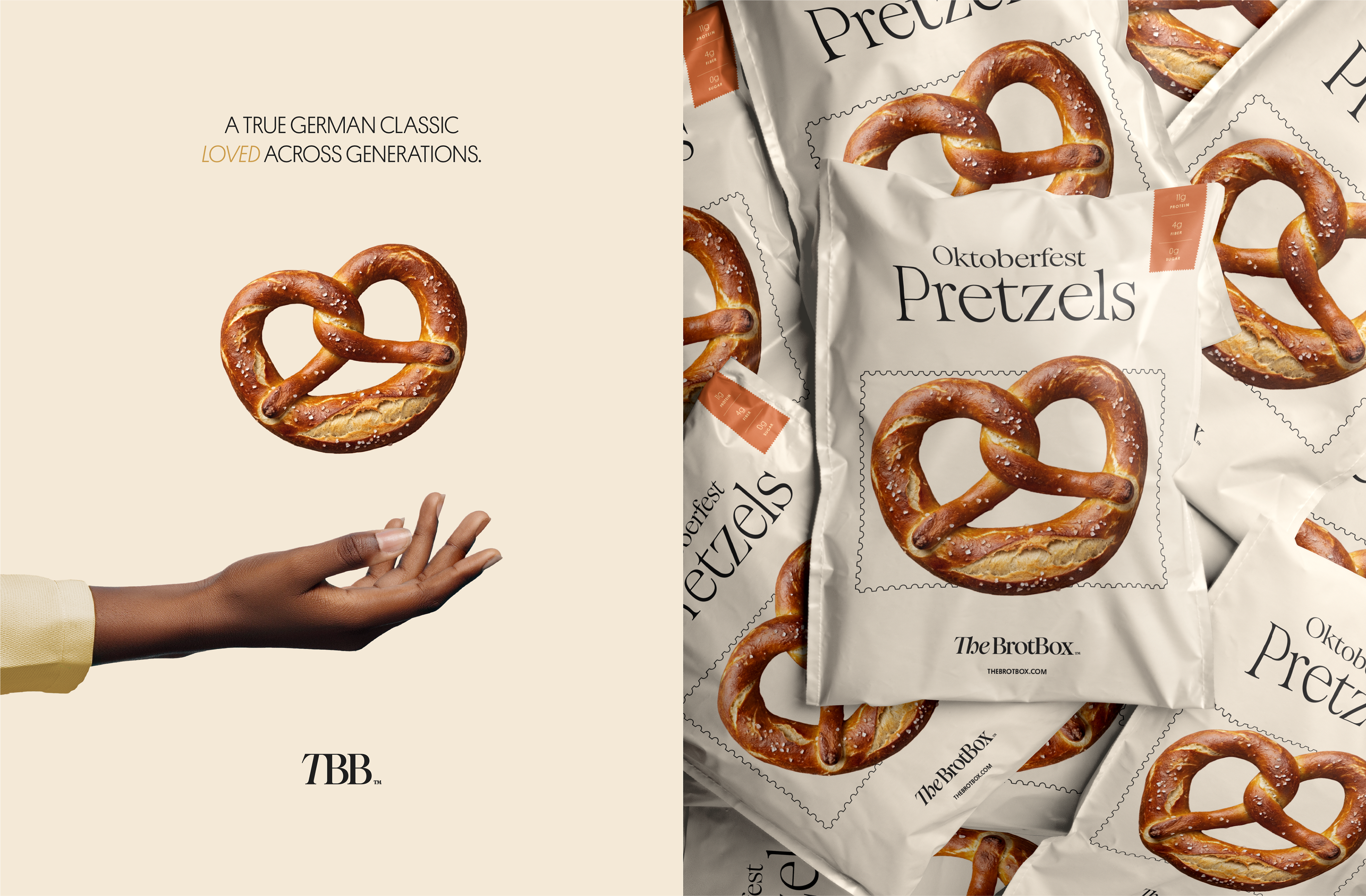
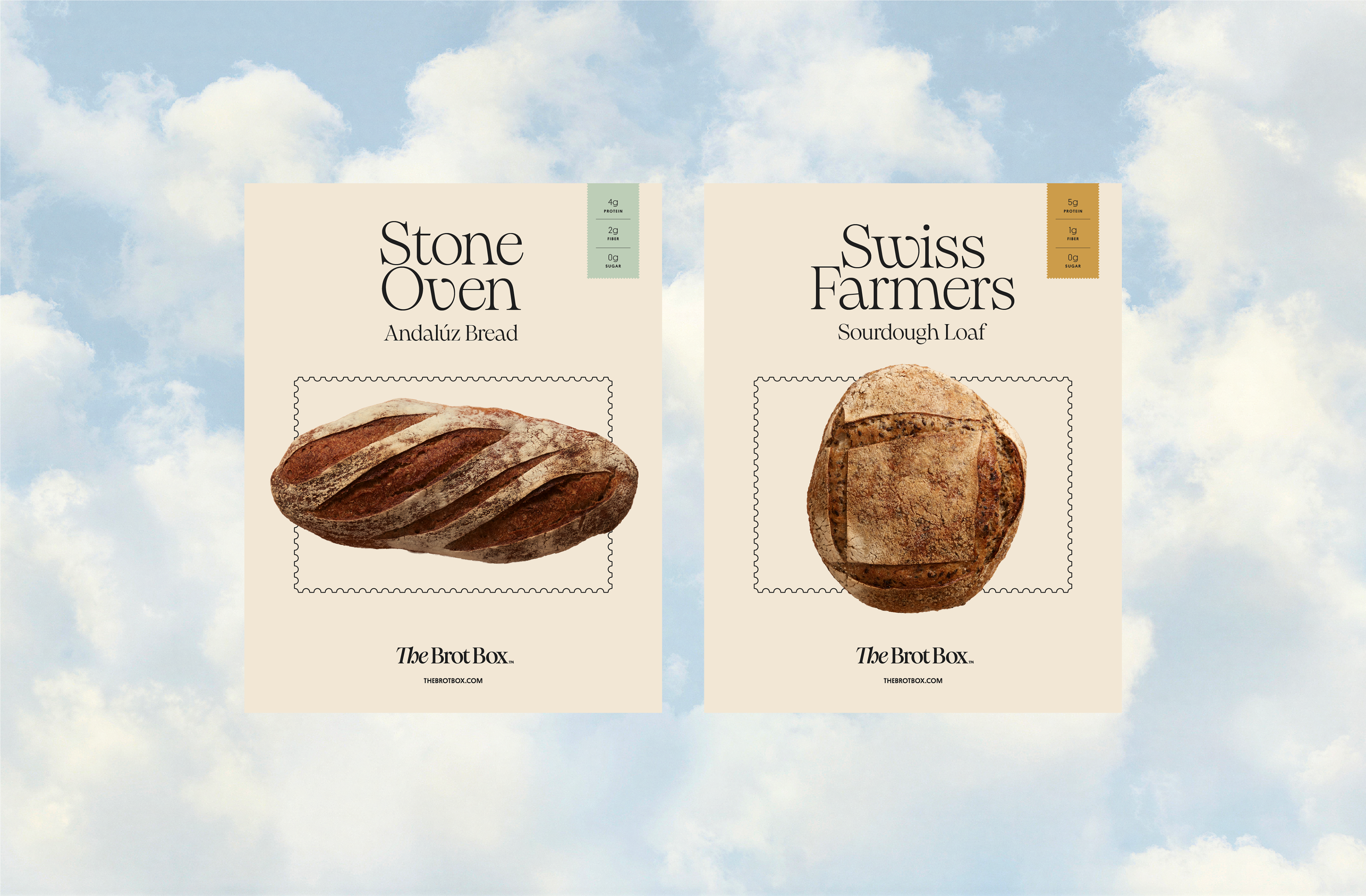
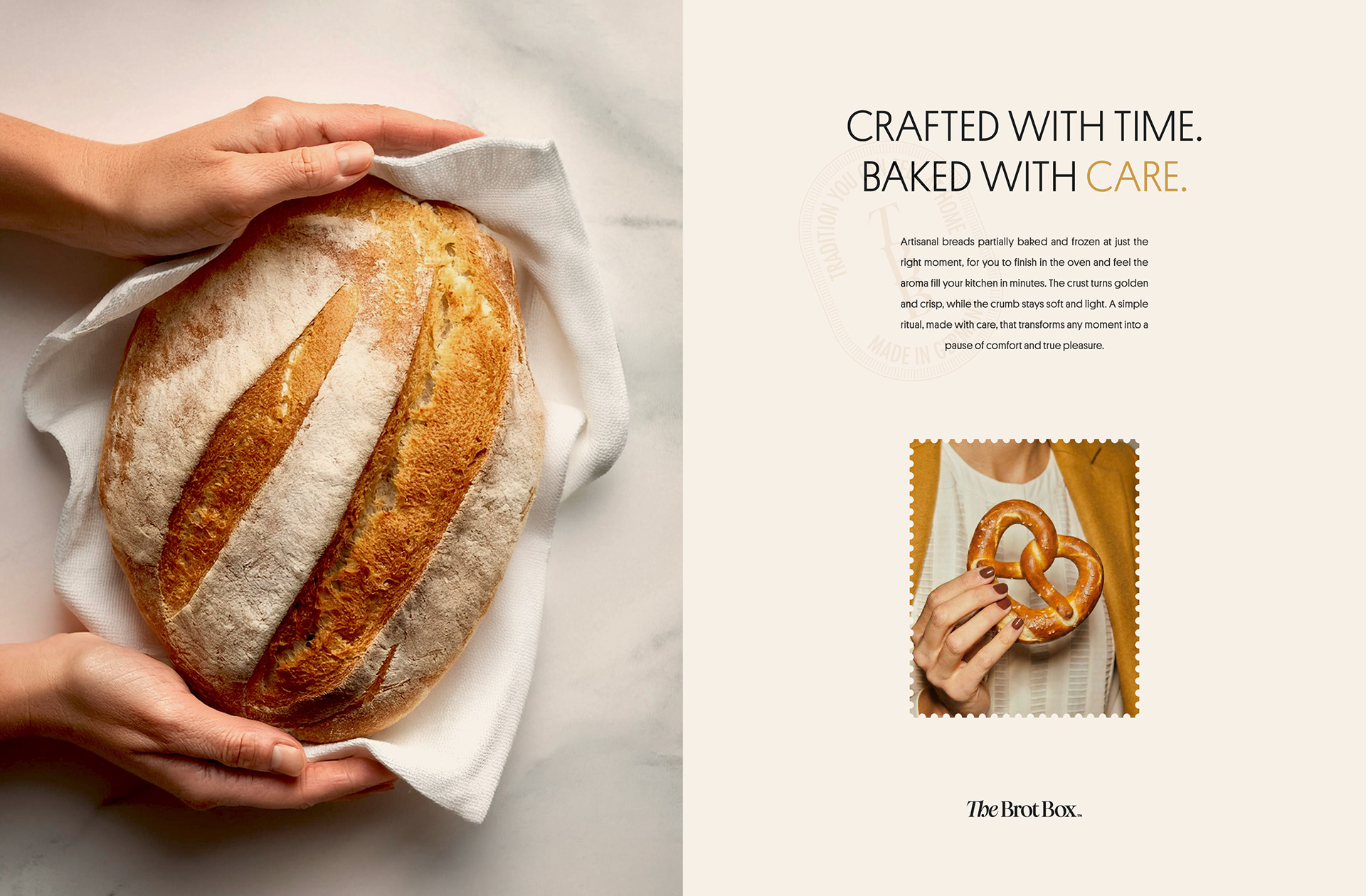
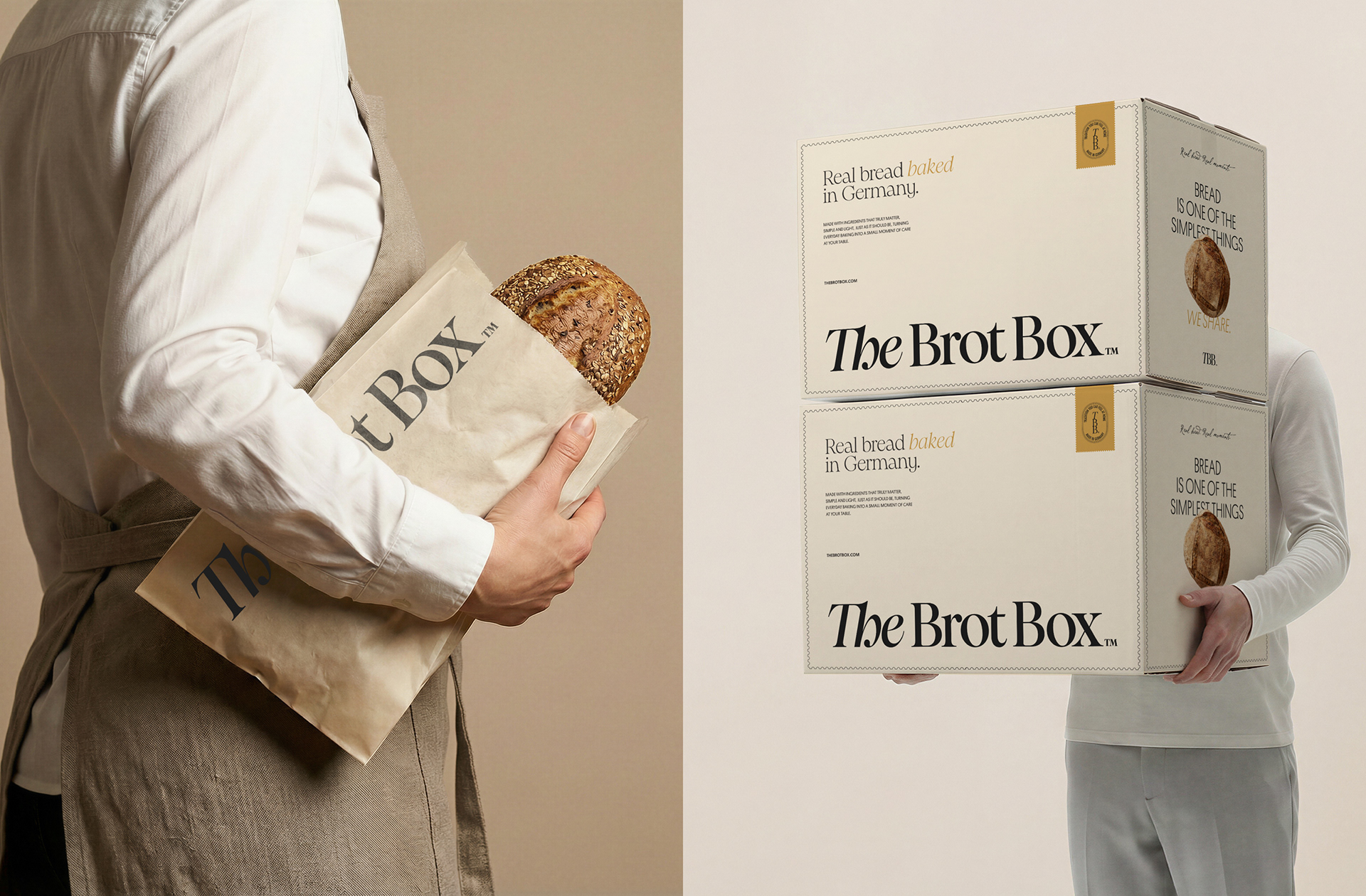
Born to turn lighter, healthier bread into an accessible daily ritual, combining German baking tradition, European flour, handcrafted techniques, and convenience, this online German artisanal bakery brings pre-baked, frozen bread to American households, ready to be finished at home, with all the aroma, texture, and experience of fresh bread.
Born to turn lighter, healthier bread into an accessible daily ritual, combining German baking tradition, European flour, handcrafted techniques, and convenience, this online German artisanal bakery brings pre-baked, frozen bread to American households, ready to be finished at home, with all the aroma, texture, and experience of fresh bread.
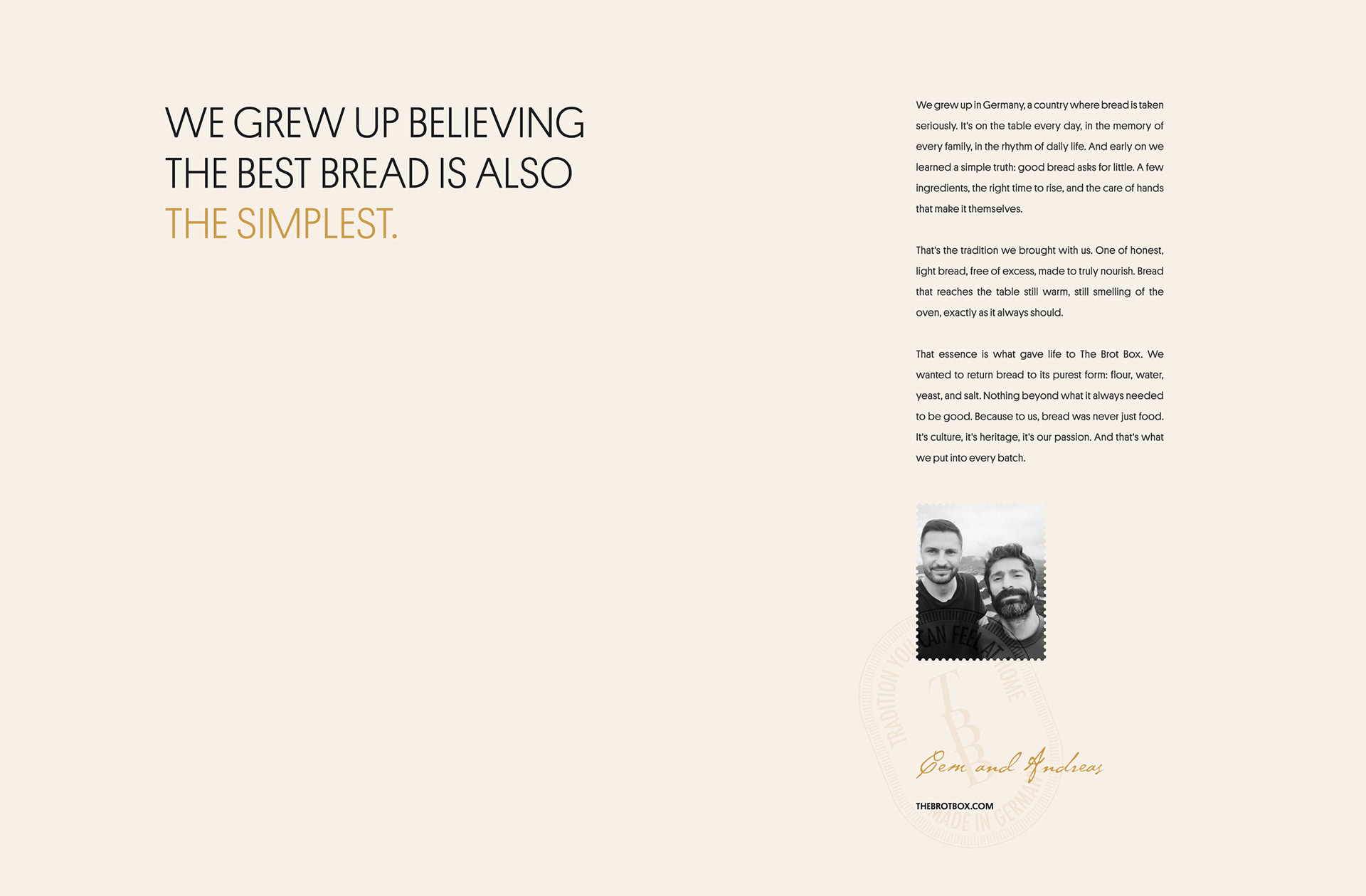
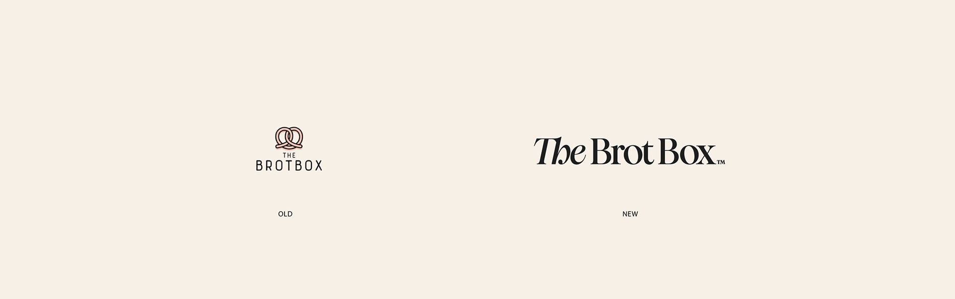
With a solid customer base and plans to expand into retail and, eventually, physical spaces across the United States, the brand faced the challenge of evolving a visual identity that no longer reflected its values, maturity, and premium positioning. The repositioning began with a deep dive into the brand's essence: its German baking tradition, the care behind every loaf, and the emotional role of bread in everyday life. The aim was to build a more consistent, welcoming, and trustworthy way of communicating.
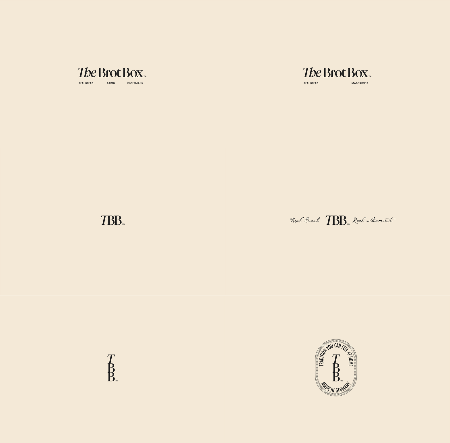
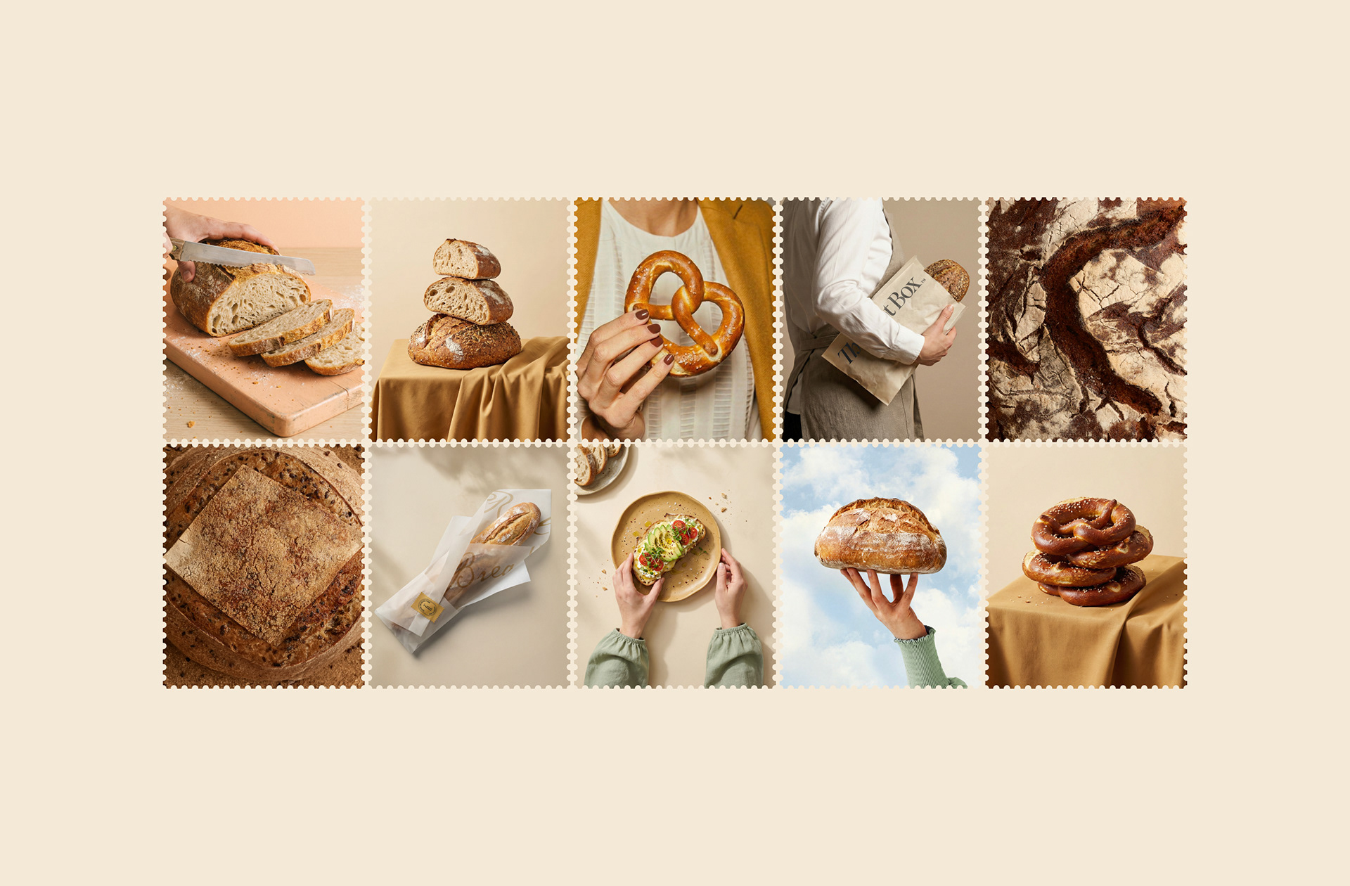
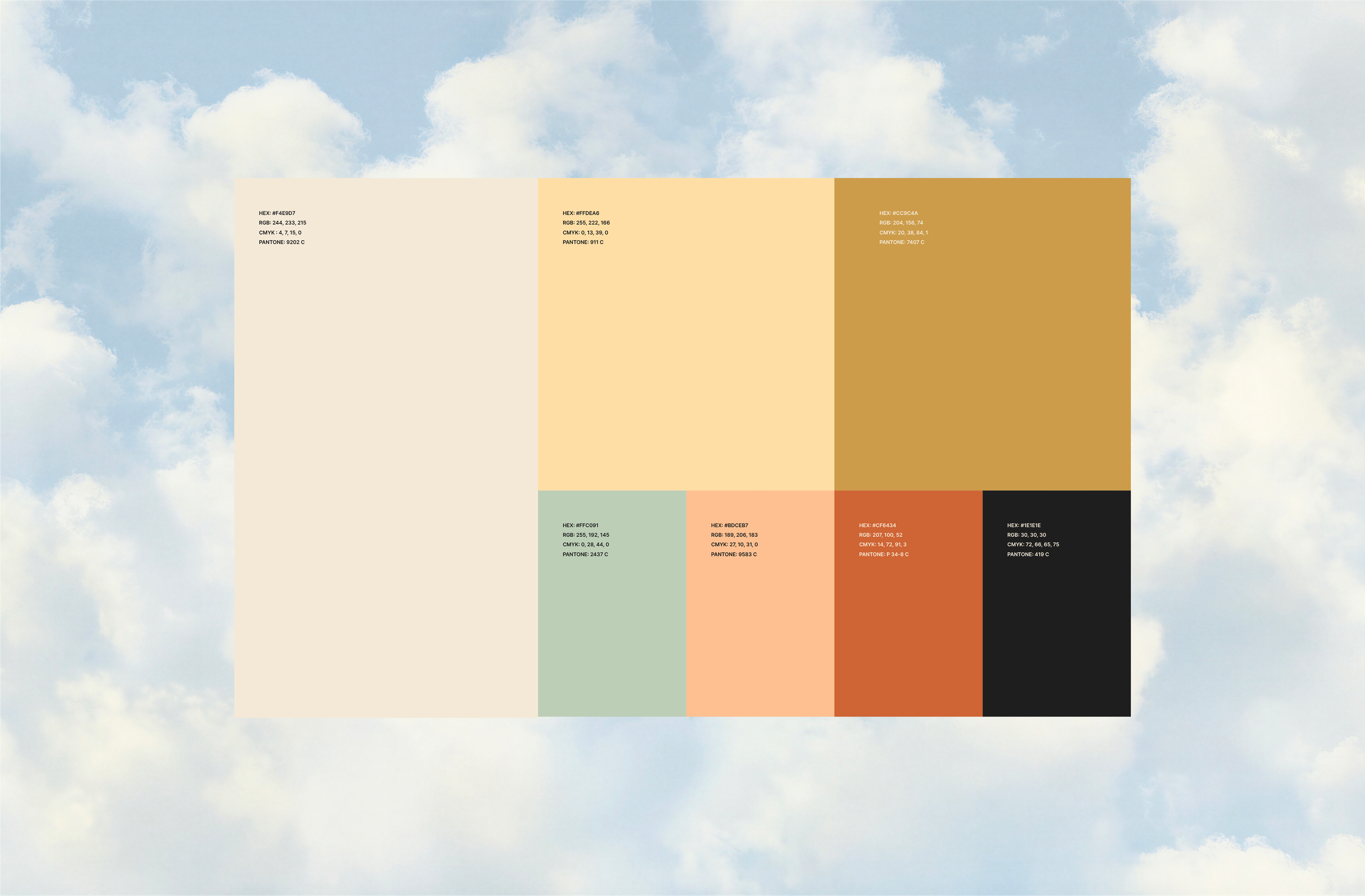
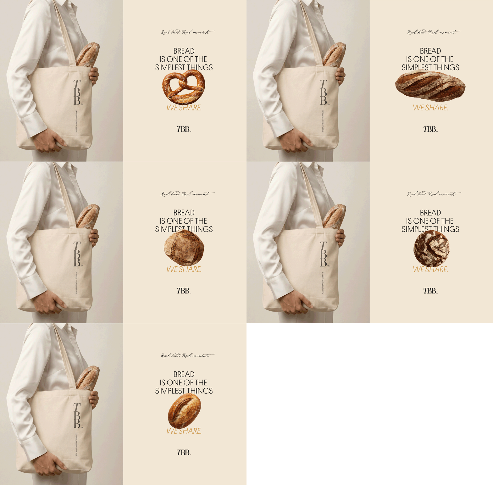
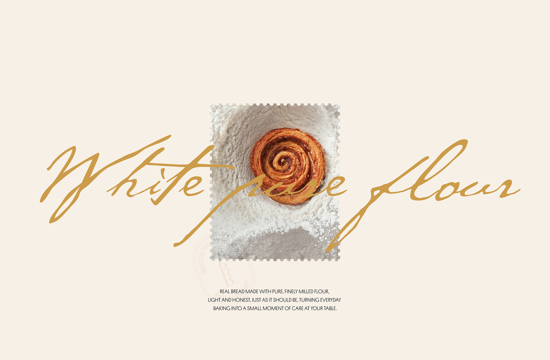
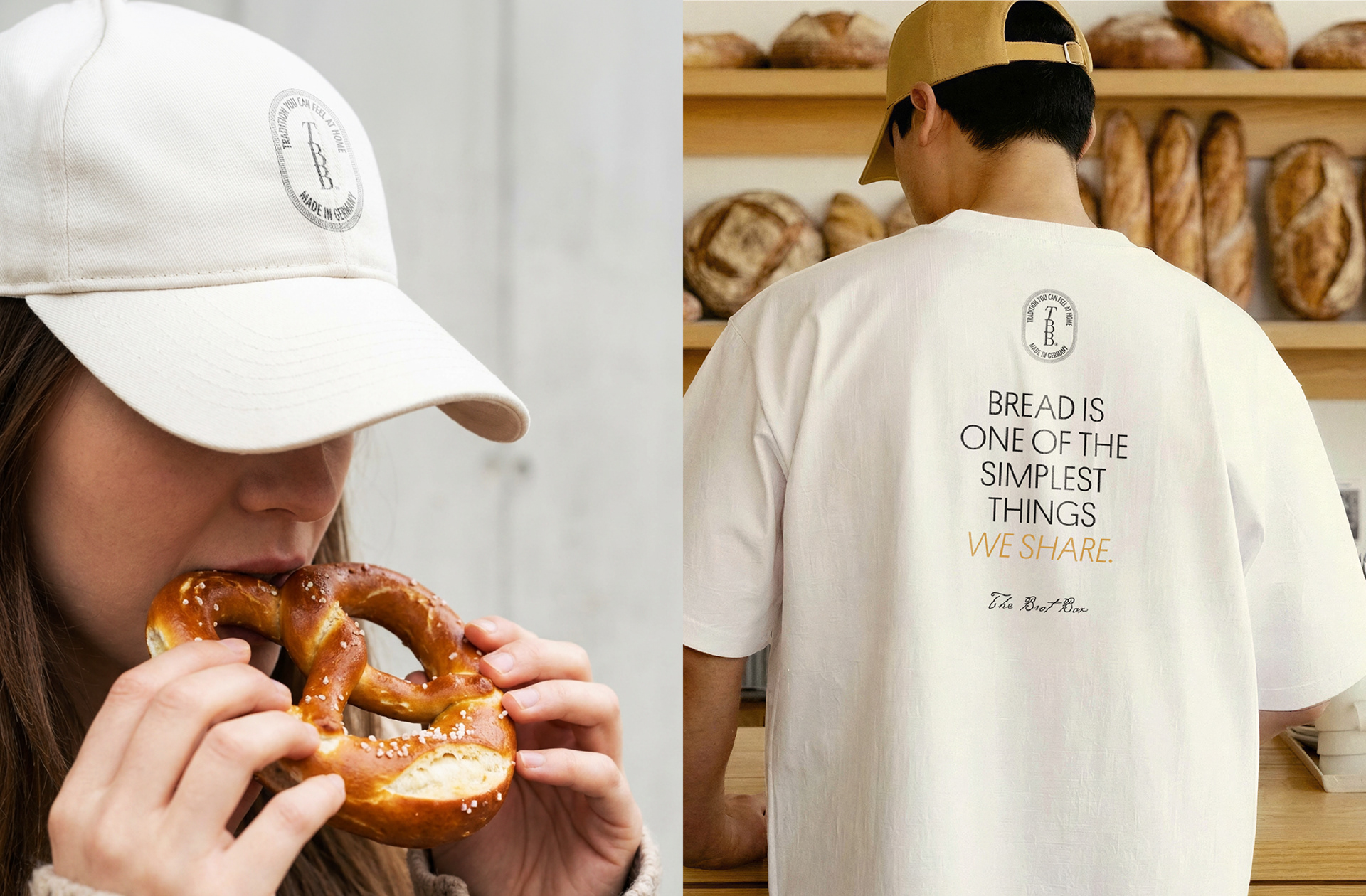
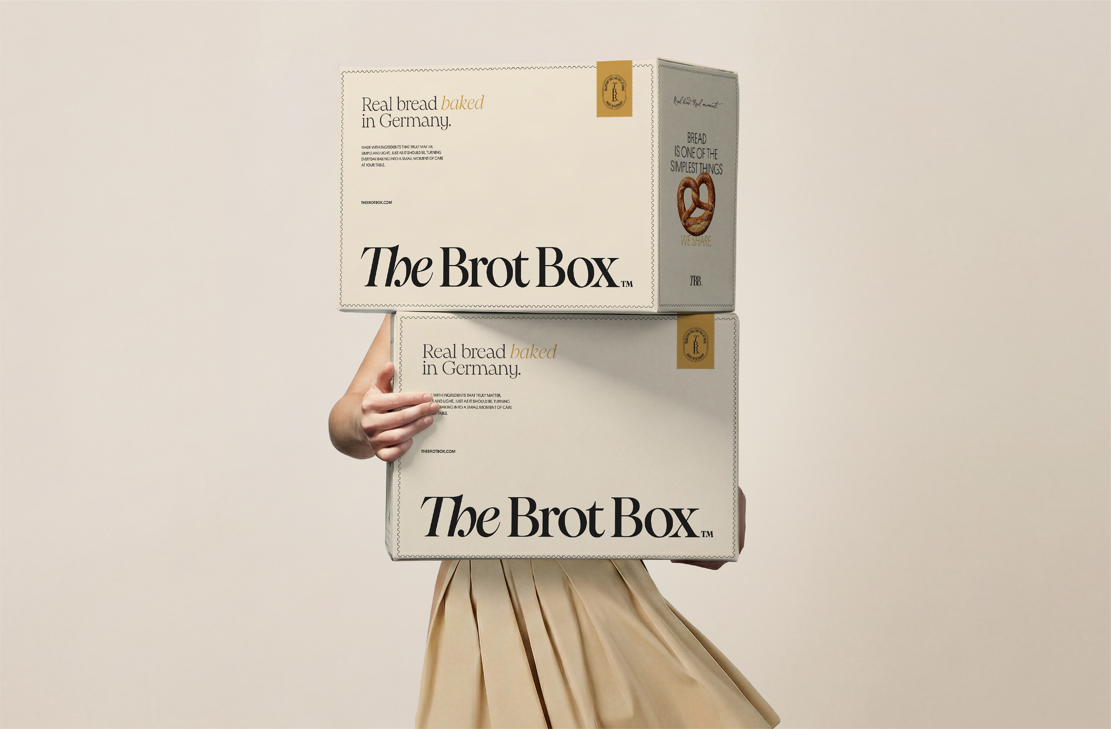
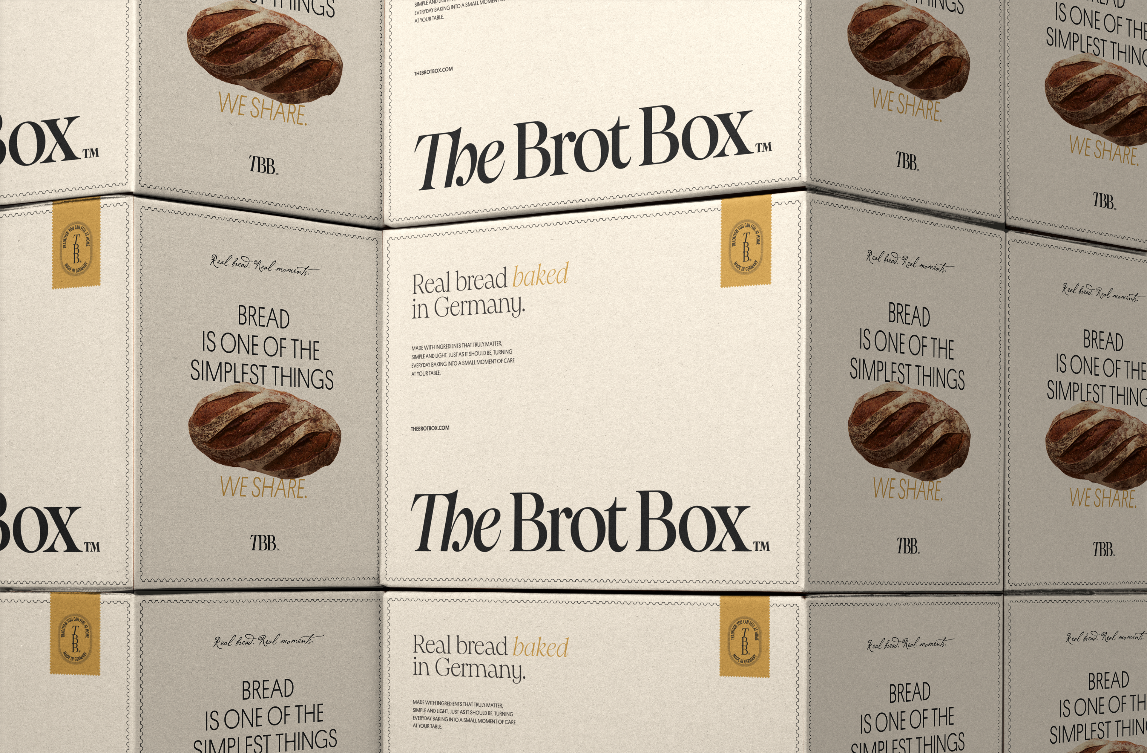
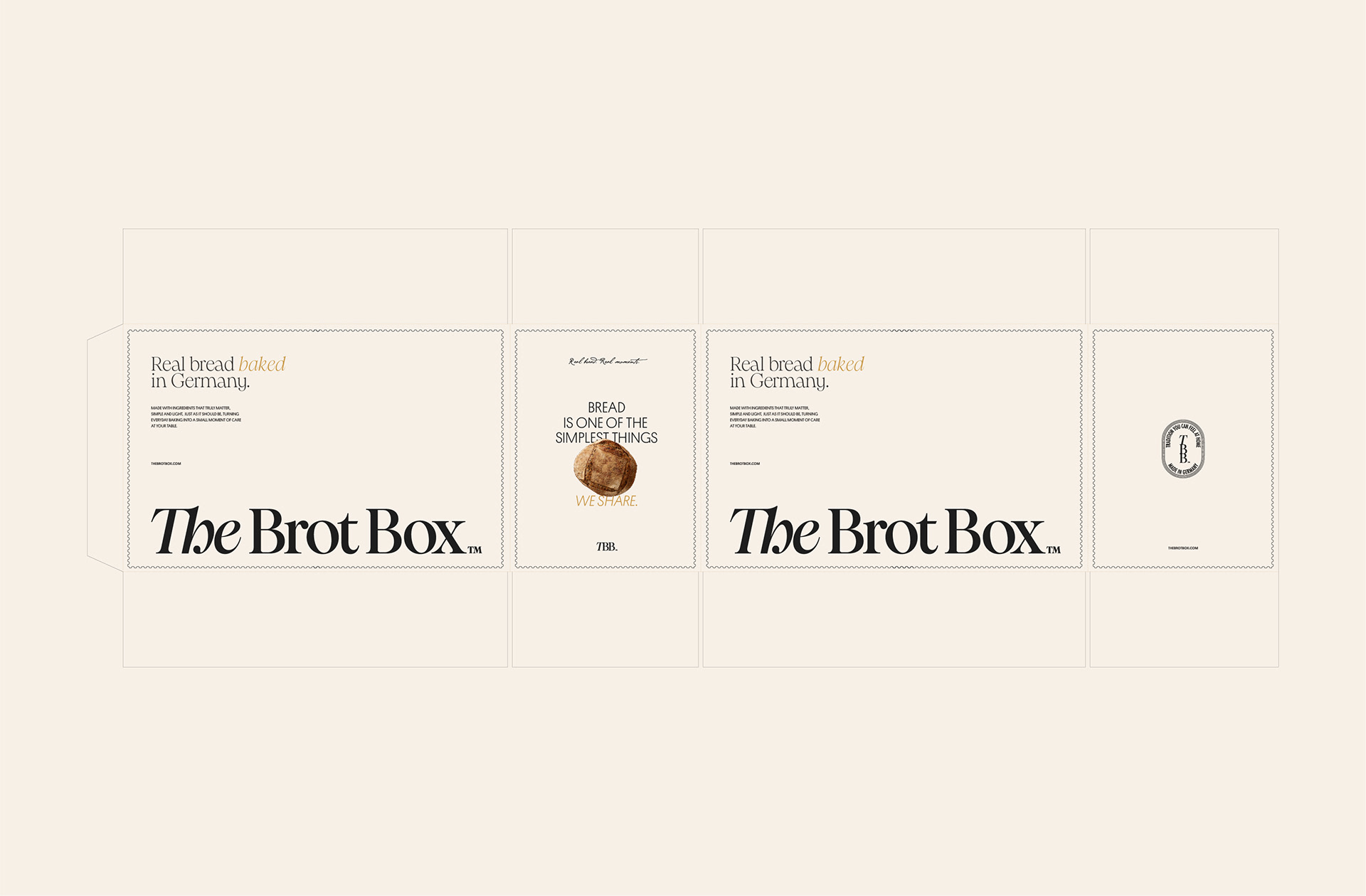
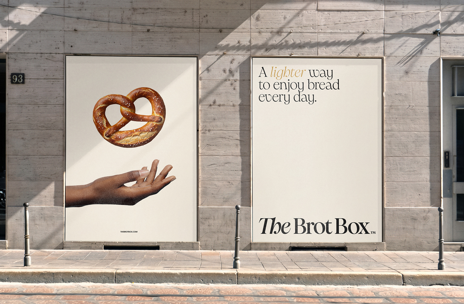
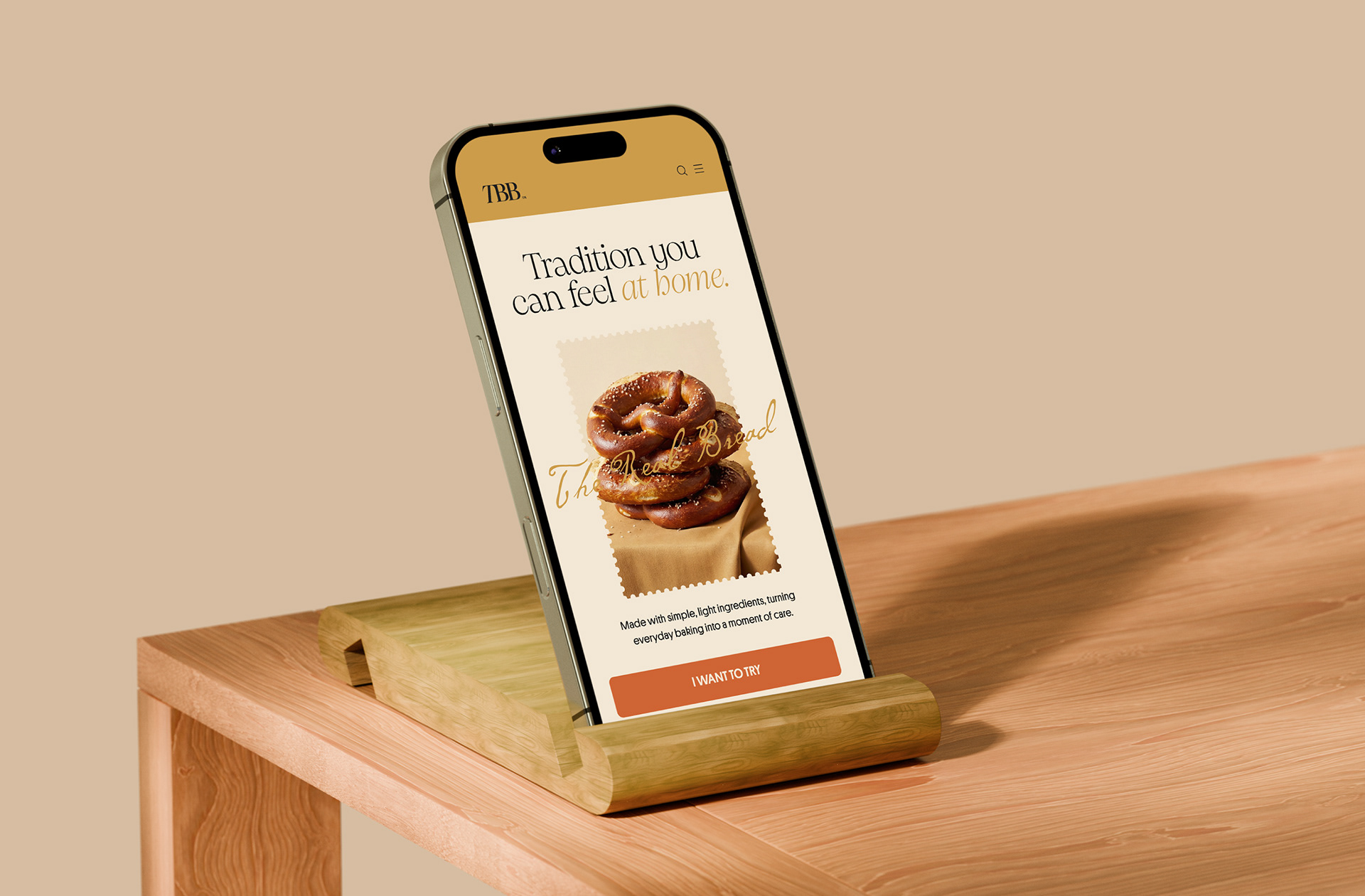
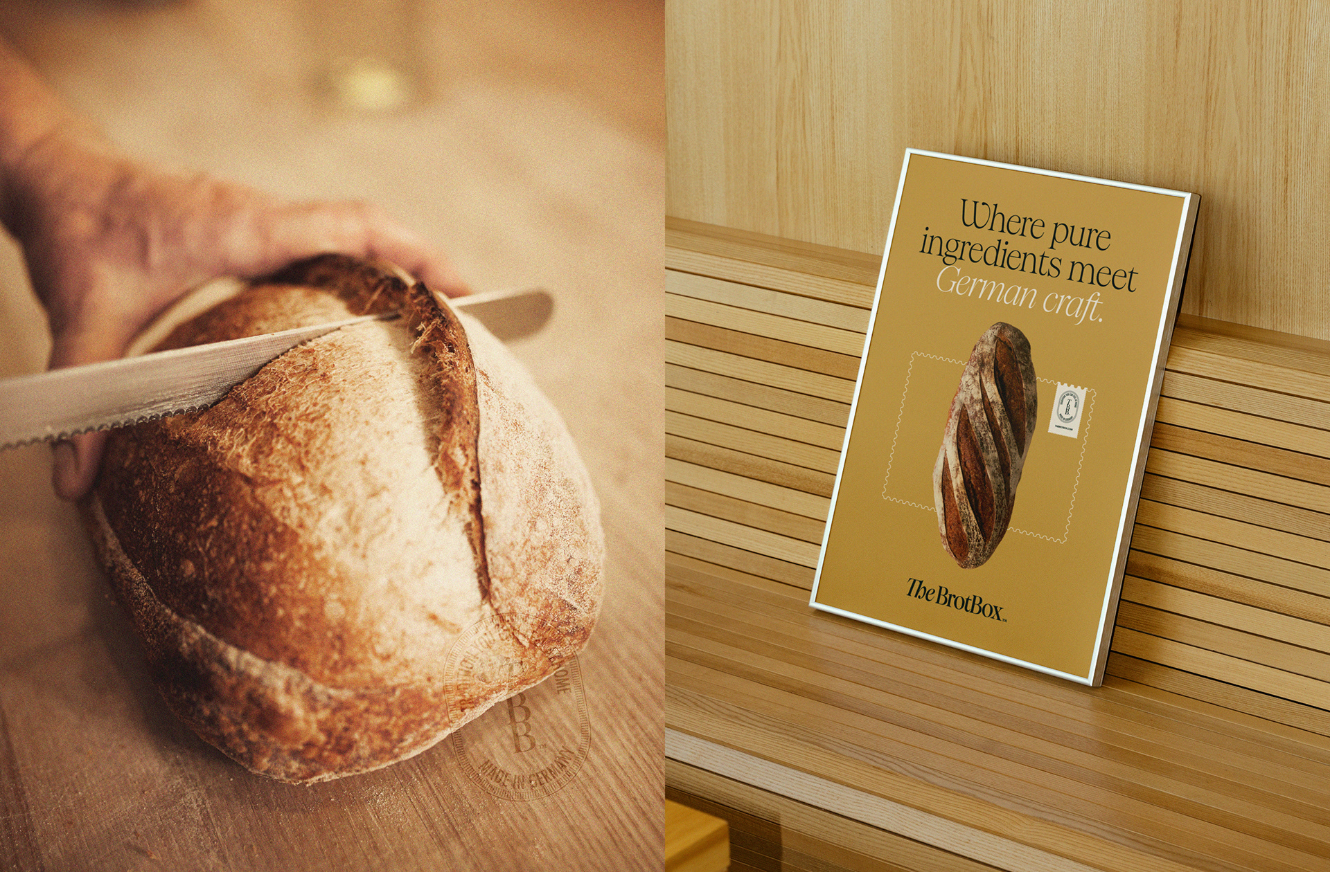
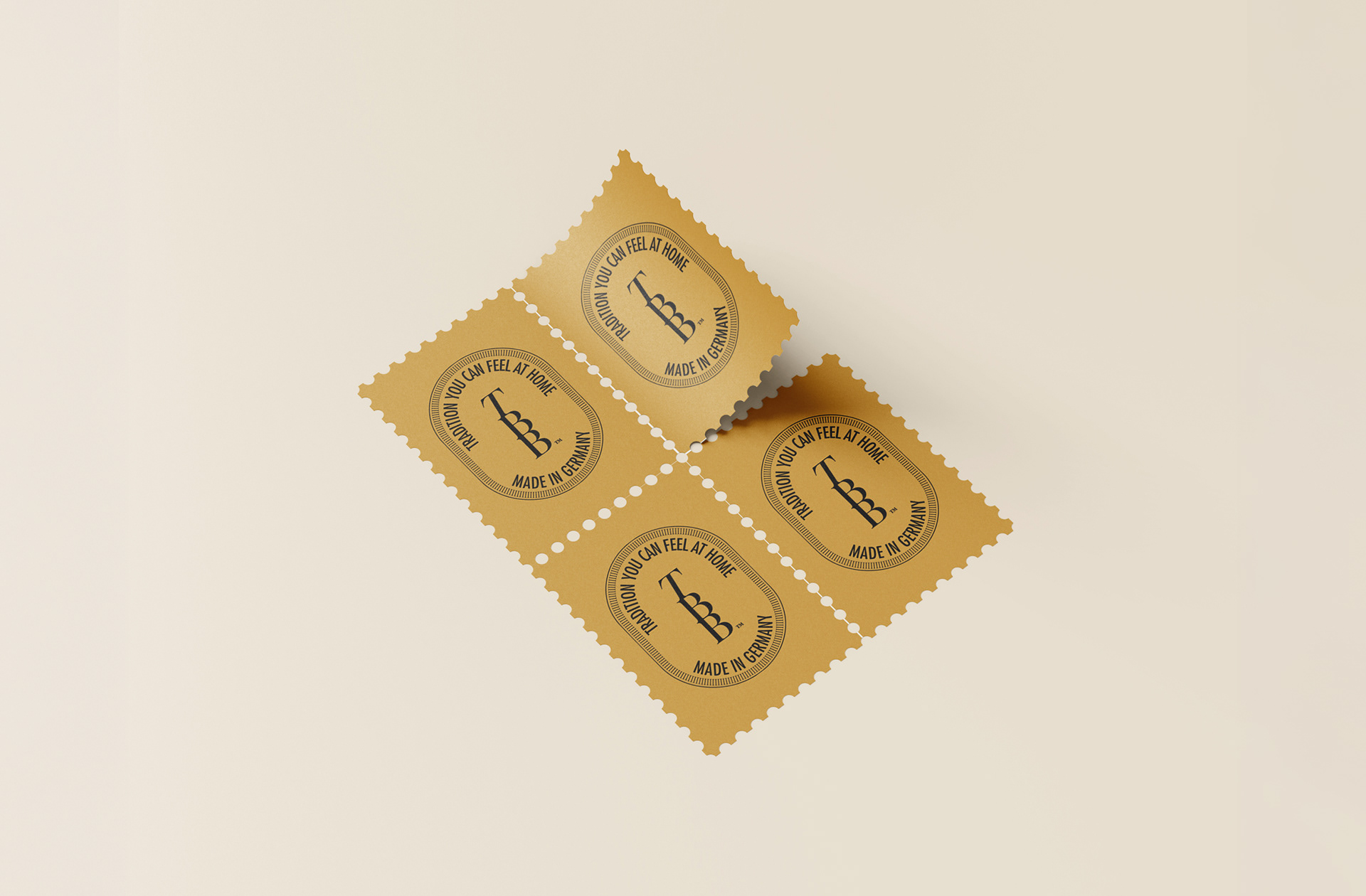
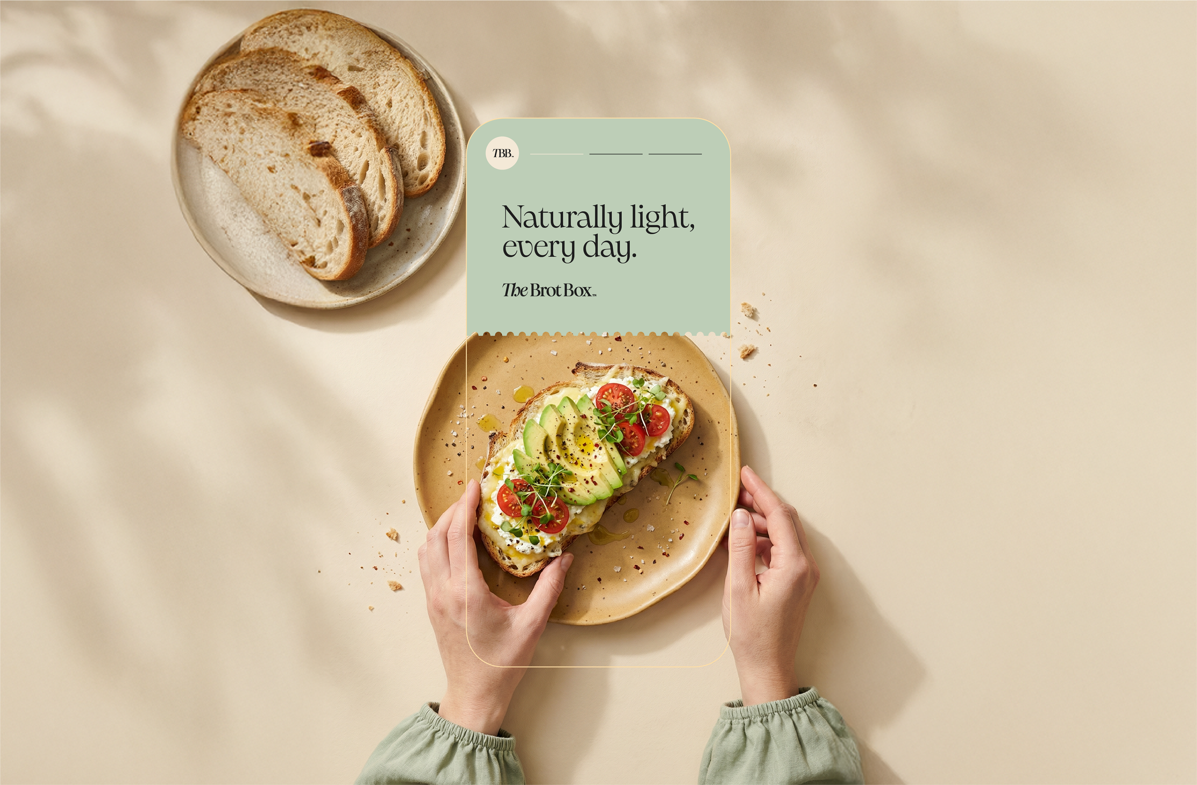
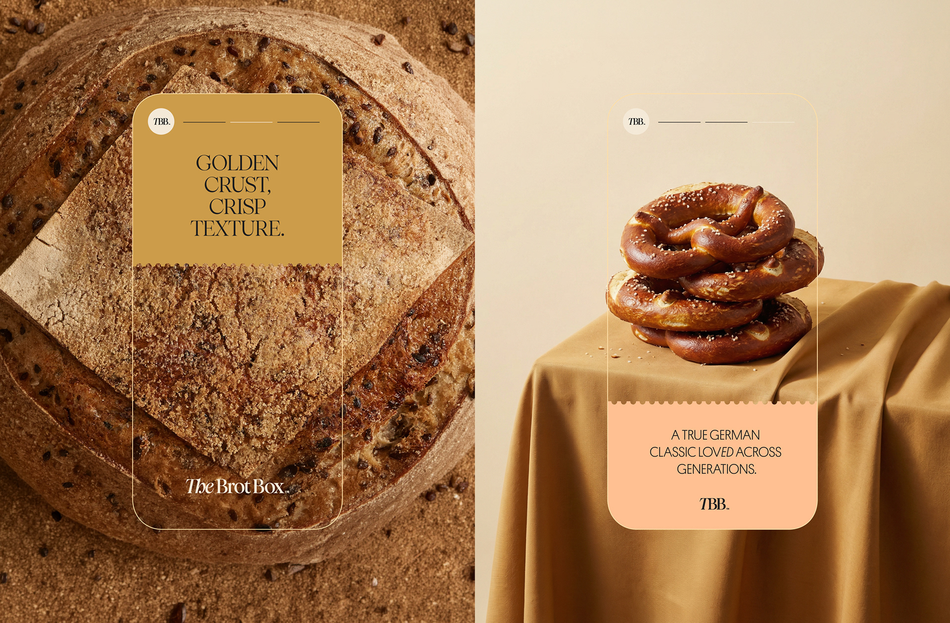
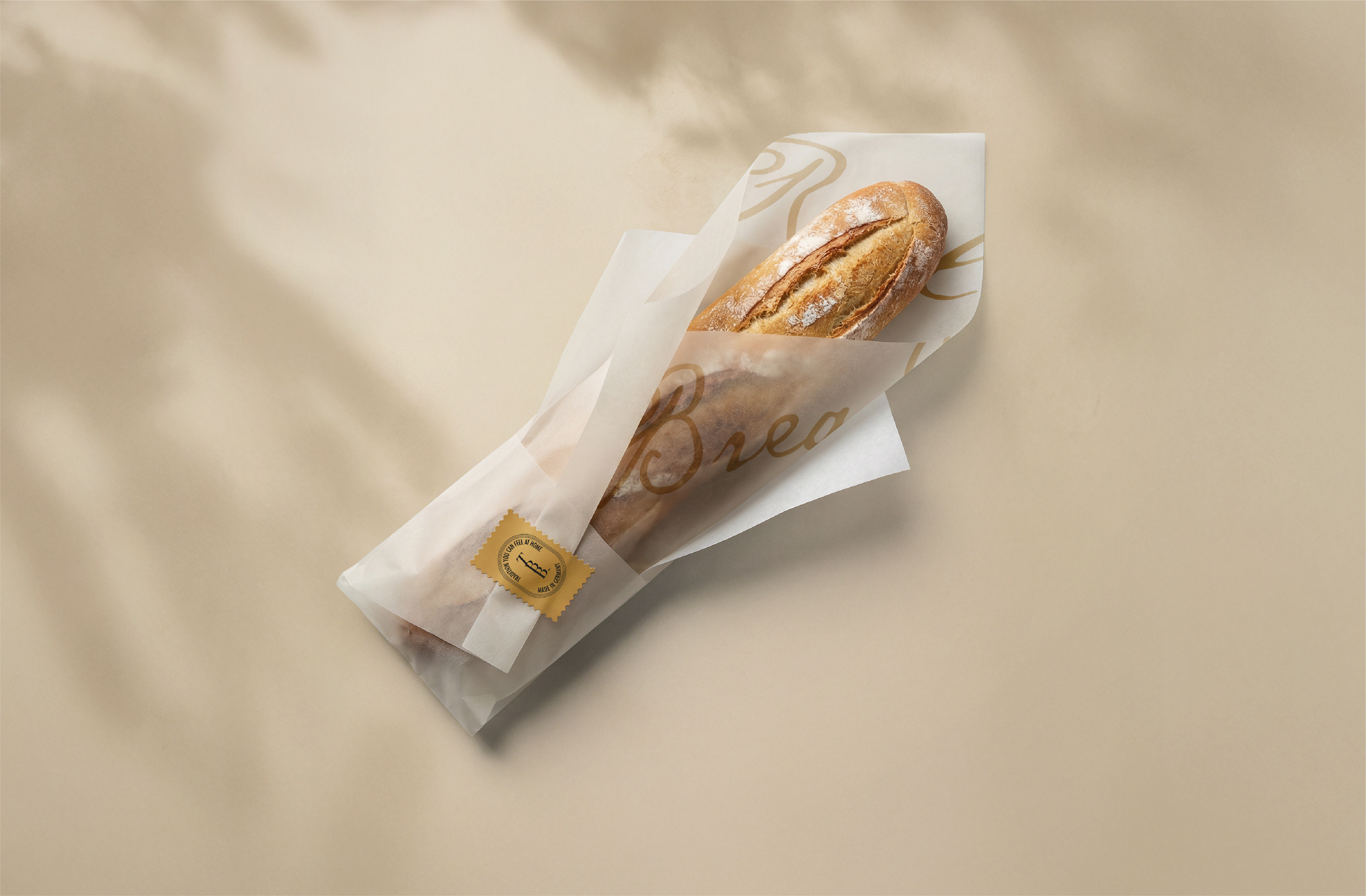
The new strategy balances tradition and modernity, translating technical attributes into tangible, everyday benefits. The visual identity moves away from literal symbols and places typography at the center, reinforcing credibility, legibility, and sophistication. A warm, natural color palette enhances the sense of comfort and value, while the brand voice becomes clear, kind, and confident, balancing information and emotion to express its craft with simplicity and closeness.
[PT-BR]
Nascida com o propósito de fazer do pão mais leve e saudável um ritual diário acessível, combinando a tradição da panificação alemã, a farinha europeia, o saber-fazer e a praticidade, essa padaria artesanal alemã online leva pães pré-assados e congelados aos lares americanos, prontos para serem finalizados em casa, com todo o aroma, a textura e a experiência do pão fresco.
Com uma base de clientes consolidada e planos de expansão para o varejo e, futuramente, para espaços físicos nos Estados Unidos, a marca enfrentava o desafio de evoluir uma identidade visual que já não refletia seus valores, sua maturidade e seu posicionamento premium. O reposicionamento começou com um mergulho profundo na essência da marca: sua herança alemã, o cuidado por trás de cada fornada e o papel afetivo do pão no dia a dia. O objetivo era construir uma comunicação mais consistente, acolhedora e confiável.
A nova estratégia equilibra tradição e modernidade, traduzindo atributos técnicos em benefícios concretos e cotidianos. A identidade visual se afasta de símbolos literais e coloca a tipografia no centro, reforçando credibilidade, legibilidade e sofisticação. Uma paleta de cores quente e natural amplia a sensação de conforto e valor, enquanto a voz da marca se torna clara, gentil e confiante, conciliando informação e emoção para expressar seu trabalho artesanal com simplicidade e proximidade.
Scope of Work
Strategic Positioning, Brand Identity & Packing.
Design Studio: Bortoletto ® Studio
Brand Strategic: Gustavo Bortoletto and Carol Stevens
Copy, Art Direction & Design: Gustavo Bortoletto
Bortoletto ® Studio is a branding studio working across industries, shaping positioning,
Design Studio: Bortoletto ® Studio
Brand Strategic: Gustavo Bortoletto and Carol Stevens
Copy, Art Direction & Design: Gustavo Bortoletto
Bortoletto ® Studio is a branding studio working across industries, shaping positioning,