Peixou, comedoria do mar.
[PT BR]
[PT BR]
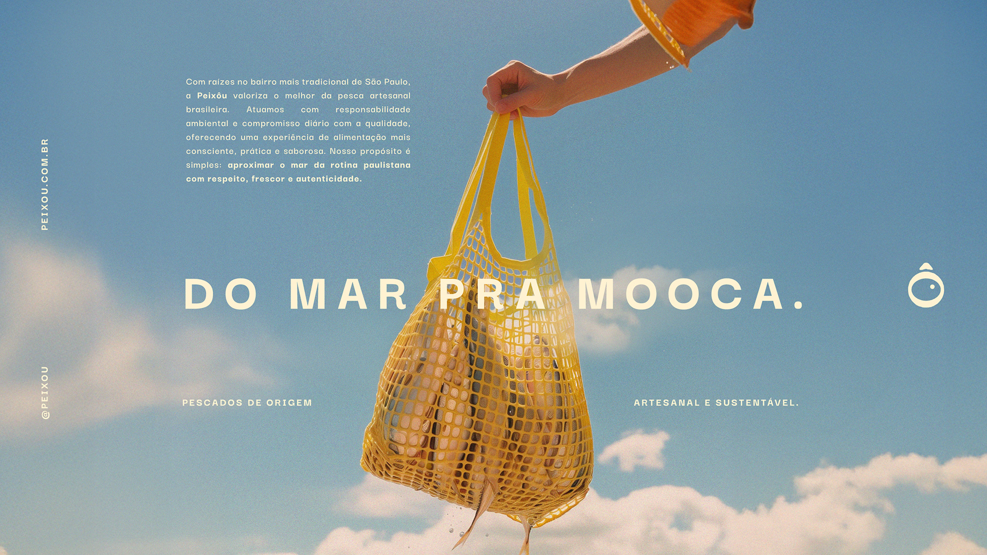
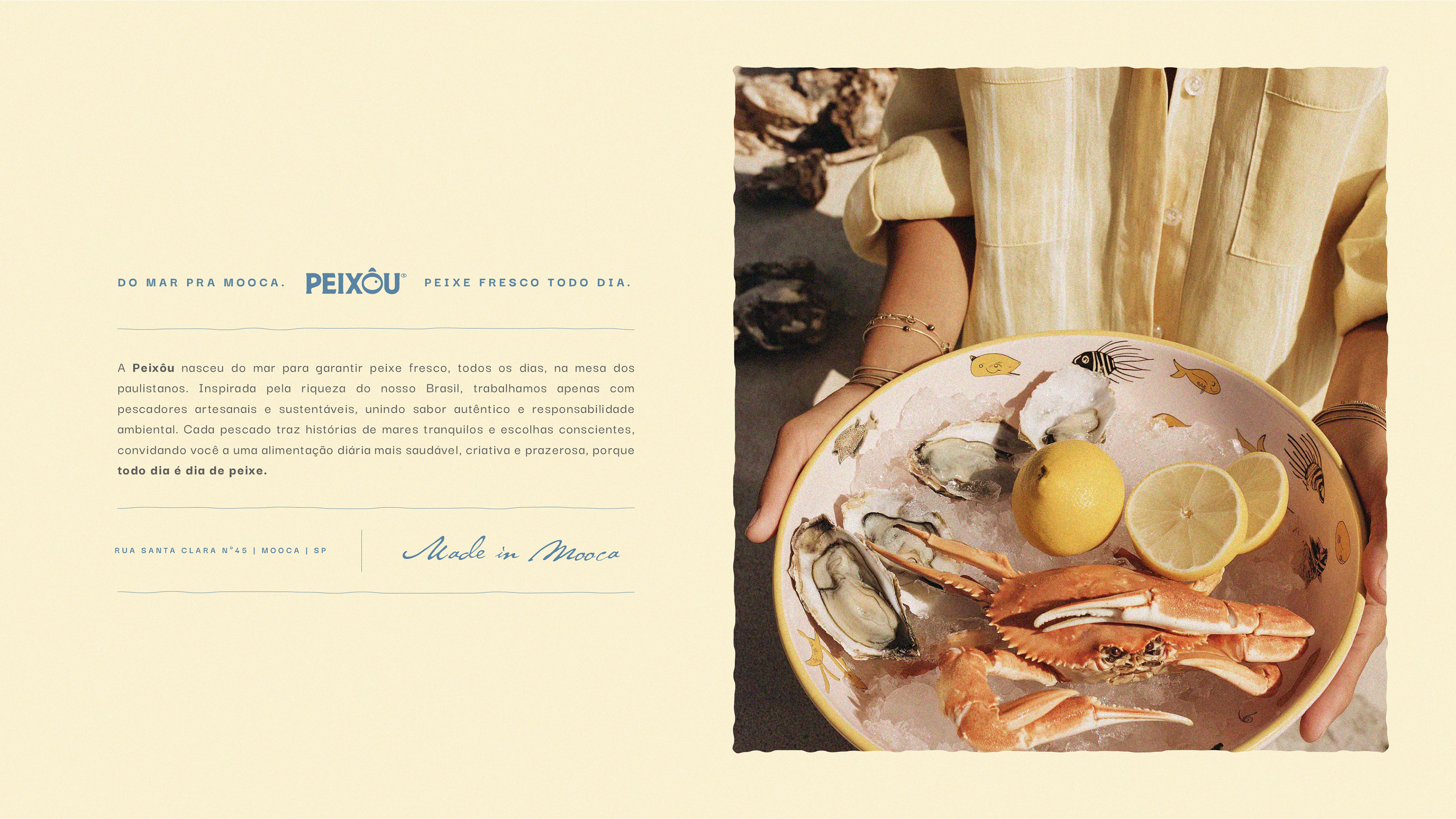
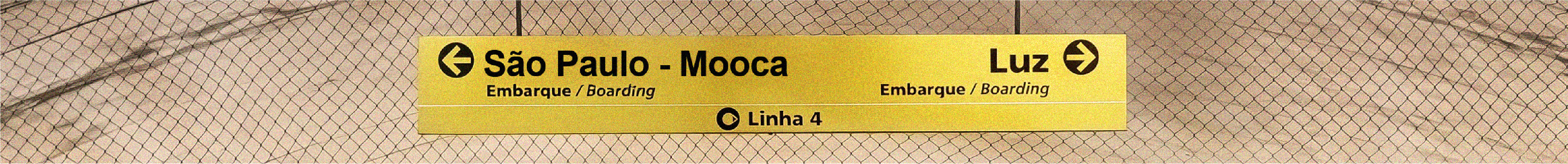
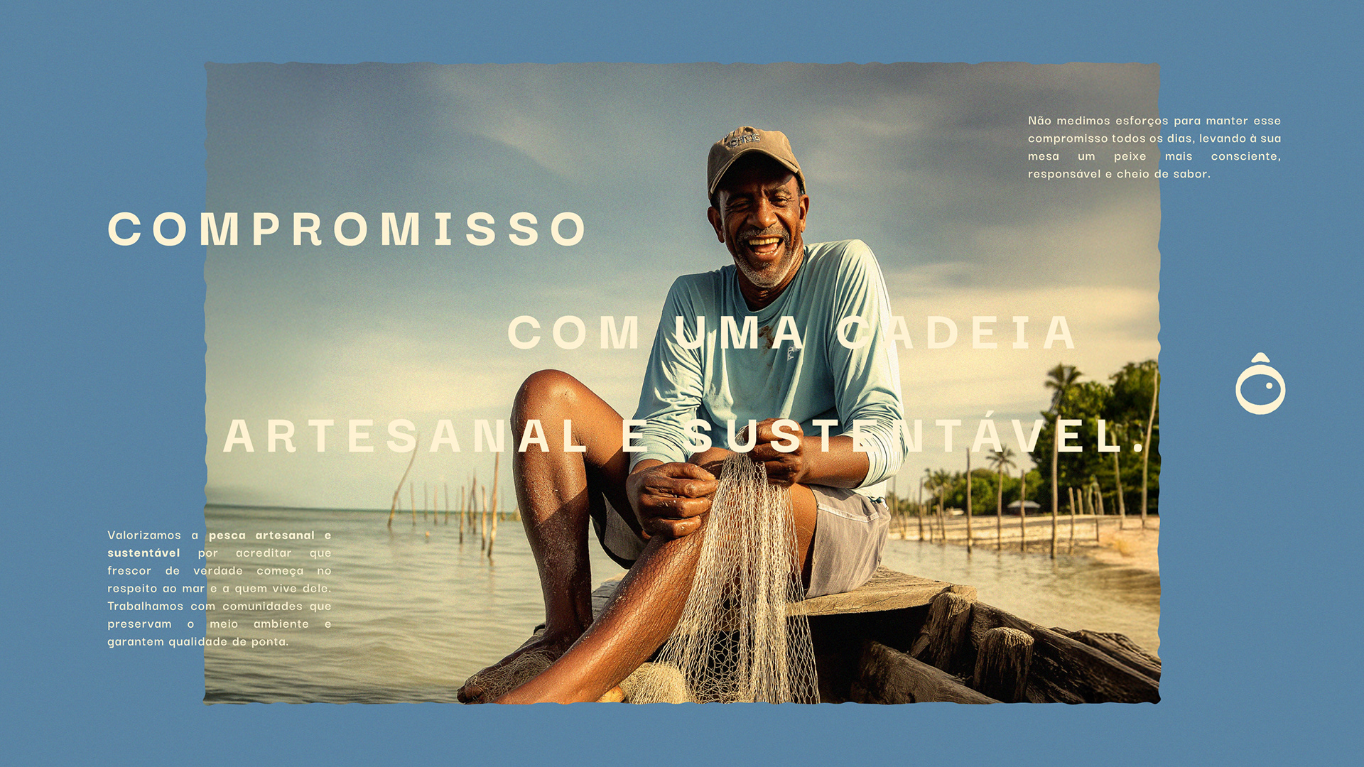
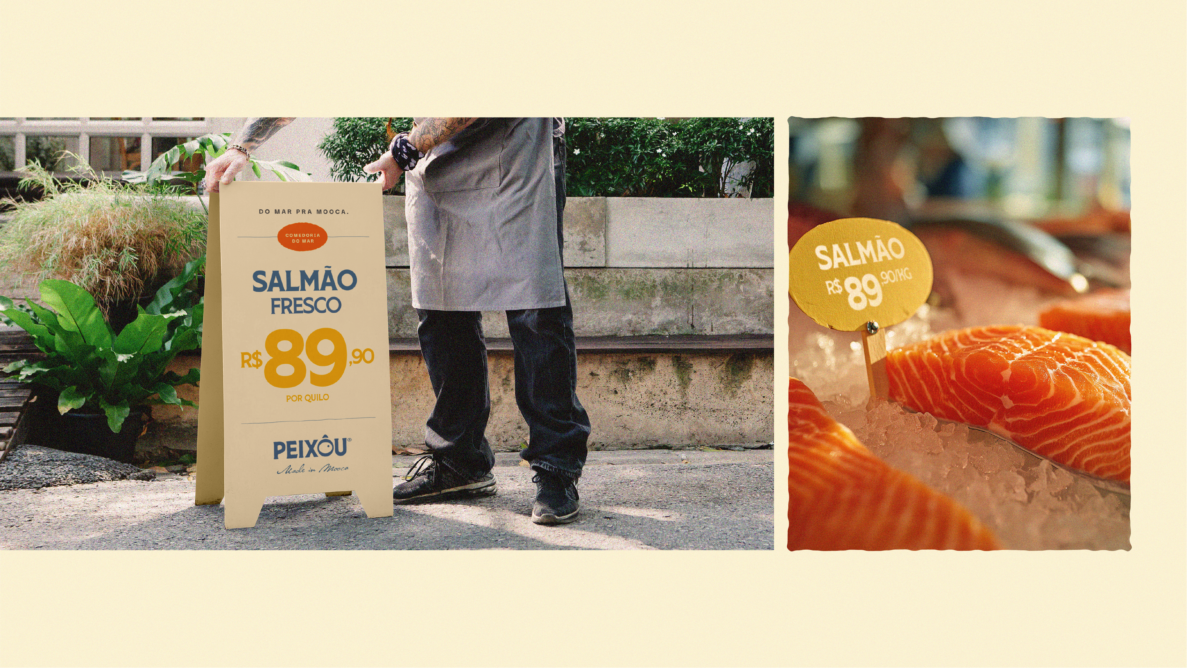
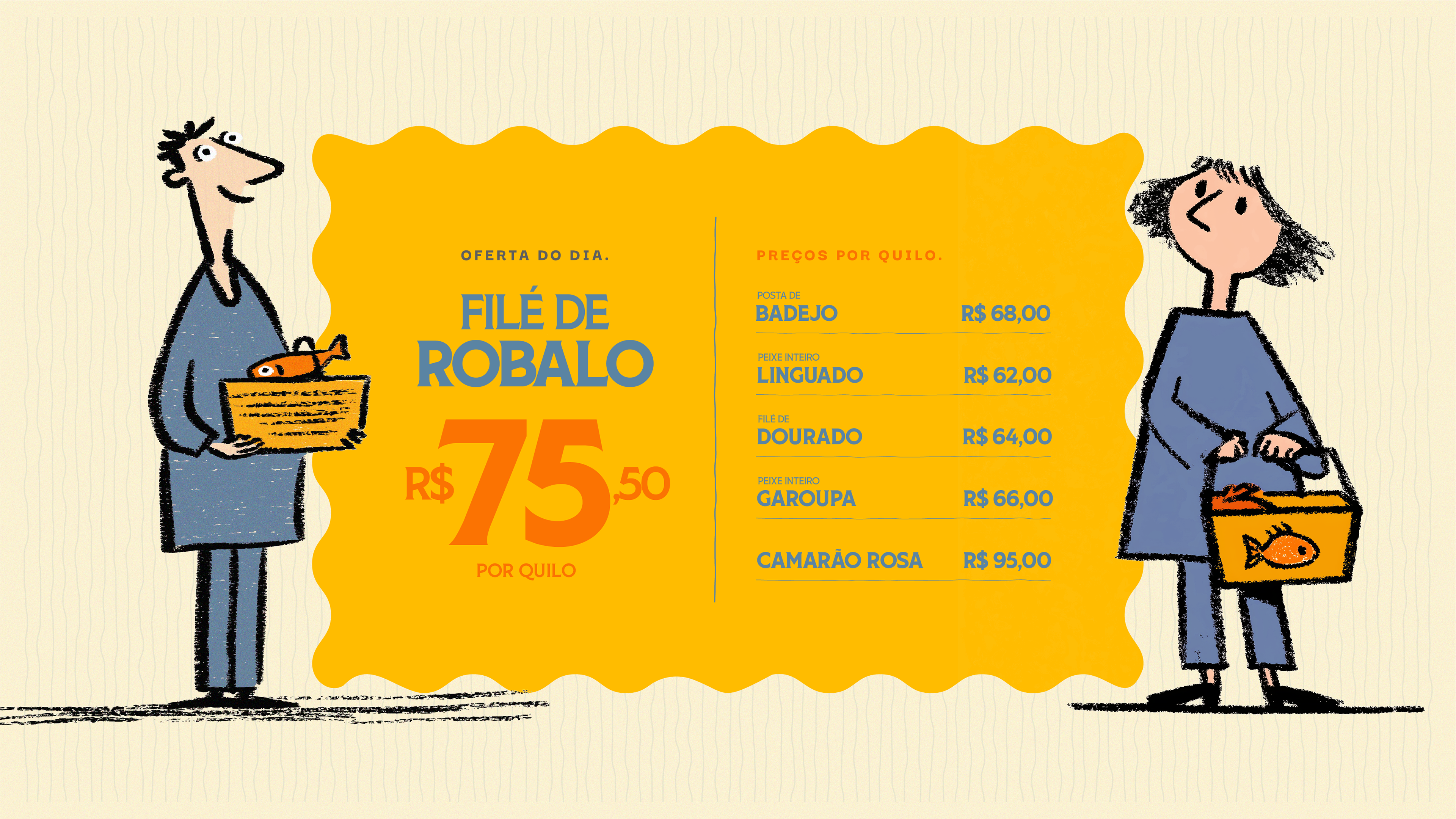
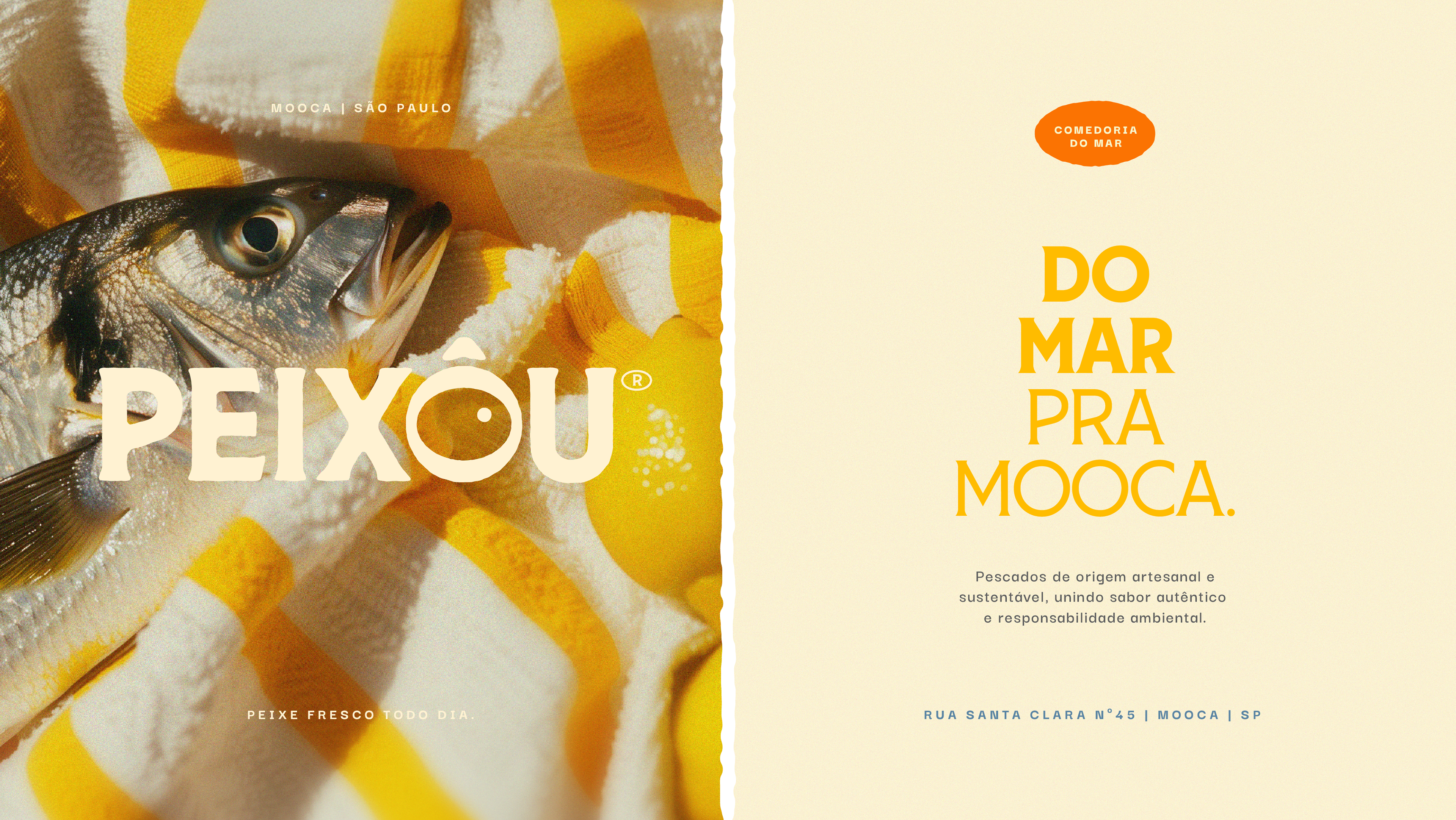
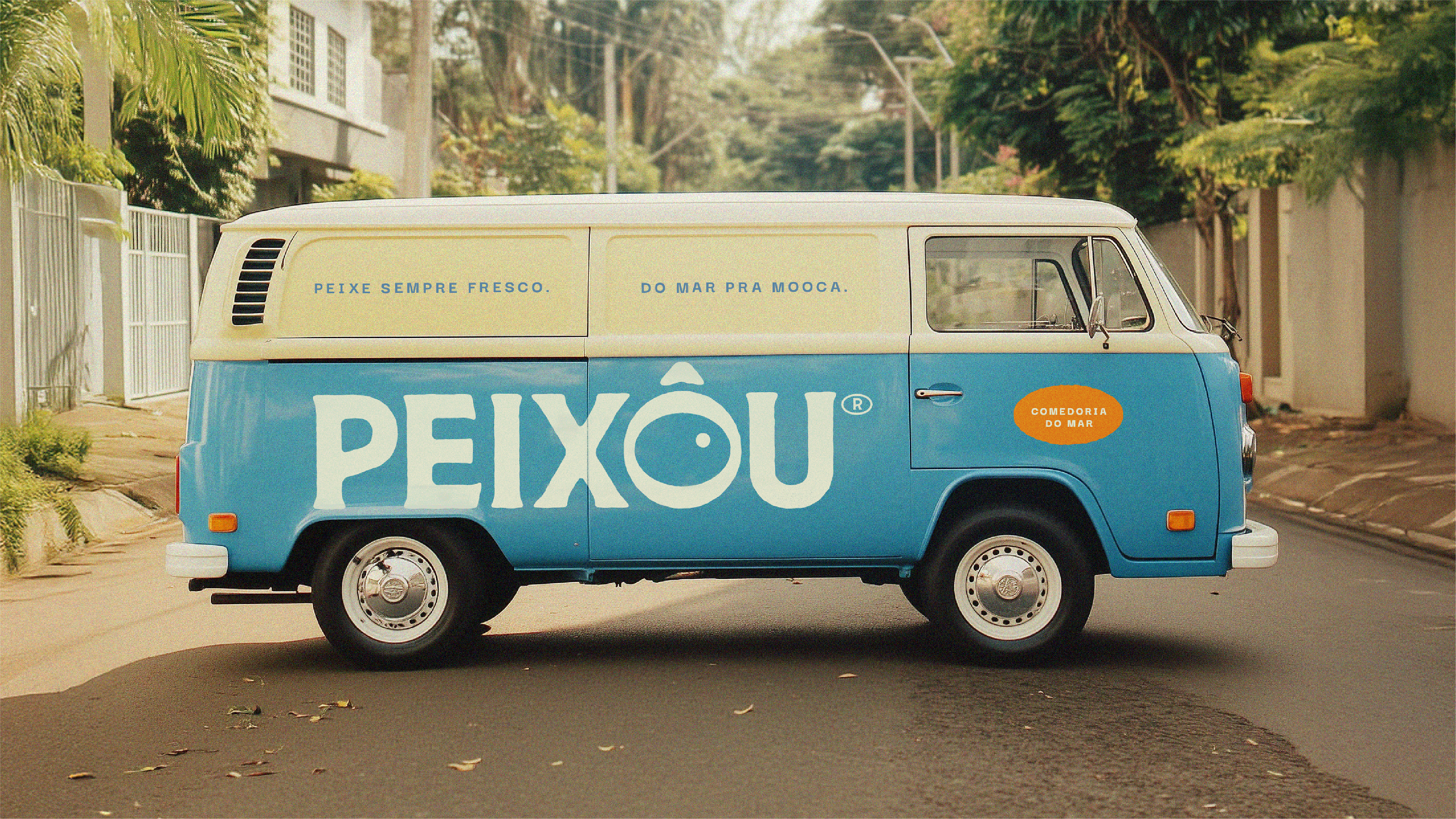
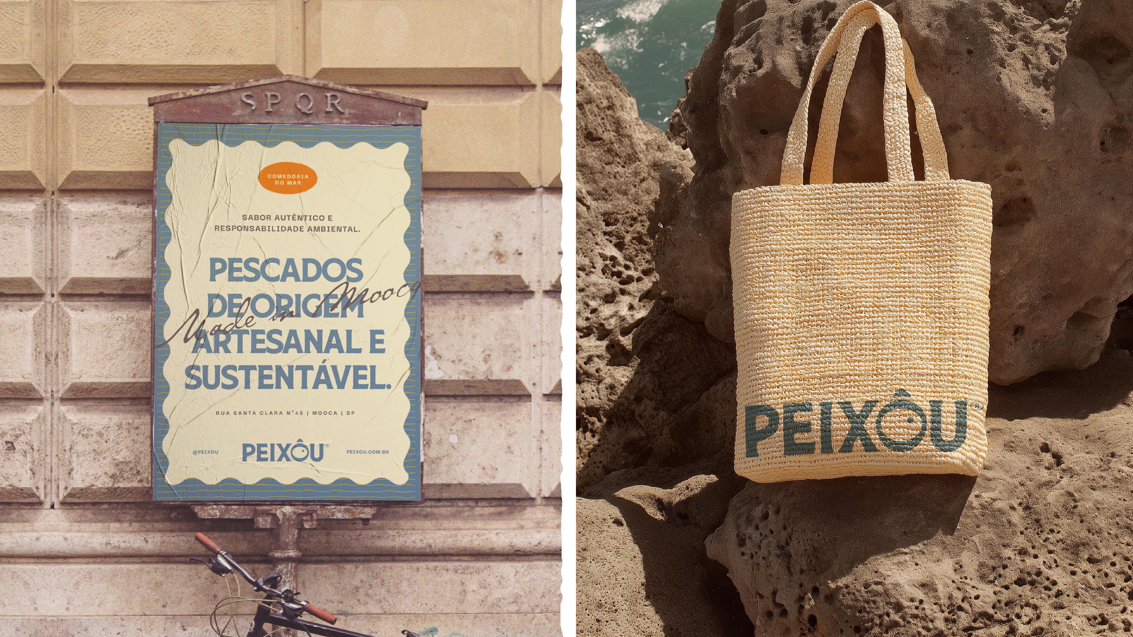
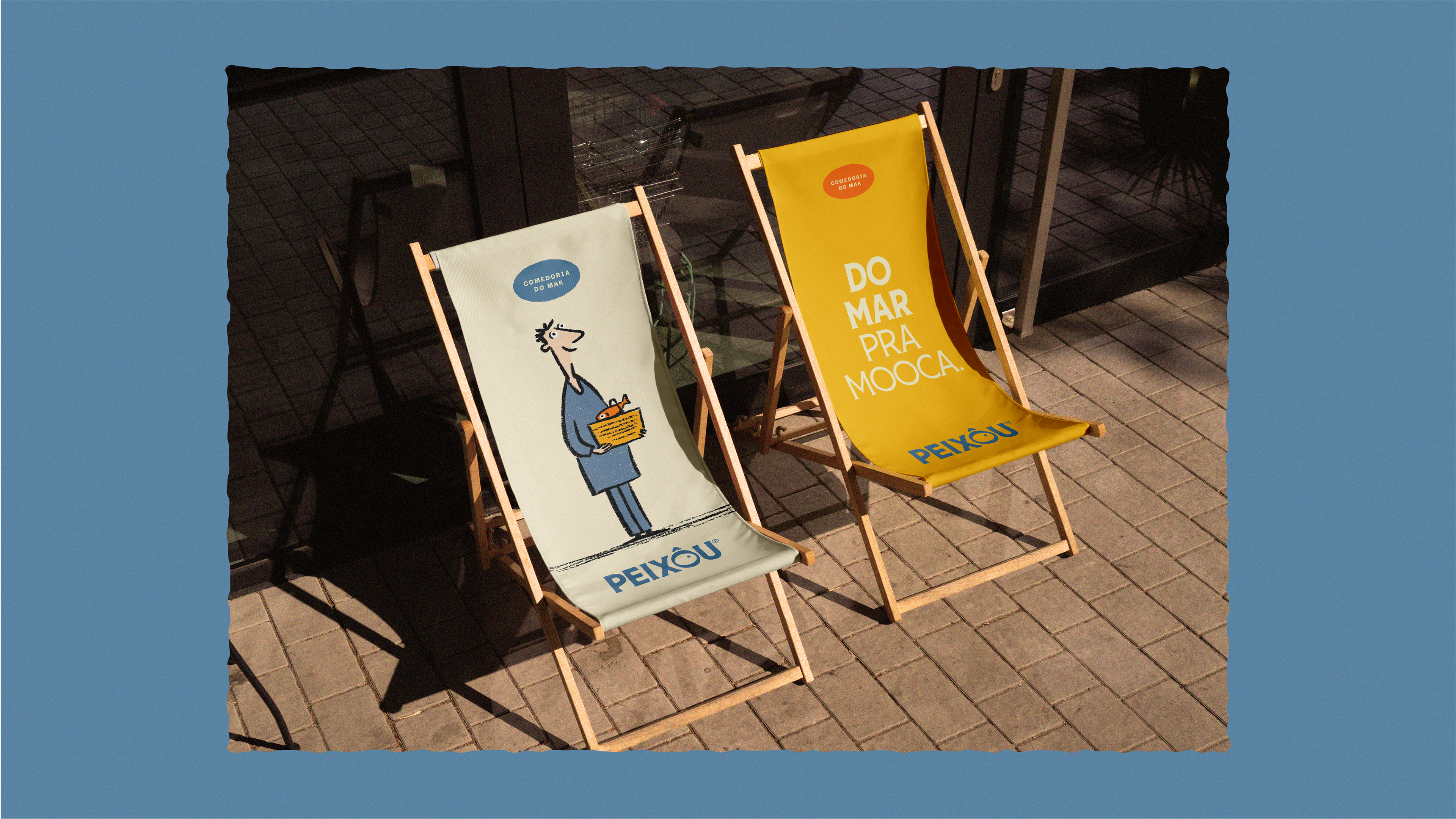
A Peixôu nasce para valorizar a pesca artesanal e garantir peixe fresco todos os dias na mesa dos paulistanos, transformando a compra de pescado em um ritual leve, saudável e prazeroso. “Do mar pra Mooca” é o conceito que permeia a marca, conectando as águas brasileiras ao bairro operário que a acolheu, uma prova de que o oceano pode, sim, morar na cidade.
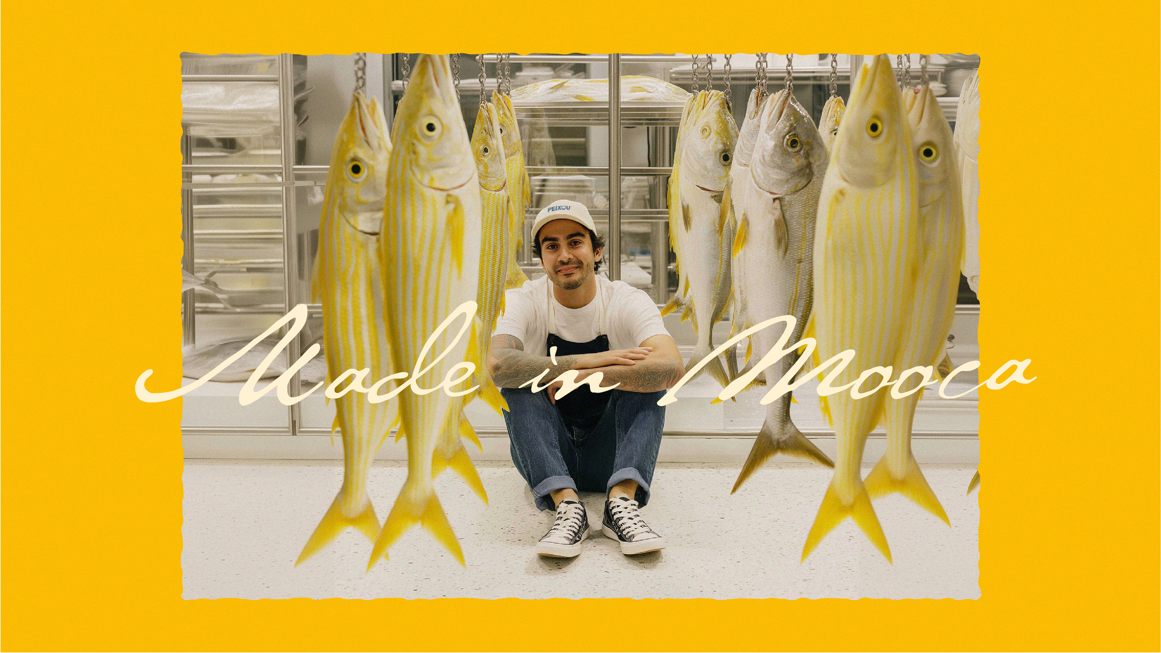
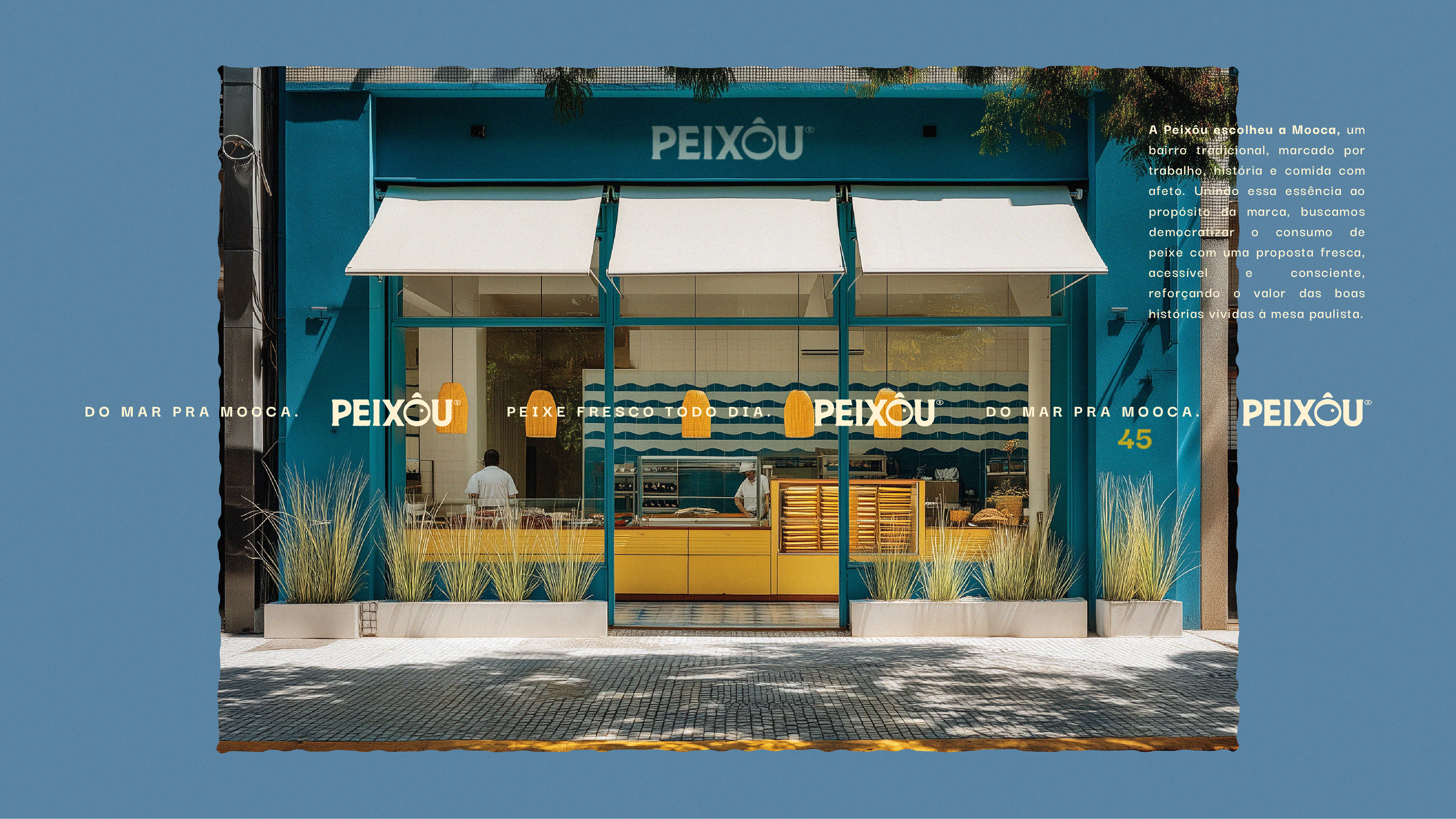
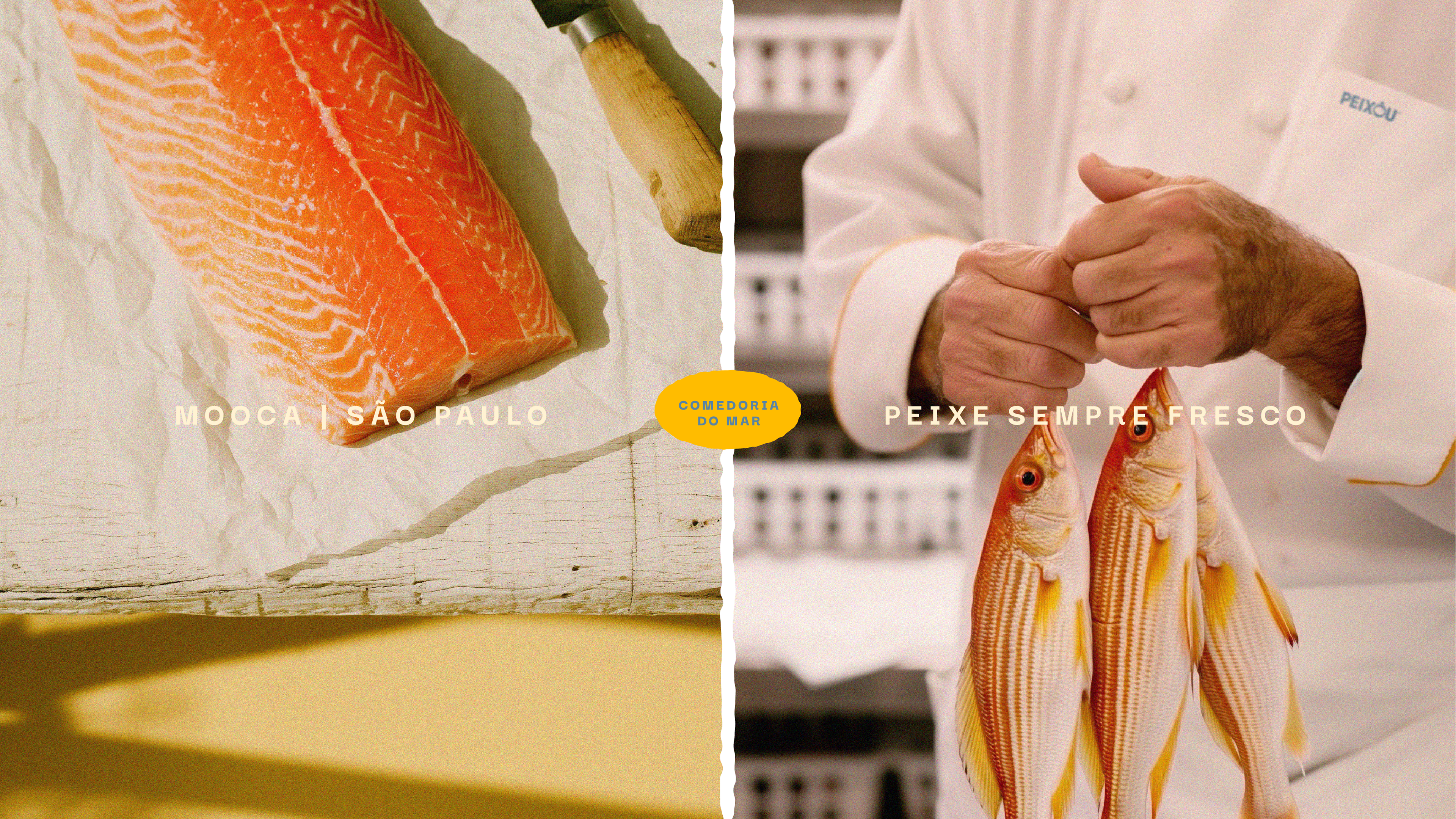
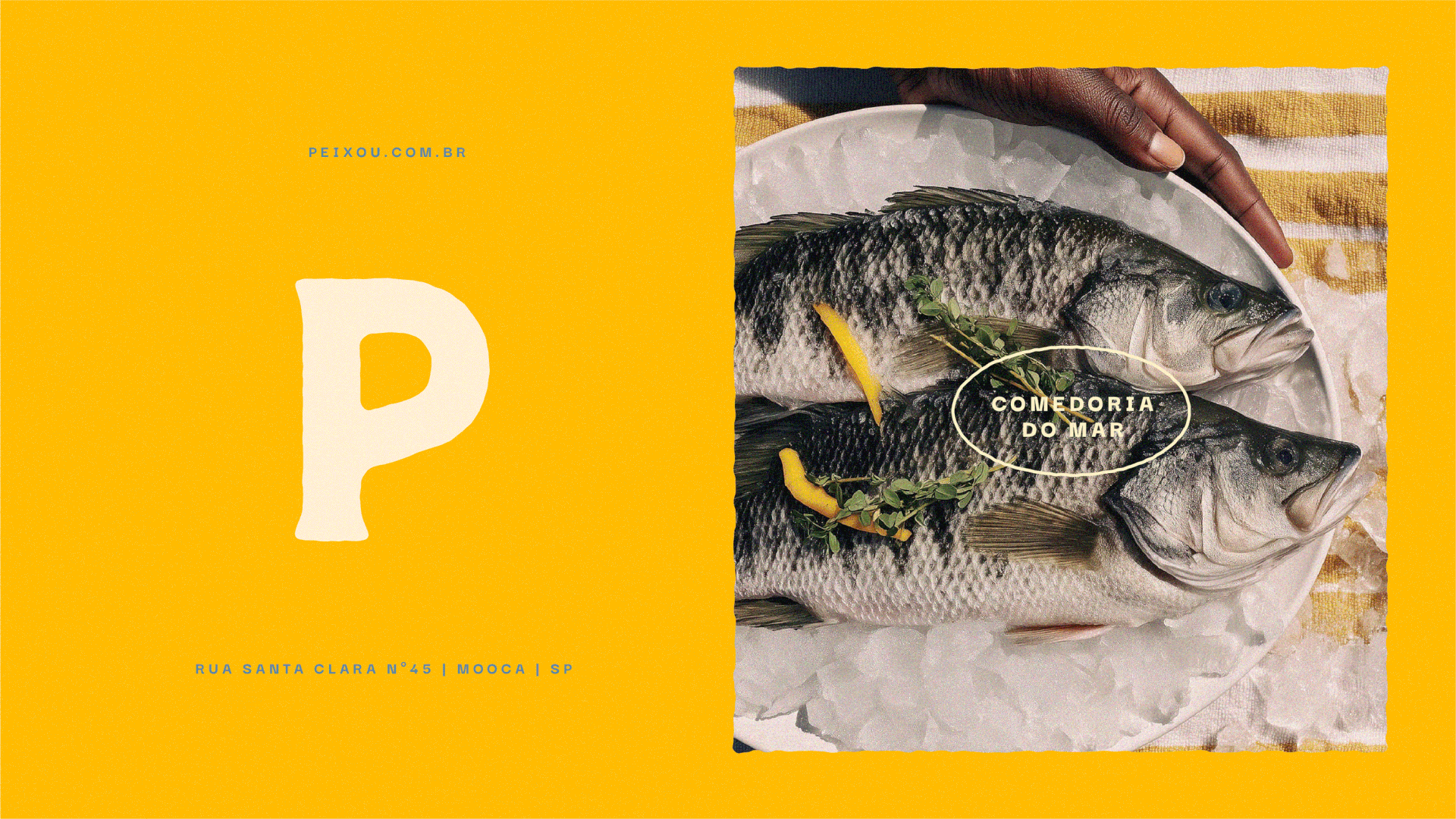
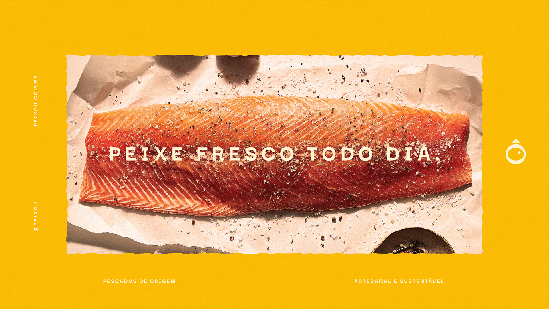
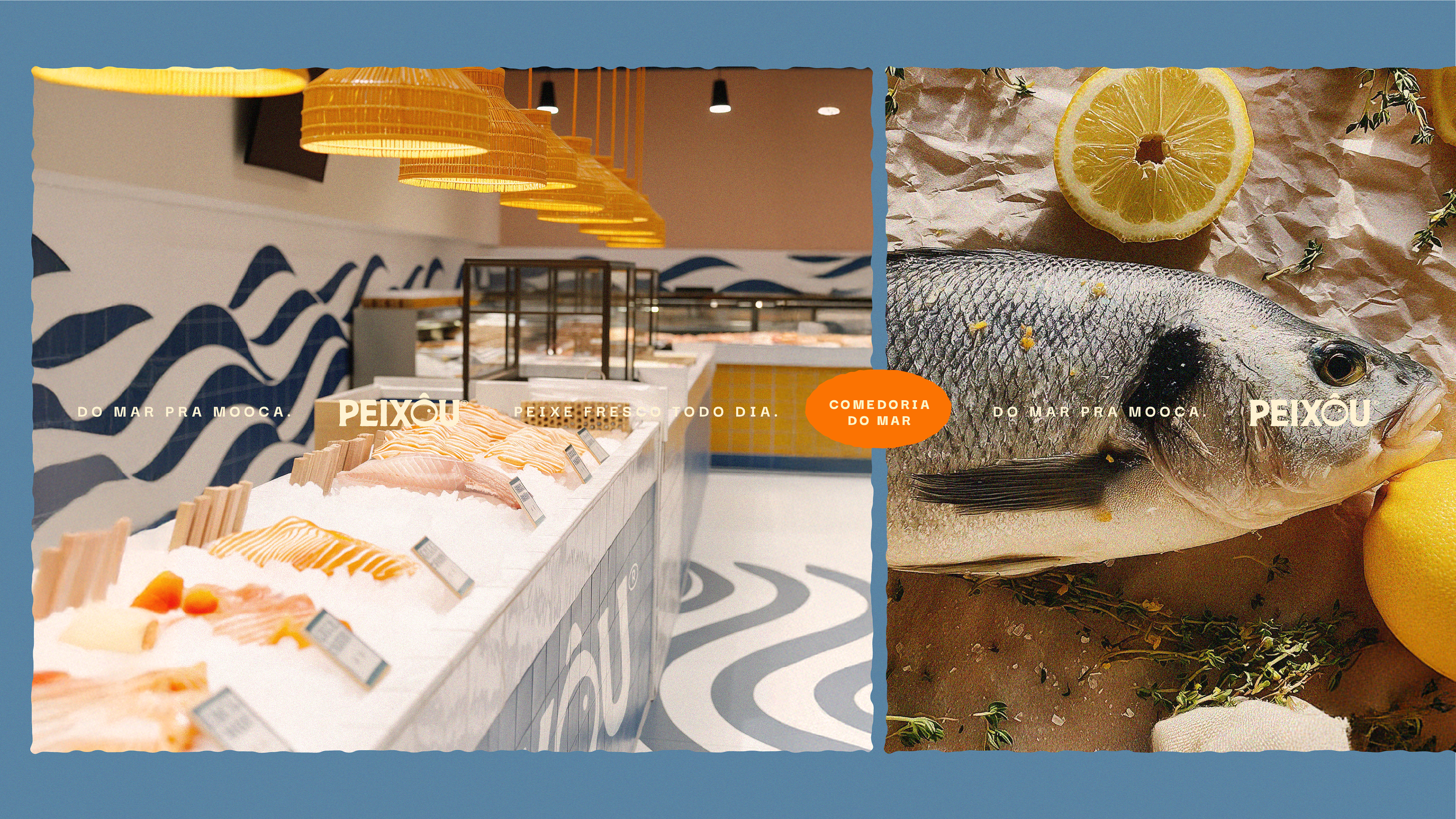
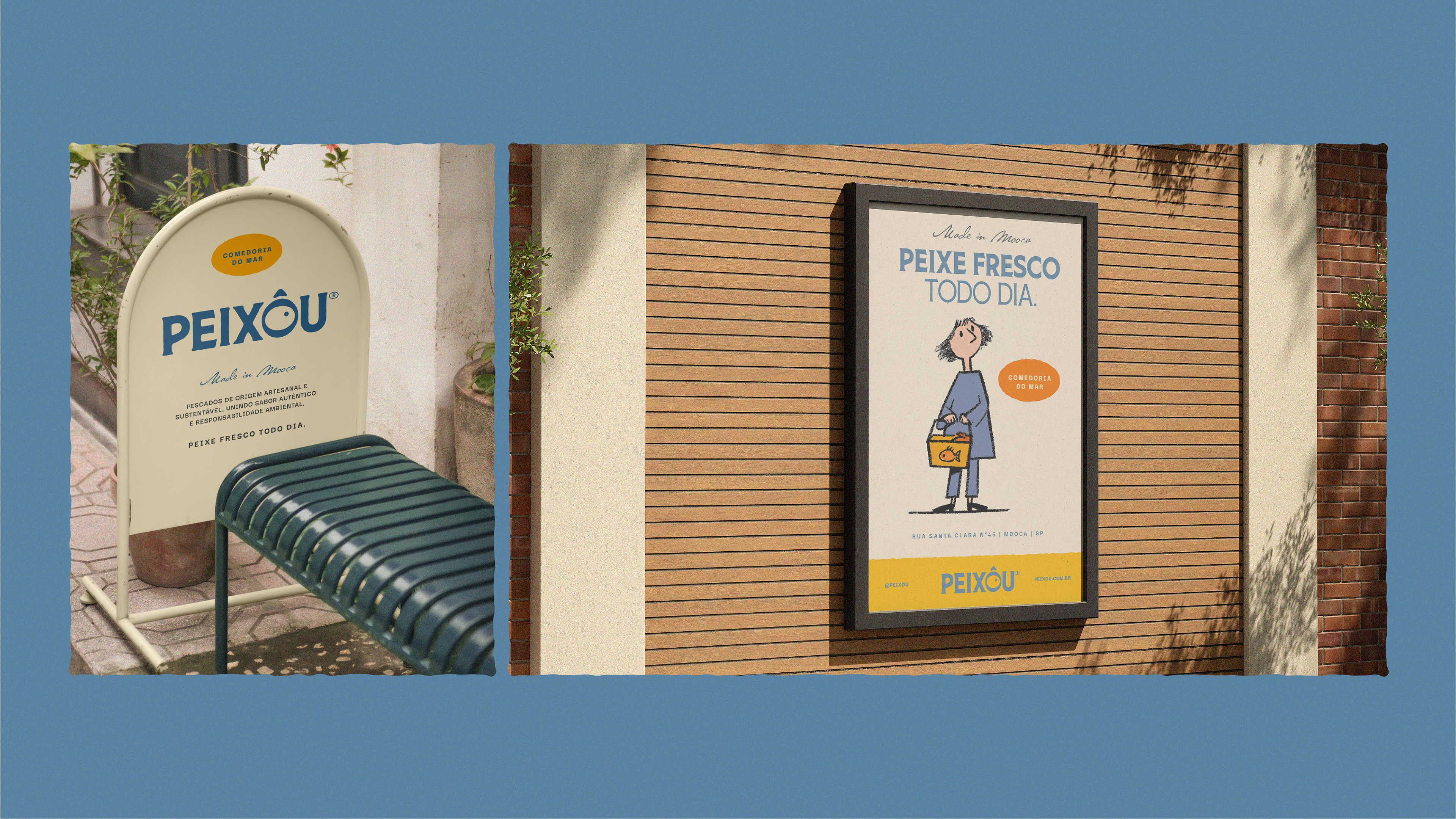
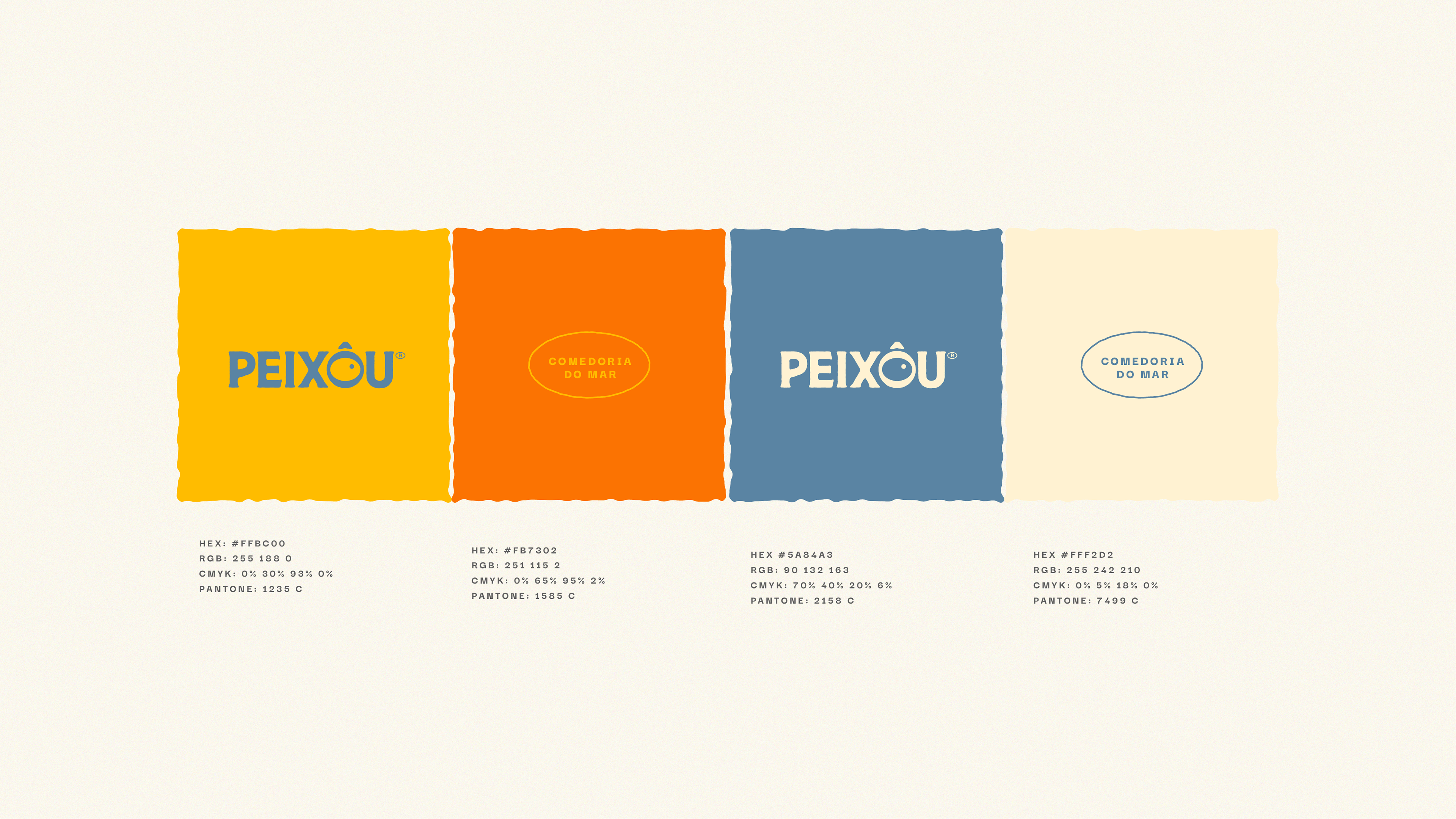
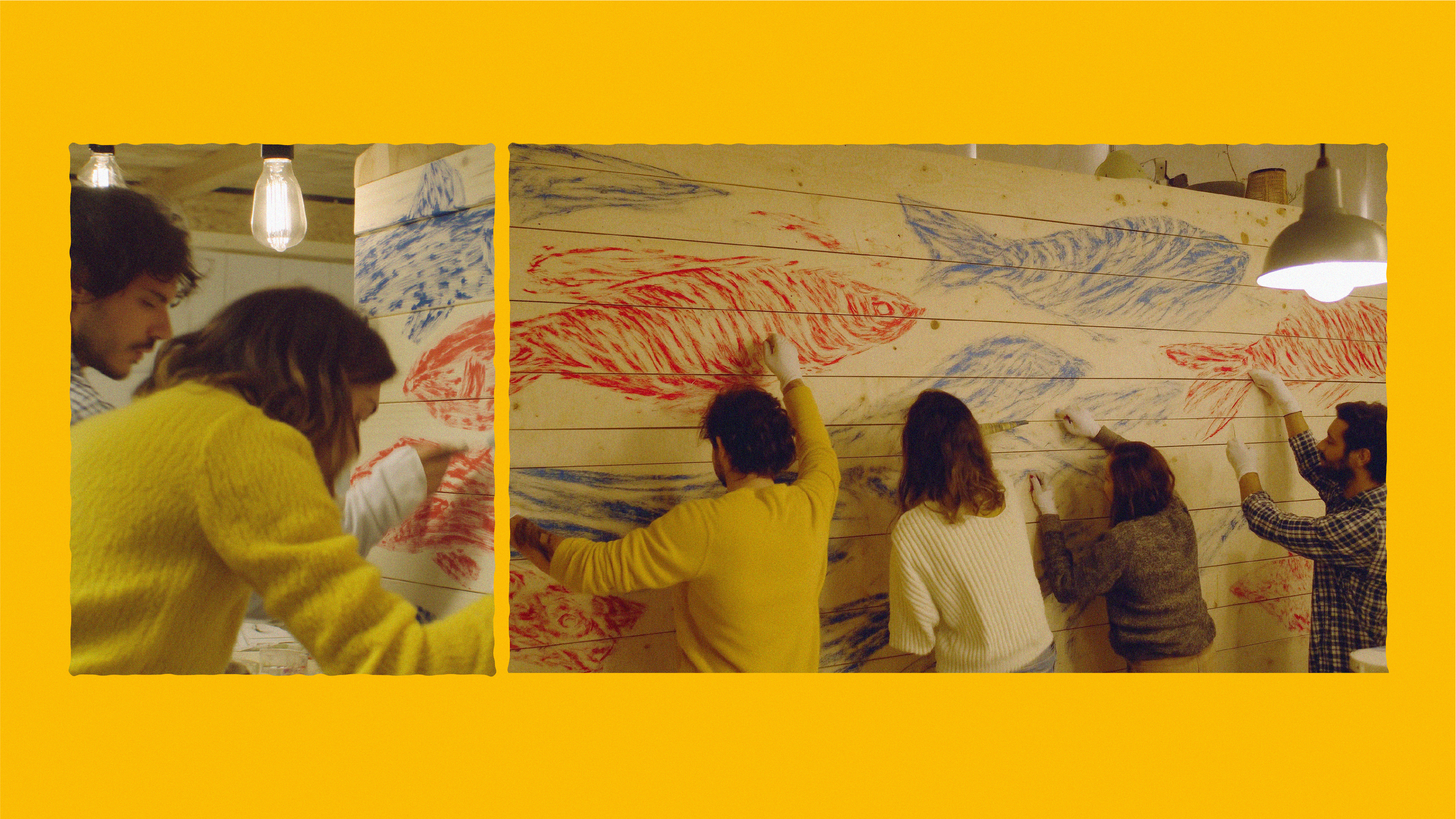
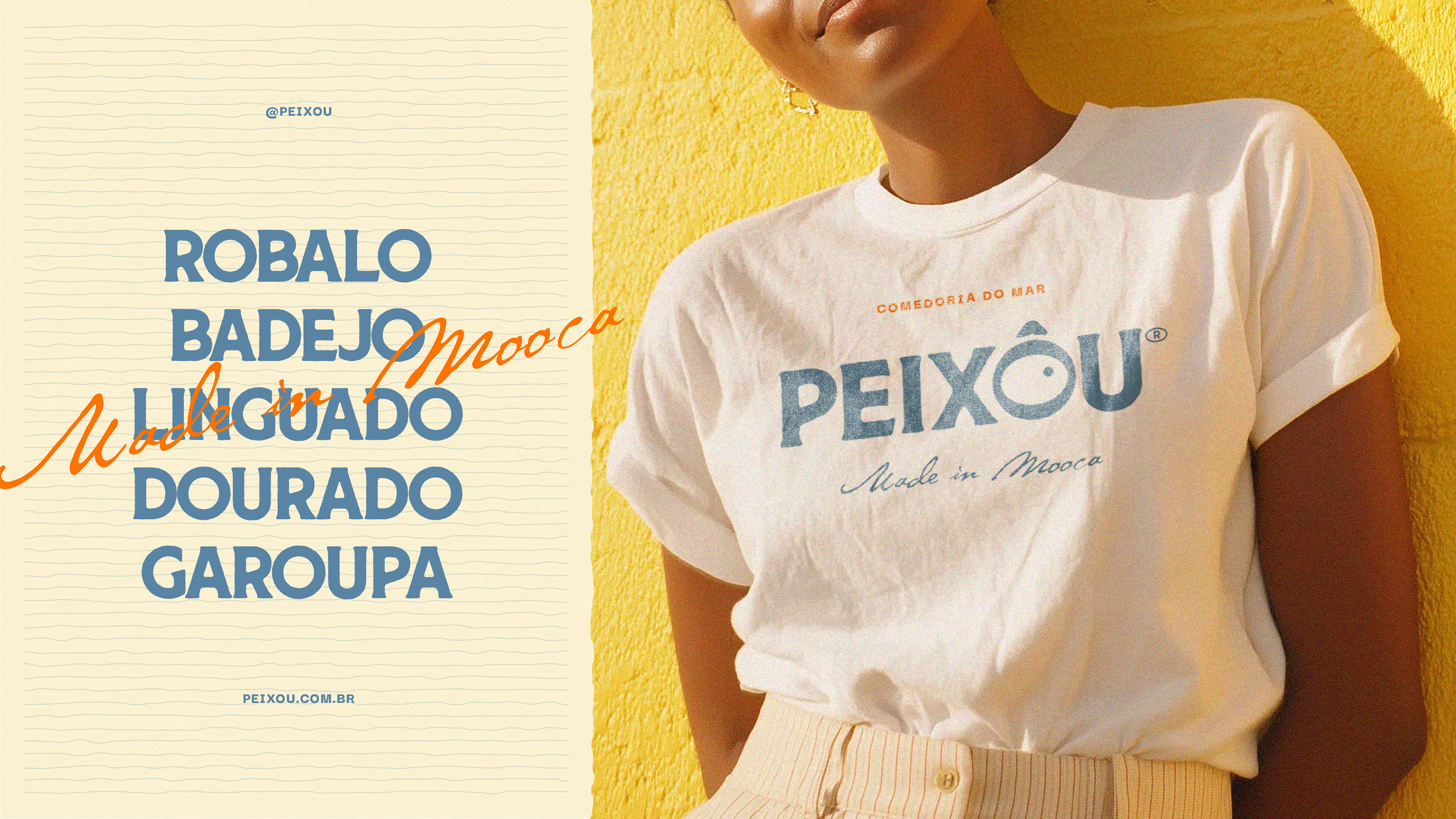
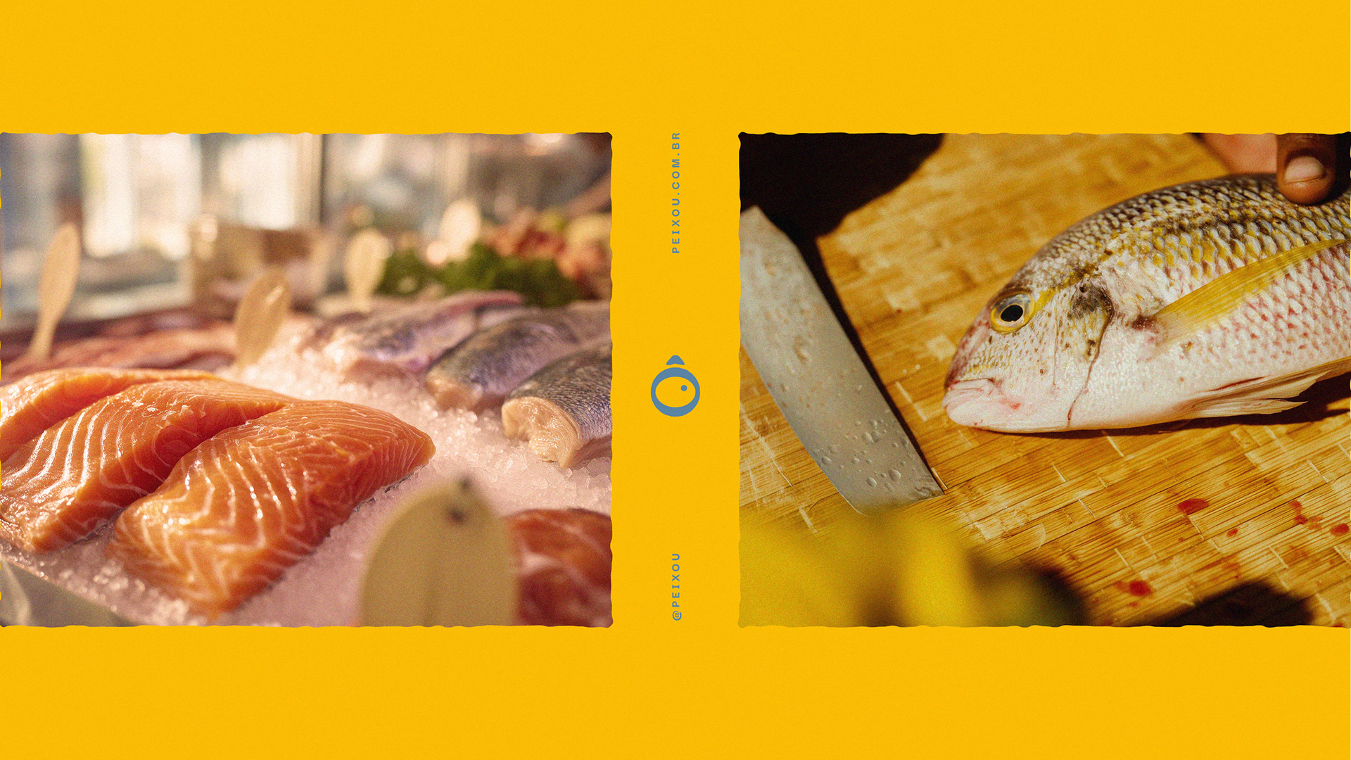
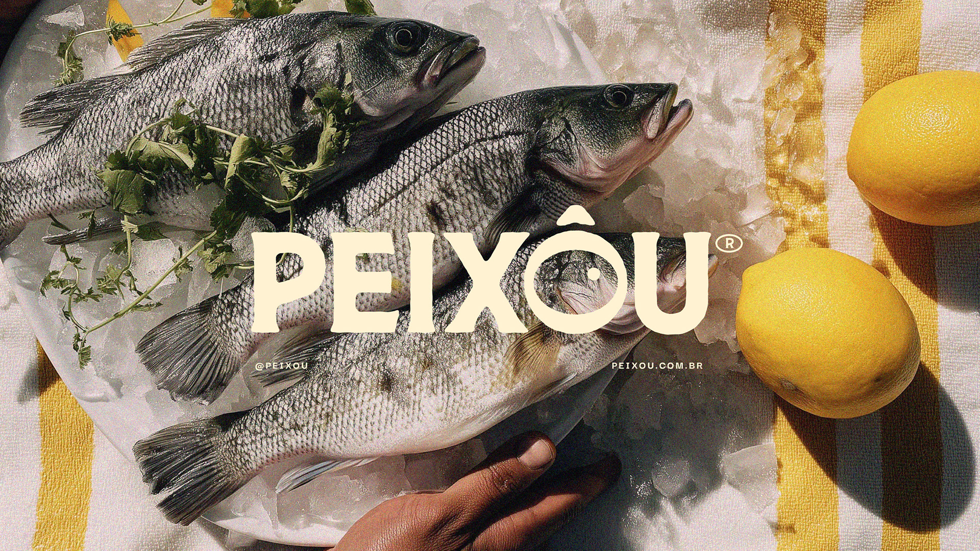
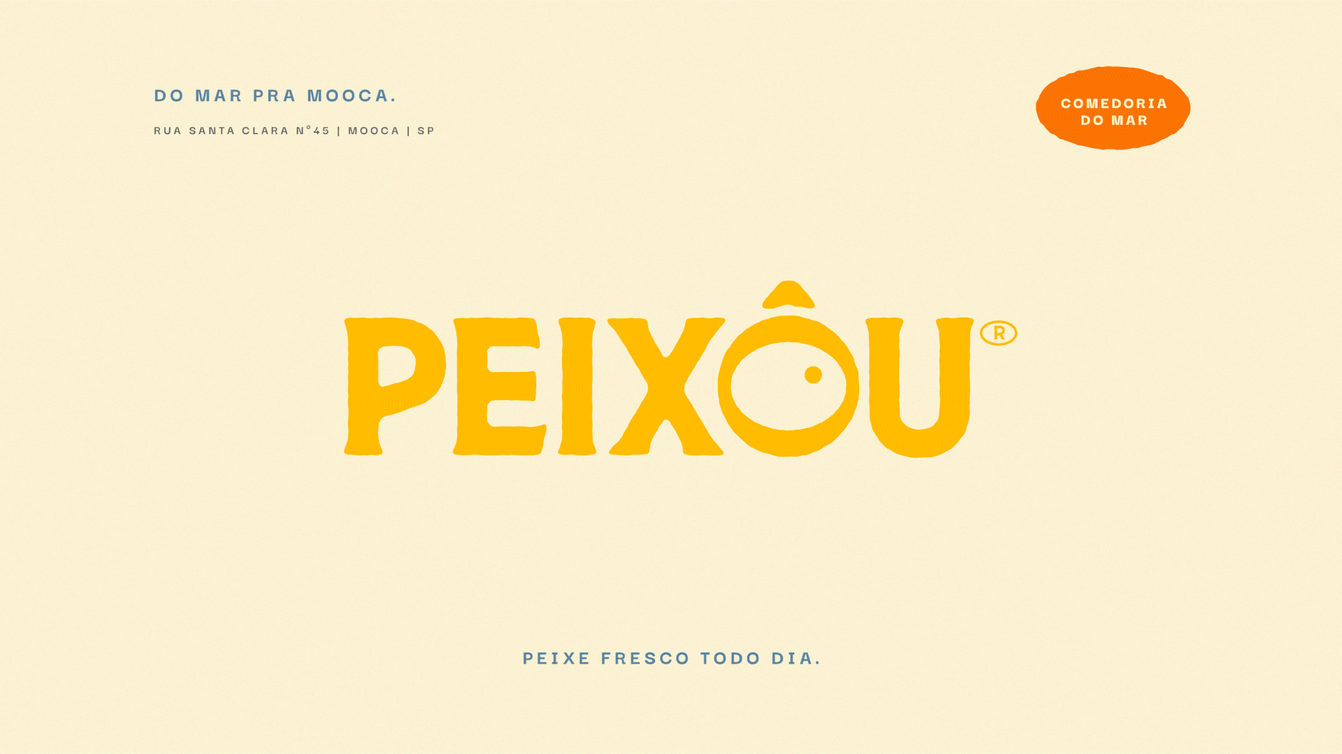
O logo, com serifas orgânicas, destaca o “Ô” com um olho central que remete à forma de um peixe, tornando-se um ícone versátil para selos, favicons e grafismos. A paleta cromática mescla amarelo, azul e um aconchegante tom de areia. Já a fotografia aposta em uma estética analógica, com luz natural e leve granulação, transportando o público para uma atmosfera de autenticidade e proximidade.
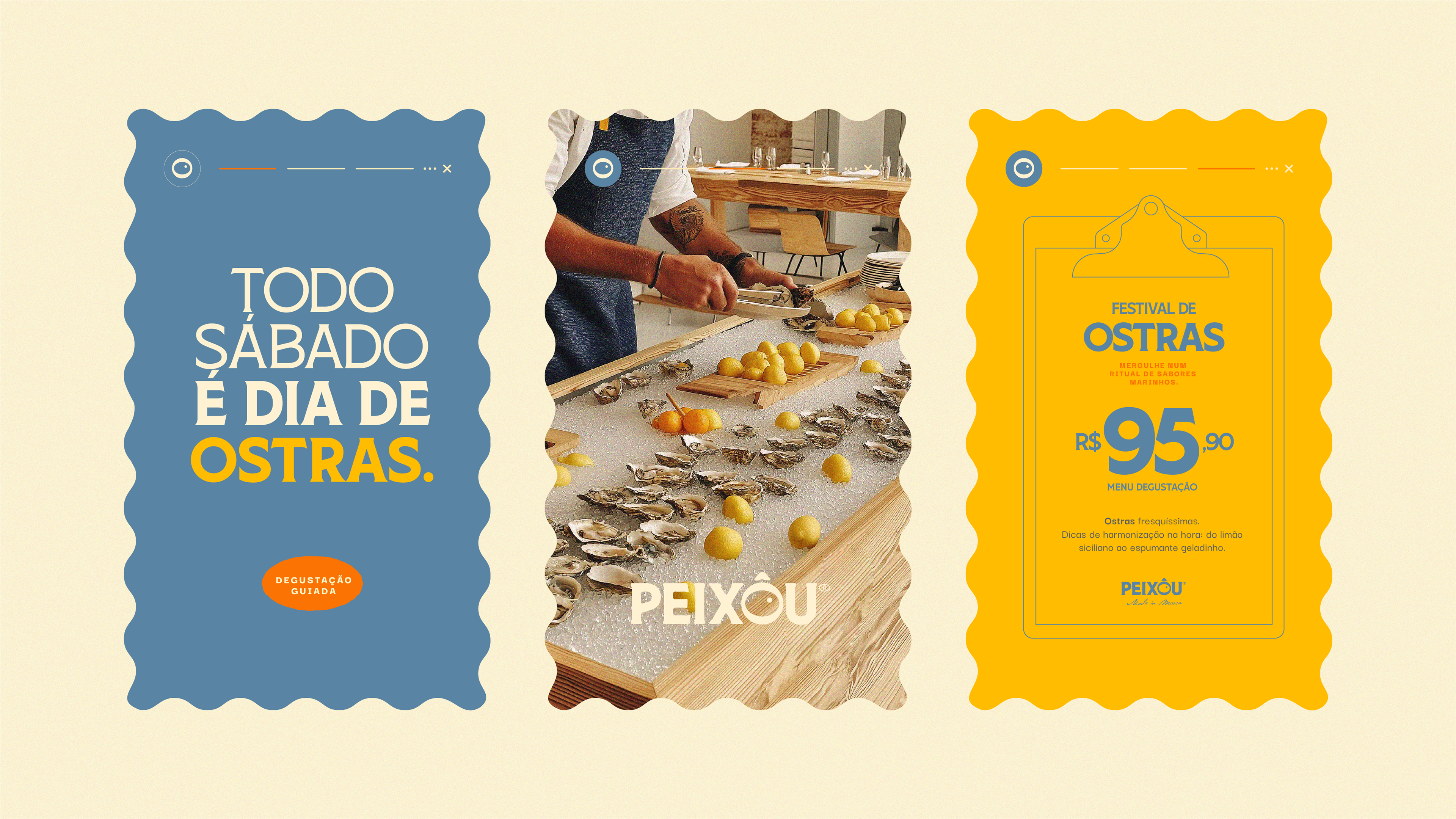
O resultado é um sistema visual caloroso, memorável e coerente, que convida os paulistanos a redescobrir o prazer de comer peixe. Afinal, na Peixôu, todo dia é dia de peixe.
Peixou, sea eatery.
[EN]
[EN]
Peixôu was born to celebrate artisanal fishing and deliver fresh fish every day to the tables of São Paulo’s residents, turning the act of buying seafood into a light, healthy, and enjoyable ritual. “From the sea to Mooca” is the concept that runs through the brand, connecting Brazil’s coastal waters to the working-class neighborhood that embraced it — proof that the ocean can, indeed, live in the city.
The logo, with its organic serifs, highlights the “Ô” with a central eye that echoes the shape of a fish, becoming a versatile icon for stamps, favicons, and graphic elements. The color palette blends yellow, blue, and a warm sandy tone. The photography embraces an analog aesthetic, with natural light and subtle grain, evoking a sense of authenticity and closeness.
The result is a warm, memorable, and cohesive visual system that invites the people of São Paulo to rediscover the joy of eating fish. After all, at Peixôu, every day is a fish day.